
-
2ezyAsked on March 24, 2015 at 6:27 AM
-
JanReplied on March 24, 2015 at 10:45 AM
Hello there,
You can decrease the width of the header by using this custom CSS code:
.form-header-group {
width: 548px !important;
}
Here's a guide on how to inject custom CSS.
Hope this helps. Let us know if you need further assistance.
Thank you.
-
JanReplied on March 24, 2015 at 10:46 AM
I created another thread for your submit button inquiry. This is the URL of the new thread: http://www.jotform.com/answers/539382
Thank you for understanding.
-
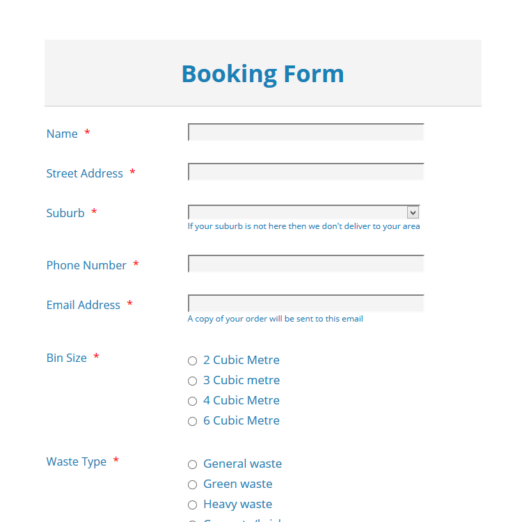
2ezyReplied on March 24, 2015 at 11:10 PM
Hi Jan,
Ok that has fixed the width now. I have selected the form to be responsive but the header and condition field are going off the right hand side of the screen on mobiles. On ipad the fields are going full width of screen and the header is staying at a fixed width which is smaller.
We use to get email notifications when you replied to our questions but I haven't been getting these. Has this changed?Thanks Mark
-
Welvin Support Team LeadReplied on March 25, 2015 at 7:21 AM
Hi Mark,
Remove the custom CSS codes for the header width and use the following instead:
.form-header-group {
margin : 12px 48px 12px 36px !important;
}
For the "condition" checkbox field, use the following custom CSS codes:
span.form-checkbox-item {
white-space: normal !important;
}
As for receiving the forum reply issue, will answer it here: http://www.jotform.com/answers/540124
Thank you!
-
2ezyReplied on March 25, 2015 at 7:40 AM
-
Welvin Support Team LeadReplied on March 25, 2015 at 8:45 AM
Hi Mark,
That's great to know! Will handle all the remaining issues into a separate threads, please find the links below:
iPad issue: http://www.jotform.com/answers/540159
Sub-label on iPhone issue: http://www.jotform.com/answers/540160
Thank you!
- Templates
- Integrations
- INTEGRATIONS
- See 100+ integrations
- FEATURED INTEGRATIONS
 PayPal
- Slack
- Google Sheets
- Mailchimp
- Zoom
- Dropbox
- Google Calendar
- Hubspot
- Salesforce
- See more Integrations
- Products
- PRODUCTS
- Form Builder
- Jotform Enterprise
- Jotform Apps
- Store Builder
- Jotform Tables
- Jotform Inbox
- Jotform Mobile App
- Jotform Approvals
- Report Builder
- Smart PDF Forms
- PDF Editor
- Jotform Sign
- Jotform for Salesforce Discover Now
- Support