


-
bbrmusicgroupAsked on March 26, 2015 at 11:52 AM
I have the settings on "Yes" for responsive form, but can't get the images to be responsive when I look on mobile. After reading through the forum, I've also added the mobile responsive widget, but that doesn't work either
-
CharlieReplied on March 26, 2015 at 1:33 PM
Hi,
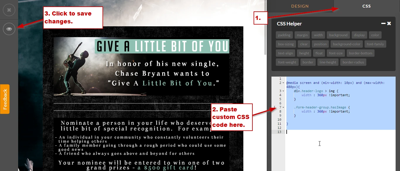
I believe the images have a fixed size. To make them responsive, you will need to add @media rule to your CSS tab in Form Designer. Here's an example:
@media screen and (min-width: 10px) and (max-width: 480px){
div.header-logo > img {
width : 360px !important;
}
.form-header-group.hasImage {
width : 360px !important;
}
}
For the other device display, you'll need to add another set of @media rules with a specific min and max width. Then for each device display you'll need to declare what the image size will be.
Do let us know if you need more information on this.
Thank you.
-
bbrmusicgroupReplied on March 26, 2015 at 1:41 PM
I have an iPhone 5 - that made it better, but the images are still a little too wide
-
CharlieReplied on March 26, 2015 at 2:45 PM
Hi,
Could you try using this code instead:
@media screen and (min-width: 10px) and (max-width: 400px){
img.header-logo-left {
width : 280px !important;
}
}
@media screen and (min-width: 401px) and (max-width: 600px){
img.header-logo-left {
width : 500px !important;
}
}
@media screen and (min-width: 601px) and (max-width: 2400px){
img.header-logo-left {
width : 600px !important;
}
}
Although, as I mentioned earlier, you can change the widths. The media rule just shows three kinds of display.
I hope this one fits.
Kind regards.
- Templates
- Integrations
- INTEGRATIONS
- See 100+ integrations
- FEATURED INTEGRATIONS
 PayPal
- Slack
- Google Sheets
- Mailchimp
- Zoom
- Dropbox
- Google Calendar
- Hubspot
- Salesforce
- See more Integrations
- Products
- PRODUCTS
- Form Builder
- Jotform Enterprise
- Jotform Apps
- Store Builder
- Jotform Tables
- Jotform Inbox
- Jotform Mobile App
- Jotform Approvals
- Report Builder
- Smart PDF Forms
- PDF Editor
- Jotform Sign
- Jotform for Salesforce Discover Now
- Support

