


-
boypinoy05Asked on March 29, 2015 at 4:52 PM
I've been trying to get the Mobile Responsiveness Widget to work, since my co-workers and I are Field Technicians and the "Mobile layout" is a lot easier than having to keep zooming in.
The form is currently on my server, but I can also link your guys' address.
http://form.jotform.us/form/50867188607164?
The picture attached is a screenshot from my iPhone 6 plus. As you can see, the form fields are too tiny to work with.
Please contact ASAP.
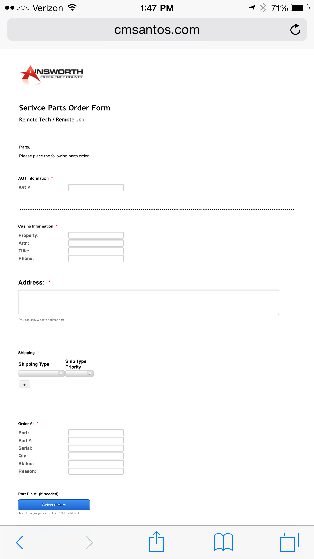 Page URL: http://www.cmsantos.com/test
 -
Elton Support Team LeadReplied on March 29, 2015 at 8:04 PM
Hi,
When I check the direct link of the forms, they appears to be bigger as they normally are since there is a scaling meta code code on Jotforms.
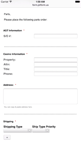
I noticed on your screenshot, in the address bar it is showing your website URL. Did you previously embed the forms to your page? If yes, make sure to add the following meta code between the header tag so the page will scale accordingly on smaller devices for easier viewing and filling of the fields.
<meta name="viewport" content="width=device-width, initial-scale=1.0, maximum-scale=1.0, user-scalable=0" />
Hope this helps. Thank you!
- Templates
- Integrations
- INTEGRATIONS
- See 100+ integrations
- FEATURED INTEGRATIONS
 PayPal
- Slack
- Google Sheets
- Mailchimp
- Zoom
- Dropbox
- Google Calendar
- Hubspot
- Salesforce
- See more Integrations
- Products
- PRODUCTS
- Form Builder
- Jotform Enterprise
- Jotform Apps
- Store Builder
- Jotform Tables
- Jotform Inbox
- Jotform Mobile App
- Jotform Approvals
- Report Builder
- Smart PDF Forms
- PDF Editor
- Jotform Sign
- Jotform for Salesforce Discover Now
- Support
