


-
DebworkAsked on April 6, 2015 at 8:14 PM
Hello,
For some reason responsive css is set to white-space: nowrap on checkboxes. How do I override it?
My fix is not working for mobile.
Also, for some reason the OTHER field is set really short so I had to make that bigger ... gets cut off in mobile version.
Thanks
<code>
form#Mynumber.jotform-form div.form-all ul.form-section.page-section li#id_12.form-line.jf-required div#cid_12.form-input-wide.jf-required div.form-single-column span.form-checkbox-item label {
white-space: normal !important;
}</code>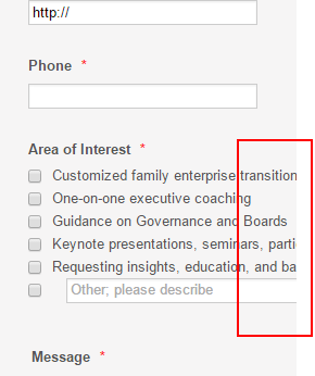 Page URL: http://lucidlegacyconsulting.com/test/
 -
David JotForm Support ManagerReplied on April 6, 2015 at 10:27 PM
Please try the following:
1) Set the responsive option to "no" at preferences tab.
2) Add the mobile responsive widget:

It should fix the issue:

Here is my cloned version of your form: http://form.jotform.co/form/50958087358873
Hope this helps you, let us know if you have more questions, we will be glad to assist you.
-
DebworkReplied on April 7, 2015 at 10:08 AM
Ok good.
hm, I wonder why that responsive setting is there but glad to have the fix with the widget.
Allow other=Y is too short and controlling it was part of the problem so I took it out.
Maybe it is standard but padding on smaller viewports also was needed.
Thanks! On to testing.
-
CharlieReplied on April 7, 2015 at 11:15 AM
I'm glad that my colleague's solution worked.
Please do update us if everything is good on your test results or if your still having problems on it.
Kind regards.
- Templates
- Integrations
- INTEGRATIONS
- See 100+ integrations
- FEATURED INTEGRATIONS
 PayPal
- Slack
- Google Sheets
- Mailchimp
- Zoom
- Dropbox
- Google Calendar
- Hubspot
- Salesforce
- See more Integrations
- Products
- PRODUCTS
- Form Builder
- Jotform Enterprise
- Jotform Apps
- Store Builder
- Jotform Tables
- Jotform Inbox
- Jotform Mobile App
- Jotform Approvals
- Report Builder
- Smart PDF Forms
- PDF Editor
- Jotform Sign
- Jotform for Salesforce Discover Now
- Support


