


-
shaliniyAsked on April 8, 2015 at 3:57 PM
Do I have too much custom CSS?
I have used the iframe method to install the JotForm code, as suggested in the forum. But it's not working on any of my iphones. It seems to start out narrow, then jumps wide again. I would be OK suppressing the background image on mobile devices IF I could then see the email, name boxes and submit button and it would be a working form.
Any help is greatly appreciated.
Michelle H.
-
jonathanReplied on April 8, 2015 at 6:01 PM
Hi Michelle,
I do see the issue when I checked your form on the website using a mobile browser.

I also agree that you should redo the form http://www.jotform.us/form/43554880672160 using the Form Builder to make it more suitable for mobile browsers.
As is now, it seems your form was designed more for desktop browsers. Like some of the injected custom CSS codes were overriding the responsiveness in the width and distance of fields on the form.

Try removing first the custom CSS codes and apply them little by little while checking the form every time on the mobile browser also.
Hope this help. Let us know if you need further assistance on the redesign.
Thanks.
-
jonathanReplied on April 8, 2015 at 6:04 PM
I made a test form using a clone of your form, and I just removed all of the custom CSS codes.
When I preview the form on the mobile browser, it already have a much better response.

-
shaliniyReplied on April 9, 2015 at 9:17 AM
Dear Jonathan- I understand completely what you are saying...but I have the beautifully designed website for desktops using a responsive theme EXCEPT for this opt-in form. So, if I take away all of my custom CSS that makes it beautiful on a desktop just to have a responsive form on mobile devices, then I lose my 'look'...is there an alternative? Can I have 2 forms...one for desktop display and one for mobile? Is that even possible? I really don't care what it looks like on mobile, as long as it has a name, email and submit button and the text.
Thanks for all of your work on this, so far!
Michelle H.
-
Elton Support Team LeadReplied on April 9, 2015 at 11:48 AM
Hi Michelle,
The existing CSS codes injected to your form is overruling the responsive CSS for mobile that is why the form does not display properly on mobile devices.
Anyway, here's the CSS codes you need to reset the two fields styles on your form and make it fully mobile responsive again. Inject this under the existing CSS codes.
@media screen and (max-width:480px){
#id_1, #id_3 {
float: none;
width: 100%;
left: 0;
top: 0;
}}
Hope this helps. Thanks!
-
shaliniyReplied on April 22, 2015 at 7:44 AM
Dear Elton- We still have an issue with iPhones and the form not being responsive. Here is what we see on iPhones...but mobile testing shows it OK.
Any thoughts on why?
Thank you. Michelle H

-
raulReplied on April 22, 2015 at 11:12 AM
Please try to add the CSS code provided here: http://stackoverflow.com/questions/23083462/how-to-get-an-iframe-to-be-responsive-in-ios-safari#23083463 to your site and let us know if this helps to make the iframe responsive in your iPhone.
-
shaliniyReplied on April 22, 2015 at 11:47 AM
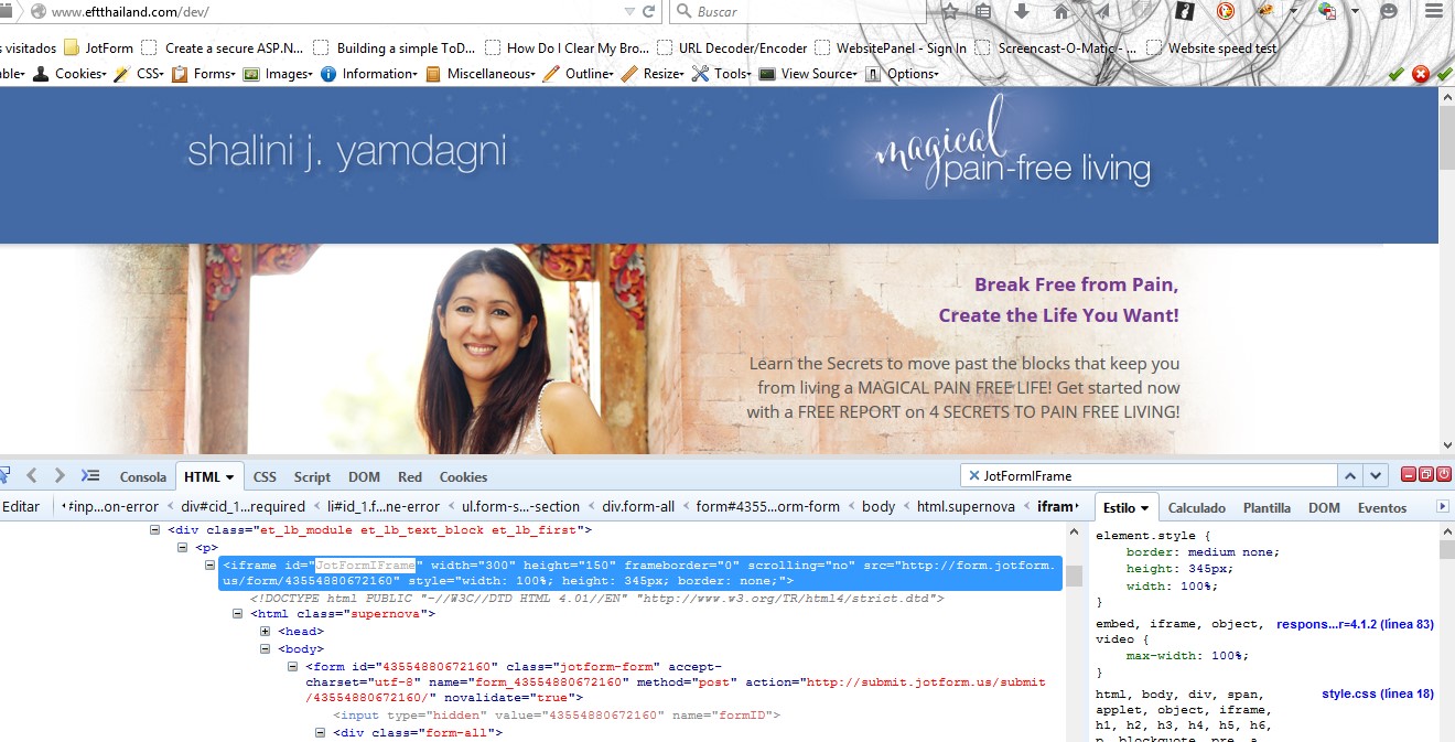
Great site...but this did not fix it for me. I am using the full iframe code with script, here:
I tried removing the script, but still does not work in Safari...
Here is the css I added:
iframe #JotFormIFrame {
width: 1px;
min-width: 100% !important;
*width: 100%;
}
Any thoughts?
Thanks!
-
raulReplied on April 22, 2015 at 1:15 PM
Can you let us know where did you add the code? I was trying to check if it wasn't being overridden by another code, but I couldn't find it on your page.
-
shaliniyReplied on April 22, 2015 at 2:34 PM
That is really weird...I have 2 places I can add custom css, one being my child theme and one is a custom css field from the theme builder...BUT the code doesn't show up when I add the code to either place, when you do inspect element...something is wrong. Thanks for pointing that out. I will keep digging. Michelle H.
-
jonathanReplied on April 22, 2015 at 3:38 PM
Hi Michelle,
Please do let us know if you require further assistance on this.
Thanks.
-
vencoReplied on February 19, 2016 at 12:05 PM
Hi, I do not know how, but one of the forms when use on mobile iphone come out like a desktop witch is the best way for me, one goes responsive and became ugly. They look same
1. https://form.jotformeu.com/60411431045339 that is the ugly one!
2. https://form.jotformeu.com/60415500082341 that is the best way I want it!
how to make them same to show on iphone, want them to be like example 2.
I think if you fix the look of your site Jot Form when open on iphone will fix my issue also.
here how look your site when open on iphone!!!

-
David JotForm SupportReplied on February 19, 2016 at 1:08 PM
@venco Since this is an older thread, I have moved your question to a thread of its own. I will address your question in the following thread shortly:
http://www.jotform.com/answers/776561
- Templates
- Integrations
- INTEGRATIONS
- See 100+ integrations
- FEATURED INTEGRATIONS
 PayPal
- Slack
- Google Sheets
- Mailchimp
- Zoom
- Dropbox
- Google Calendar
- Hubspot
- Salesforce
- See more Integrations
- Products
- PRODUCTS
- Form Builder
- Jotform Enterprise
- Jotform Apps
- Store Builder
- Jotform Tables
- Jotform Inbox
- Jotform Mobile App
- Jotform Approvals
- Report Builder
- Smart PDF Forms
- PDF Editor
- Jotform Sign
- Jotform for Salesforce Discover Now
- Support


