


-
glandoreghycAsked on April 15, 2015 at 5:39 PM
-
BenReplied on April 15, 2015 at 5:55 PM
Could you please add a screenshot of the error so that we can better understand what is the issue that you are having and we would be happy to assist with it and of course help you resolve it.
Also, do let us know if there are specific steps needed to recreate the error, or if a specific device.
-
glandoreghycReplied on April 16, 2015 at 3:21 AM
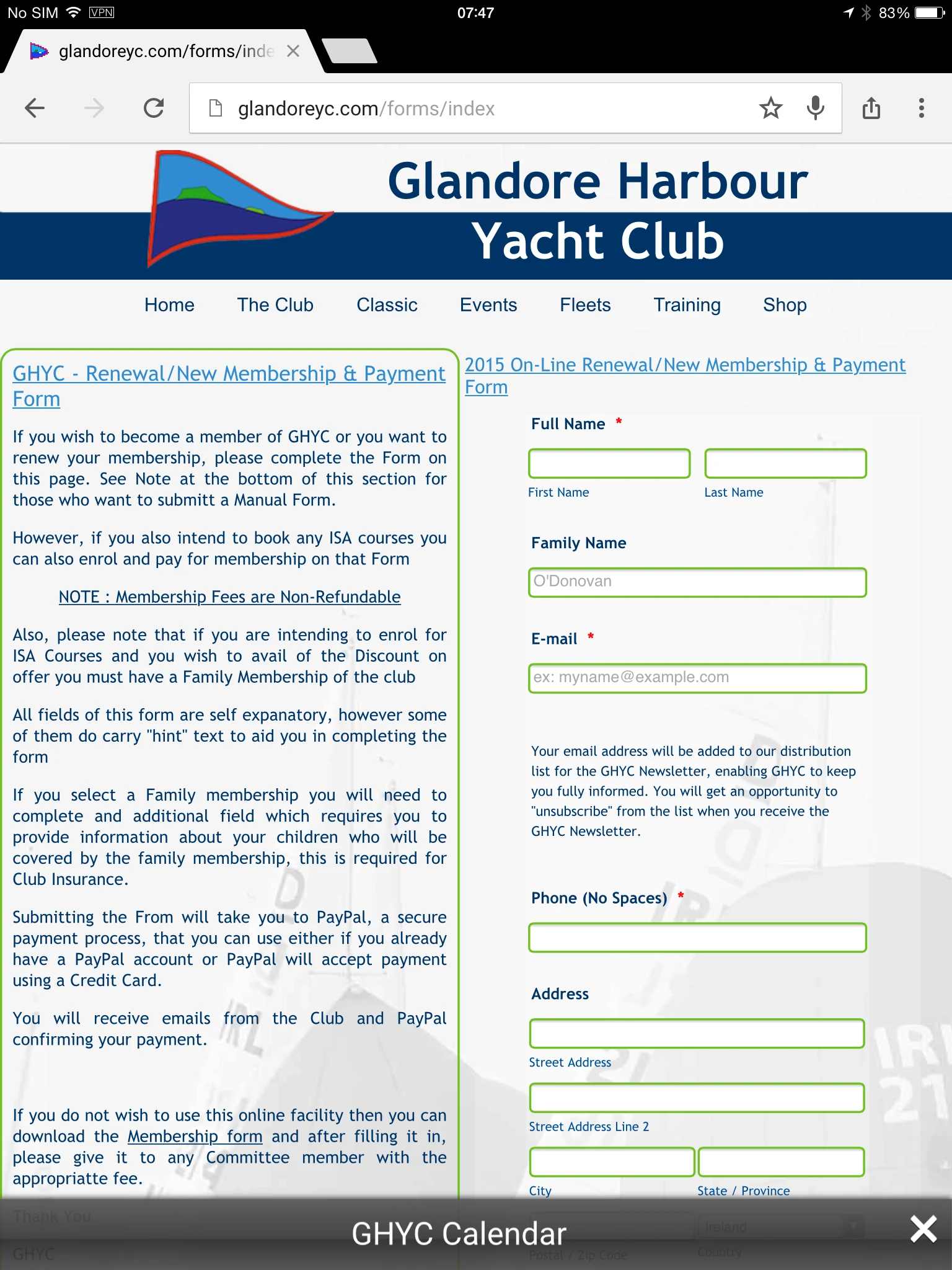
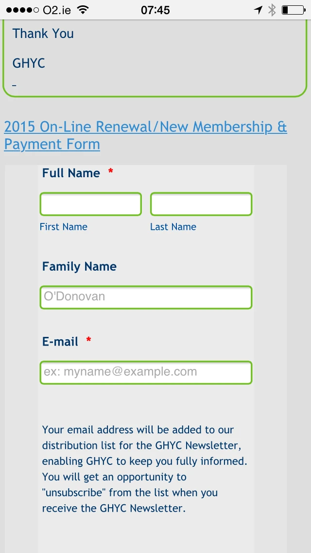
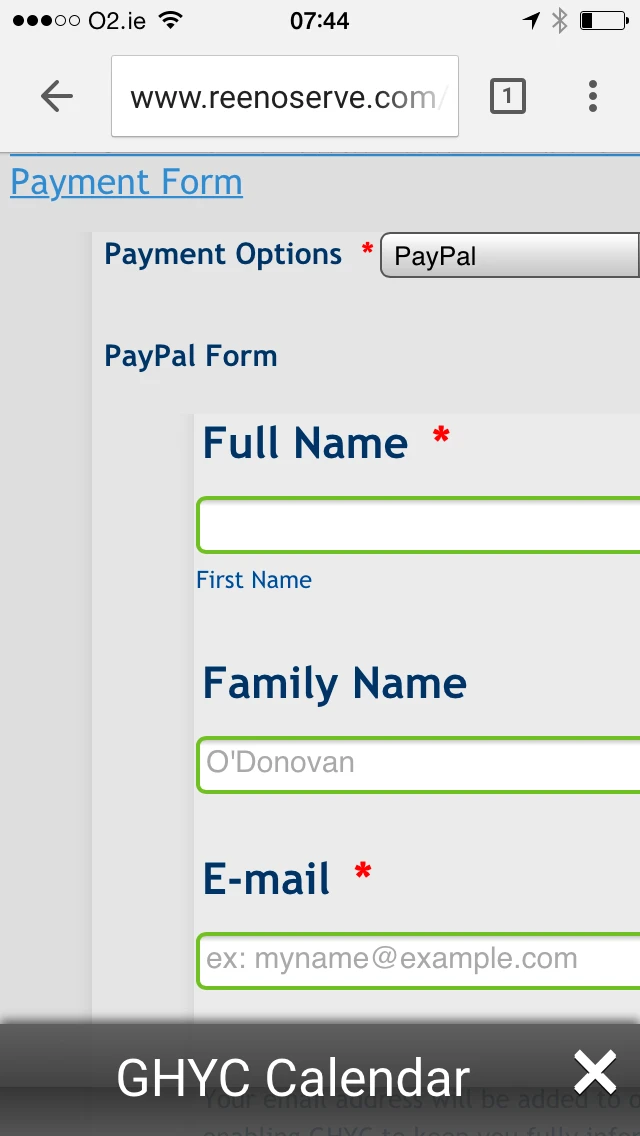
The following images show the issue on both iPad and IPhone, there are two images for both the iPad and Iphone,
1 shows the current Live page with the existing JotForm
1 shows the the test page with the failing Responsive dispaly
-
BenReplied on April 16, 2015 at 9:40 AM
Thank you for the screenshots John.
I see the issue and we will need to change the CSS code a bit from what it was before:
form.jotform-form {
padding: 0 !important;
}
div.form-all {
min-width: 100%;
width: 100%;
}As you can see the first part of the code is almost the same, but we need the !important, since the padding got changed once the mobile resizing was active.
The second part is to stretch the embedded form to full width, since also, once in mobile form, it got changed, but with min-width, we do not need the !important.
Please add that code to both embedded (child) forms, again at the end of their custom CSS.
Once you do, also do add the mobile responsive widget to both of them as well.
Basically what happens, is that iframe holding the forms gets resized, while the forms inside of it do not, but once both the widget and the CSS code above is added, it should work properly for you.
Do let us know how it goes.
-
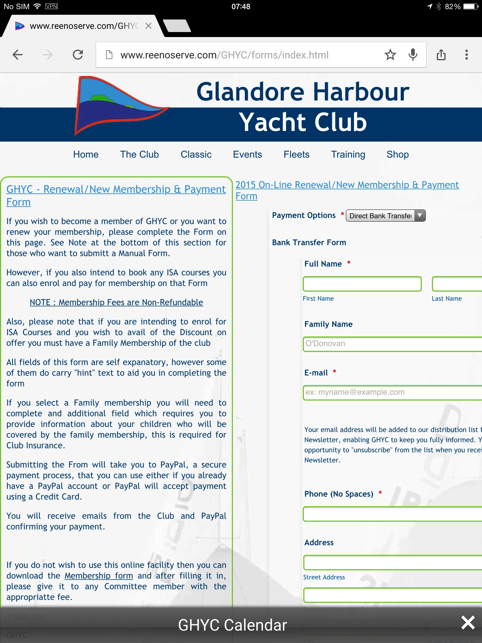
glandoreghycReplied on April 16, 2015 at 10:16 AM
Ben,
Thanks, we seem to have created another issue now, look at the screen shot below.

The initial fields are "Clipped" at the top
Please not this screen shot is from a desk top
Ref the Mobile Responsive Widget this is included in each of the 'Secondary" forms, but does not show when the forms are embedded, however the Primary form does have Mobile Responsive widget included in it,,,,,
-
BenReplied on April 16, 2015 at 11:45 AM
OK, that is caused by this CSS:
form.jotform-form {
padding: 0 !important;
}Lets change it to:
form.jotform-form {
padding-left: 0 !important;
padding-right: 0 !important;
}That way we only set the left and the right side, without the top and bottom padding.
Please do change the code as shown above and it should work (the cut of the field should not be present).
In regards to mobile responsive widget, if it is included in all fields, that is the way it should be left.
Do let us know once you make the change and we will inspect the form again (http://www.reenoserve.com/GHYC/forms/index.html)
-
glandoreghycReplied on April 16, 2015 at 12:41 PM
-
BenReplied on April 16, 2015 at 2:22 PM
It seems that the iframe code is not accepting the values to be re-sized, so it always stays with the original width that was set to it.
For that reason, I will raise this to our developers working on widgets to see if there is anything that can be done so that the forms are displayed in the right manner.
Now while they are looking into that, I would like you to try out this form on your website: http://form.jotformpro.com/form/51055914562959
It is basically a clone of your jotform, but instead of using iframe embed widget, I made the iframe myself using Text field. This allowed me to add a bit of CSS and have it behave more dynamic than it was by using the widget. It would be best however to test it out on your website.
All you should do is change the link (under src attribute) in the current iframe embed code to point to my clone of your jotform and refresh the page on your website to see how it works.
-
BenReplied on April 16, 2015 at 2:34 PM
Just wanted to mention that it does not matter if the CSS code above:
form.jotform-form {
padding : 0;
}is in the form, as long as:
form.jotform-form {
padding: 0 !important;
}
is not in there (if it is, we should remove it) and that the following is:
form.jotform-form {
padding-left: 0 !important;
padding-right: 0 !important;
}You can also remove it from the form if you wish - it would be OK and it would not make any change.
I have also opened a new thread here: http://www.jotform.com/answers/553806 where I will raise this to our team working on widgets so that we can continue to assist you here, while also you get notified once that is resolved on the other thread.
-
glandoreghycReplied on April 17, 2015 at 5:49 AM
Ben,
Tried your cloned form as in
http://form.jotformpro.com/form/51055914562959
and it seemed to work fine.
John
-
KadeJMReplied on April 17, 2015 at 10:55 AM
Thank you for the update about that John and I am happy it's working out for you now.
Additionally, I am sure that Ben will be pleased to know that as well and on his behalf you are very welcome.
If you need any help in the future with anything else just let us know via a new thread.
-
glandoreghycReplied on April 17, 2015 at 11:07 AM
Hello,
There seems to be some kind of misunderstanding....
This issue is NOT resolved. Ben created an experimental form just to test out a theory he had i believe...and that was the form i was testing at his request.
This issue is with your Widget Development team who i believe are trying to determine why the Embed iFrame is not workign correctly in Responsive mode.
John
-
KadeJMReplied on April 17, 2015 at 1:01 PM
My apologies about any misunderstandings and thank you for letting us know about that.
I can indeed confirm that my colleague Ben had opened up a separate thread with a report to our widget team about the Embedded iFrame not working properly. That part will actually be followed up in that thread there.
Anyhow though, I will check in with Ben to see what he knows about it if anything further as well as try to see what else we can do to help get this issue fully resolved for you as soon as possible.
- Templates
- Integrations
- INTEGRATIONS
- See 100+ integrations
- FEATURED INTEGRATIONS
 PayPal
- Slack
- Google Sheets
- Mailchimp
- Zoom
- Dropbox
- Google Calendar
- Hubspot
- Salesforce
- See more Integrations
- Products
- PRODUCTS
- Form Builder
- Jotform Enterprise
- Jotform Apps
- Store Builder
- Jotform Tables
- Jotform Inbox
- Jotform Mobile App
- Jotform Approvals
- Report Builder
- Smart PDF Forms
- PDF Editor
- Jotform Sign
- Jotform for Salesforce Discover Now
- Support


