


-
JKulp42757Asked on April 21, 2015 at 11:51 PM
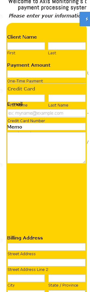
My form looks great on desktop. However on mobile it's a jumbled mess.
The Custom CSS code I'm using is below and attached is what the desktop and mobile views look like.
*****************************************
#id_7 {
position : relative;
top : -30px !important;
}
.form-line.form-line-column.form-col-1.form-line-column-clear {
top : -240px;
}
@media only screen
and (min-device-width : 320px)
and (max-device-width : 480px) {
.form-textbox, .form-textarea {
width: 250px;
}
}
@media only screen
and (min-device-width : 768px)
and (max-device-width : 1024px) {
.form-textbox, .form-textarea {
width: 250px;
}
}
*****************************************
-
CharlieReplied on April 22, 2015 at 5:10 AM
Hi,
I've cloned your form and made some changes in the custom CSS code. Here's mine:
@media screen and (min-width: 580px){
#id_7 {
position : relative;
top : -30px !important;
}
.form-line.form-line-column.form-col-1.form-line-column-clear {
top : -240px;
}
}
@media screen and (min-width: 200px) and (max-width: 570px){
#input_6_donation {
width : 80% !important;
}
}
Here's the direct link of my form: http://form.jotformpro.com/form/51112300000929?. You can clone it and see if it works for you. Here's a guide on how to clone my form: http://www.jotform.com/help/42-How-to-Clone-an-Existing-Form-from-a-URL.
Do let us know if that works.
Kind regards.
-
JKulp42757Replied on April 22, 2015 at 12:26 PM
Thanks for the reply.
I tried the code, and I also cloned your form.
It looks correct via mobile, EXCEPT when you get to the bottom where the submit button should be, it's cut off (like the form box had a set length that was met and so everything below that point is cut off)...I'm not sure why this is....

-
CharlieReplied on April 22, 2015 at 1:44 PM
Hi,
I assume that your form is embedded on a website? Could you share us the link of it so that we can better check, also, you could try embedding the form using the iFrame code and make sure that the height value in the iFrame covers all the fields in the form. Here's a guide on it: http://www.jotform.com/help/148-Getting-the-Form-iFrame-Code.
We'll wait for your response.
-
JKulp42757Replied on April 22, 2015 at 3:05 PM
okay, using the iframe code and changing the height fixed it - thanks!!
-
CharlieReplied on April 22, 2015 at 3:10 PM
You're welcome. I'm glad it worked.
If you needed any assistance again, feel free to open a new thread here in the forum.
Kind regards.
- Templates
- Integrations
- INTEGRATIONS
- See 100+ integrations
- FEATURED INTEGRATIONS
 PayPal
- Slack
- Google Sheets
- Mailchimp
- Zoom
- Dropbox
- Google Calendar
- Hubspot
- Salesforce
- See more Integrations
- Products
- PRODUCTS
- Form Builder
- Jotform Enterprise
- Jotform Apps
- Store Builder
- Jotform Tables
- Jotform Inbox
- Jotform Mobile App
- Jotform Approvals
- Report Builder
- Smart PDF Forms
- PDF Editor
- Jotform Sign
- Jotform for Salesforce Discover Now
- Support

