


-
beskilsonAsked on April 24, 2015 at 1:30 PM
Hi,
1) How can I get the mobile version of my form to fit the screen instead of requiring horizontal scrolling? I am already using the mobile widget.
2) Why are my "Other" boxes being bumped down a line on the desktop version? How can I fix this?
3) How do I get the Submit button to be small and centered instead of stretching horizontally across the whole form?
Thank you,
Brooke
-
Kiran Support Team LeadReplied on April 24, 2015 at 3:51 PM
As I check the form normally with the direct URL on a desktop, it seems to be displayed correctly. However, when embedded on your wix website the width allocated to the JotForm causing the form to display in responsive mode and causing the mentioned issues. I see that you have already enabled Responsive Form from the Form Preferences and Form Designer as mentioned in the guide below :
http://www.jotform.com/help/311-How-to-make-forms-Mobile-Responsive
Since you have also added Mobile responsive widget to the form, it seems to be a conflict with CSS. Could you try removing Mobile Responsive widget on your JotForm to see if that resolves the issue?
Please get back to us if you need any further assistance. We will be happy to help.
Thanks!
-
beskilsonReplied on April 24, 2015 at 4:55 PM
Removing the mobile widget makes the problem much worse, as you can see by visiting the page now. http://www.mothersmatterdoula.com/#!freeconsultation/c11m6 Please advise a different solution.
Thank you,
Brooke
-
Kiran Support Team LeadReplied on April 24, 2015 at 5:51 PM
As I check your webpage on my desktop, it is now displayed correctly. But the height of the html widget seems to be a little small to fit the form.

Could you please try increasing the height of the html widget on your wix webpage a little so that the form fits correctly? As I check your webpage on a mobile emulator, I see that the form is displayed correctly.


Could you provide us with a screenshot of the issue that you are experiencing at your end so that we can further investigate the issue?
Thanks!
-
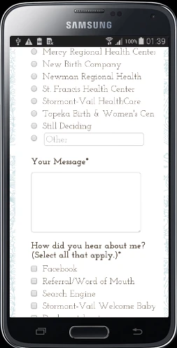
beskilsonReplied on April 24, 2015 at 6:10 PM
The attached screen shot shows the display on my iPhone 5C. It requires horizontal scrolling to view all of the form text. I want the form to fit the screen of the device it's being viewed on with no horizontal scrolling.

-
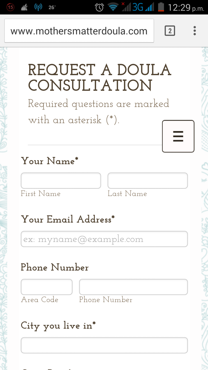
David JotForm Support ManagerReplied on April 24, 2015 at 7:43 PM
For some reason the IOS emulator is not working properly, so I could no make sure this will work, but currently your form looks fine in mobile devices:
Please try the following:
1) Unable the responsiveness at the Designer feature and at Preferences.
2) Add the Mobile Responsive widget at the bottom of your form, and save the form.
Hope that helps, let us know what happens.
-
beskilsonReplied on April 25, 2015 at 11:02 AM
My form does NOT look fine in the screen shot you attached above. You can see that the text is cutting off after the "n" in "Topeka Birth & Women's Center" and after the "y" in "Stormont-Vail Welcome Baby Jubilee." I want the form to respond so that all of the text and text fields fit within the screen WITHOUT having to scroll across. Is that not possible?
Your last suggestion didn't fix the issue. I have tried the form with just the mobile responsive widget, with the widget AND the responsiveness designer feature selected, and with just the responsive designer feature selected (no widget). I have also tried reducing the width of the overall form to 500 px and reducing the width of the input fields. No matter what I do, the form still cuts off text and text boxes requiring horizontal scrolling on both my phone (iPhone 5C) and my husband's phone (iPhone 5S).
-
beskilsonReplied on April 25, 2015 at 11:04 AM
That did not fix the issue. I have tried the form with just the mobile responsive widget, with the widget AND the responsiveness designer feature selected, and with just the responsive designer feature selected (no widget). I have also tried reducing the width of the overall form to 500 px and reducing the width of the input fields. No matter what I do, the form still requires horizontal scrolling on both my phone (iPhone 5C) and my husband's phone (iPhone 5S).
My form does NOT look fine in the screen shot you attached above. You can see that the text is cutting off after the "n" in "Topeka Birth & Women's Center" and after the "y" in "Stormont-Vail Welcome Baby Jubilee." I want the form to respond so that all of the text fits the screen WITHOUT having to scroll across. Is that not possible?
-
beskilsonReplied on April 25, 2015 at 11:12 AM
That did not fix the issue. I have tried the form with just the mobile responsive widget, with the widget AND the responsiveness designer feature selected, and with just the responsive designer feature selected (no widget). I have also tried reducing the width of the overall form to 500 px and reducing the width of the input fields. No matter what I do, the form still requires horizontal scrolling on both my phone (iPhone 5C) and my husband's phone (iPhone 5S).
My form does NOT look fine in the screen shot you attached above. You can see that the text is cutting off after the "n" in "Topeka Birth & Women's Center" and after the "y" in "Stormont-Vail Welcome Baby Jubilee." I want the form to respond so that all of the text fits the screen WITHOUT having to scroll across. Is that not possible?
-
beskilsonReplied on April 25, 2015 at 11:13 AM
That did not fix the issue. I have tried the form with just the mobile responsive widget, with the widget AND the responsiveness designer feature selected, and with just the responsive designer feature selected (no widget). I have also tried reducing the width of the overall form to 500 px and reducing the width of the input fields. No matter what I do, the form still requires horizontal scrolling on both my phone (iPhone 5C) and my husband's phone (iPhone 5S).
My form does NOT look fine in the screen shot you attached above. You can see that the text is cutting off after the "n" in "Topeka Birth & Women's Center" and after the "y" in "Stormont-Vail Welcome Baby Jubilee." I want the form to respond so that all of the text fits the screen WITHOUT having to scroll across. Is that not possible?
-
raulReplied on April 25, 2015 at 2:35 PM
It seems that this issue is only happening on iPhones since the form looks correctly on my phone (Android).
Could you try adding the code suggested here: http://stackoverflow.com/questions/23083462/how-to-get-an-iframe-to-be-responsive-in-ios-safari#23083463 to the CSS code of your site to see if the issue is fixed by adding it?
Let us know if this helps.
-
beskilsonReplied on April 27, 2015 at 10:11 PM
Can you please be more specific? Exactly what code should I insert? The article you linked to is too technical for me and contains a lot of code.
-
Kiran Support Team LeadReplied on April 28, 2015 at 12:43 AM
It's okay. The code that Raul is referring to the one mentioned in the first answer in the thread. I've made some modifications to the code as below. Please try adding the following code to your JotForm and see how it works.
@media screen and (max-device-width: 480px){
padding: 10px;
min-width: 100%;
*width: 100%;
}
Thank you!
-
beskilsonReplied on April 28, 2015 at 10:58 AM
Adding that code to my CSS seems to have had no affect. The form still requires horizontal scrolling on iPhones.
-
Kiran Support Team LeadReplied on April 28, 2015 at 1:24 PM
It seems that I am having some issue with the iphone simulator. Let me check the site through the simulator to see what best we can do for you in this regard. We'll get back to you once we find something helpful to you.
Thank you for your patience.
-
beskilsonReplied on April 28, 2015 at 9:40 PM
Thank you. This issue is the only thing holding up the launch of my website, so I would really like to get it resolved. I have too many potential customers who use iPhones to move forward with a form that doesn't display well on this type of device.
-
Kiran Support Team LeadReplied on April 29, 2015 at 9:47 AM
As I check the JotForm with direct link and the website on a simulator, it seems to be working fine at my end. Please see the screenshots below L
Direct URL :
This one seems to be a perfect fit on the screen.

The form embedded webpage :
This one has a slight excess margin approx 2mm due to the frame of html widget from wix.

The responsiveness from the JotForm end is working fine as we check the direct URL. When embedded on the Wix website, it is how Wix is processing the embedded object. We would also request you to check with Wix on this regard.
Thanks!
- Templates
- Integrations
- INTEGRATIONS
- See 100+ integrations
- FEATURED INTEGRATIONS
 PayPal
- Slack
- Google Sheets
- Mailchimp
- Zoom
- Dropbox
- Google Calendar
- Hubspot
- Salesforce
- See more Integrations
- Products
- PRODUCTS
- Form Builder
- Jotform Enterprise
- Jotform Apps
- Store Builder
- Jotform Tables
- Jotform Inbox
- Jotform Mobile App
- Jotform Approvals
- Report Builder
- Smart PDF Forms
- PDF Editor
- Jotform Sign
- Jotform for Salesforce Discover Now
- Support


