


-
adrianmwAsked on April 29, 2015 at 10:32 AM
Hi, I have a form that I have embedded onto my Wordpress.org website. The website is responsive itself so it automatically resizes well on mobile devices. I have my form also responsive and resizing and it looks great on a desktop (i've dragged my browser size around and it still looks good) but bad on my iPhone. What can I do to fix this problem. I've tried some of the CSS recommended on this forum in the past but nothing seems to work.
The url is http://www.amwsitedesigns.com/request-a-quote/

-
KadeJMReplied on April 29, 2015 at 12:53 PM
I see that you are having issues with making your jotform display properly on your iPhone.
I have checked this on my iPhone and do see that there are two problems that are associated with this issue. The first being the fields don't display correctly. And the second is that your form is shifted slightly to the right going off the page.
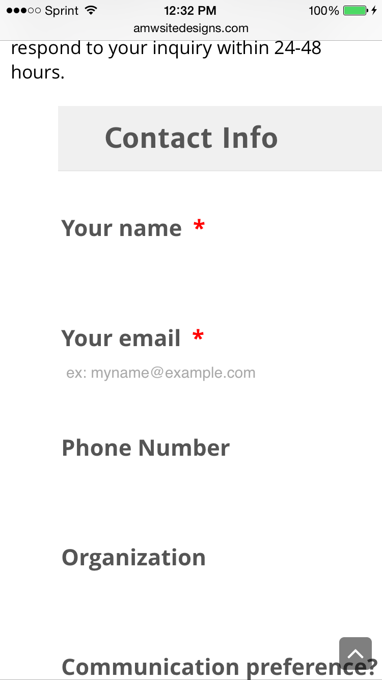
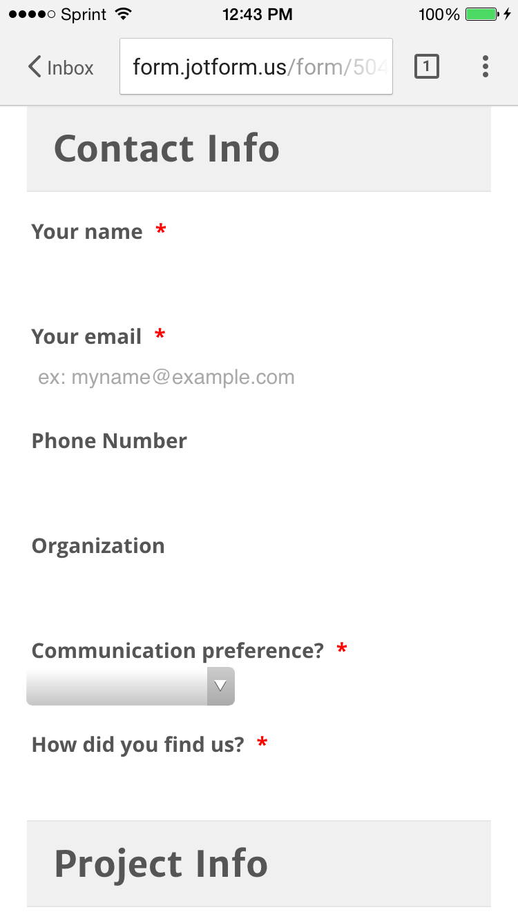
Now when I checked this for the responsiveness setting I found that you do have that option enabled which is good. I also checked and compared it with the standalone link of just your jotform and found that the form appears fine on mobile so I think your site is what is offsetting it to the right slightly. But as for the fields they still did not display properly.
Please allow us some time to investigate this further to see if we can find a solution to help resolve this problem that you are having and we will get back to you about this as soon as possible.
-
adrianmwReplied on May 5, 2015 at 1:35 PM
Hello, any fix found for this issue yet?
-
pacitReplied on May 5, 2015 at 1:47 PM
Noticed your form is displaying incorrectly in Chrome. All the drop-down boxes seem to have part of the text cut-off as well. Another bug?

-
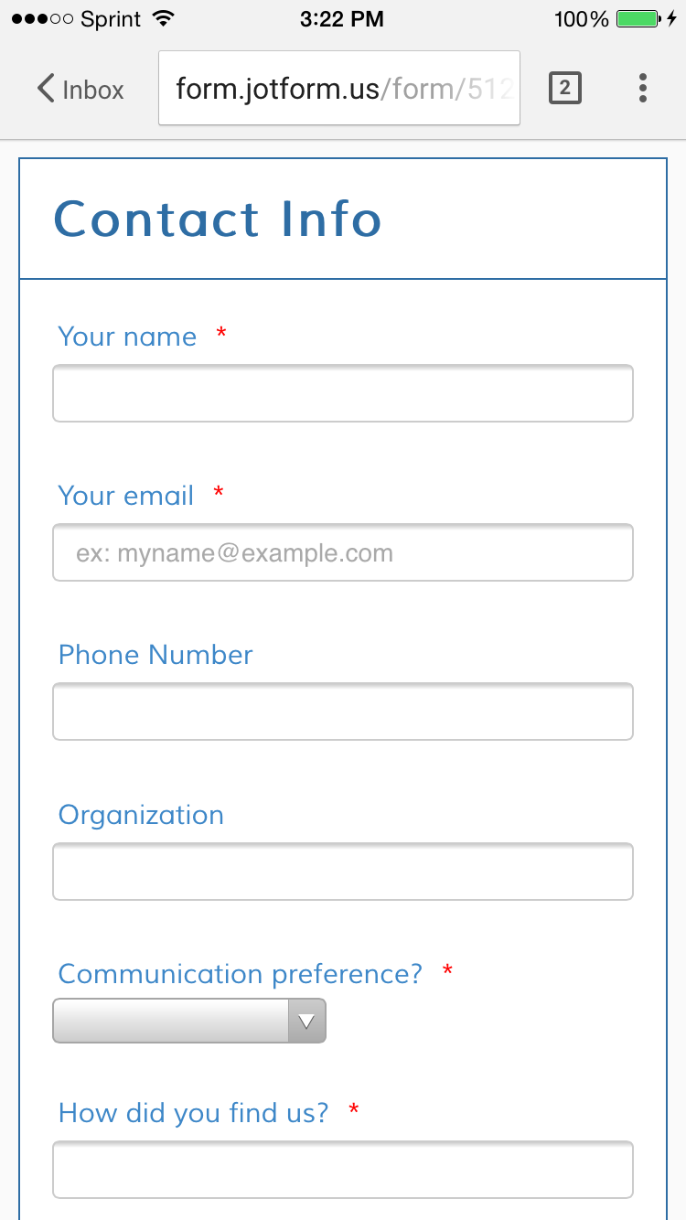
KadeJMReplied on May 5, 2015 at 3:36 PM
My apologies for not getting back to you sooner about this issue. Anyhow, Looking into this some more I found that your form needs to be shifted slightly to the left for starters.
Your Website:
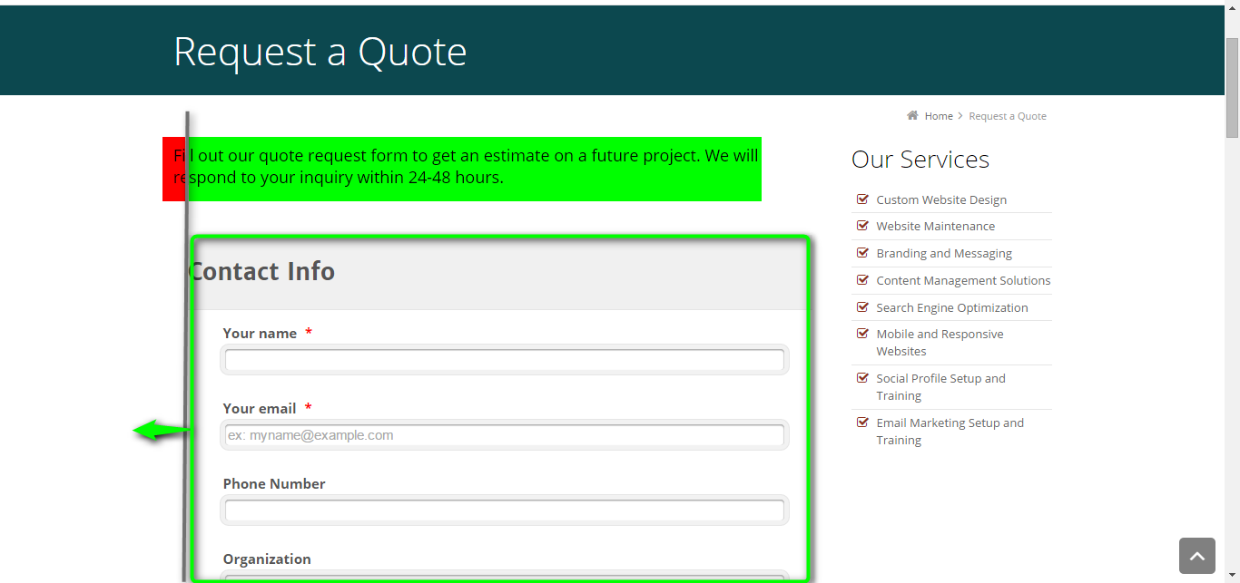
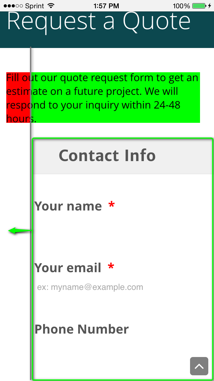
As you can see it also carries over to the shifting on your Mobile Site as well. See below.
As for the inputs that are not appearing correctly that is because of the theme that is currently applied to your jotform. The only way to get around that problem is to either remove it or apply a different theme.
You currently have the "Sleek Theme" applied which unfortunately is not displaying correctly on Mobile. If you look at this test I had switched it to below of a different theme you'll notice that it is working.
Test Before - Sleek Theme:

Test After - Different Theme:
From what I can see I believe there is something with the css coloring for the theme's css that is causing the inputs to go missing so I will need more time to try to fix that if you are looking to keep that theme.
In regards to the original inputs that pacit had mentioned about your fields not displaying appropriately for their positioning that was because of the applied css in that theme.
- Templates
- Integrations
- INTEGRATIONS
- See 100+ integrations
- FEATURED INTEGRATIONS
 PayPal
- Slack
- Google Sheets
- Mailchimp
- Zoom
- Dropbox
- Google Calendar
- Hubspot
- Salesforce
- See more Integrations
- Products
- PRODUCTS
- Form Builder
- Jotform Enterprise
- Jotform Apps
- Store Builder
- Jotform Tables
- Jotform Inbox
- Jotform Mobile App
- Jotform Approvals
- Report Builder
- Smart PDF Forms
- PDF Editor
- Jotform Sign
- Jotform for Salesforce Discover Now
- Support


