


-
fhpwAsked on April 30, 2015 at 11:58 PM
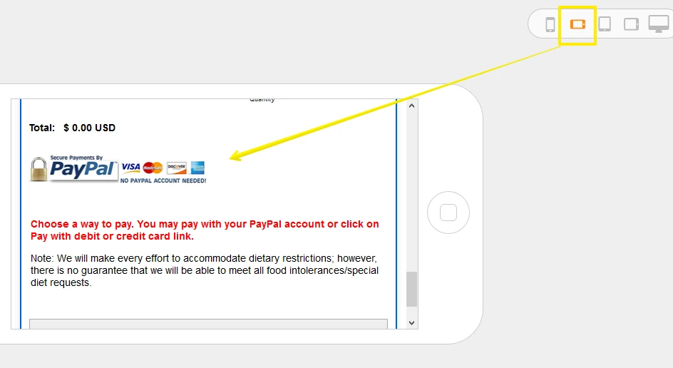
When viewing my form in portrait mode on my mobile device the image is stretched. Is there a way to avoid the some images filling the media screen, while allow other images to respond?
The image show is too large.
Thanks,
Form Link: https://secure.jotformpro.com/form/51174046122949

-
SammyReplied on May 1, 2015 at 9:46 AM
Hi,
You can try limiting the width of the image you don't want expanded by applying specific widths to them.
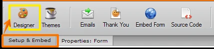
Goto Setup & embed -> designer
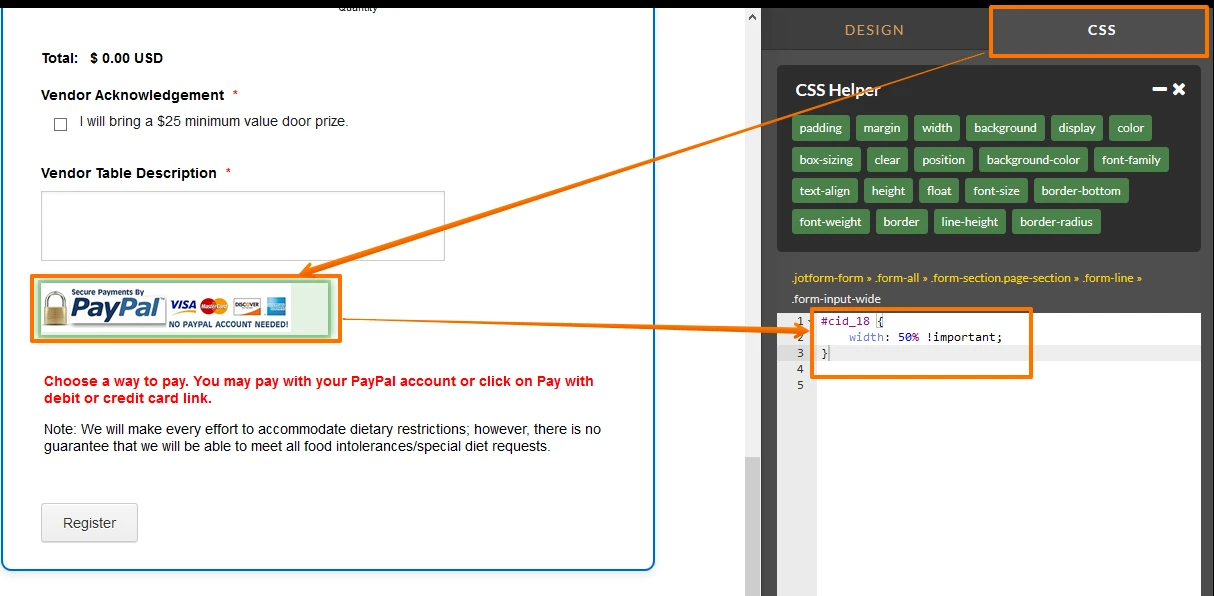
Goto the CSS tab, click on the image wizard whose size you want to limit, when you click the element a CSS class will be added automatically, add a width property of 50% i.e width: 50% !important;
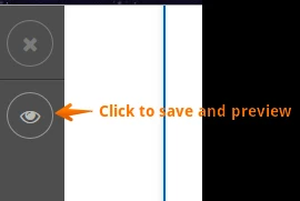
Save and test the preview
-
fhpwReplied on May 1, 2015 at 2:15 PM
Hi Sammy,
It worked but changed the ratio. Also, it changed the top banner, which I do want stretched.
I will just leave it as is.
Thanks,
-
Mike_G JotForm SupportReplied on May 1, 2015 at 4:06 PM
In addition to what Sammy had suggested, you can also try to add this codes inside the #cid_18{}.
display: block; max-width:230px; max-height:95px; width: auto; height: auto;
You may, of course, set the max-width and max-height to your own preference.
Let us know if this doesn't help still or if you just want to stick with how it looks right now and leave it as it is just like you have said above.
- Templates
- Integrations
- INTEGRATIONS
- See 100+ integrations
- FEATURED INTEGRATIONS
 PayPal
- Slack
- Google Sheets
- Mailchimp
- Zoom
- Dropbox
- Google Calendar
- Hubspot
- Salesforce
- See more Integrations
- Products
- PRODUCTS
- Form Builder
- Jotform Enterprise
- Jotform Apps
- Store Builder
- Jotform Tables
- Jotform Inbox
- Jotform Mobile App
- Jotform Approvals
- Report Builder
- Smart PDF Forms
- PDF Editor
- Jotform Sign
- Jotform for Salesforce Discover Now
- Support

