


-
aprpacAsked on May 7, 2015 at 6:25 AM
Hi,
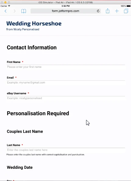
My custom page background image scales massively when form viewed on iPad. Works fine on a desktop browser.
How can I resolve this please?
Thanks
Paul
-
Welvin Support Team LeadReplied on May 7, 2015 at 10:11 AM
Hi Paul,
I am checking this now and we'll get back to you later.
Thanks
-
Welvin Support Team LeadReplied on May 7, 2015 at 11:06 AM
Please try injecting the following custom CSS codes:
@media only screen and (min-device-width : 768px) and (max-device-width : 1024px) {
.supernova {
height: 100%;
background-repeat: no-repeat;
background-attachment: fixed !important;
background-position: center !important;
background-size: cover !important;
}
}
Here's how you can do it: http://www.jotform.com/help/117-How-to-Inject-Custom-CSS-Codes. Add these codes at the very bottom.
I hope it helps.
Thanks
-
aprpacReplied on May 7, 2015 at 12:26 PM
Hi Welvin,
Thanks, I have injected this CSS code at the bottom as per your instructions, but it does not seem to have made any difference on the iPad screen.
Please let me know what to try next.
Thanks
Paul
-
Welvin Support Team LeadReplied on May 7, 2015 at 1:33 PM
I'm sorry, Paul. Will check this further and let you know here.
Thanks
-
aprpacReplied on May 11, 2015 at 4:59 AM
Hi,
Please can you let me have an update on this problem.
Thanks
Paul
-
SammyReplied on May 11, 2015 at 9:49 AM
In the above CSS provided by Welvin try changing the background size property to this
background-size: 1500px,contain;
tweak the pixel size until you get a satisfactory size
-
aprpacReplied on May 12, 2015 at 3:52 AM
Hi,
Thanks for this, I have tried this with various values (1000px to 5000px) and I can see the size of the image changing. It needs to be 5000px to cover the whole form and as such is still very zoomed in.
When I look at the same form on my desktop browser (Safari) the background image fills the window and then remains static whilst the form scrolls over the top of this static image. This is what I would like on the iPad screen, however the image is not static and scrolls with the form on the iPad.
How do I fix this so that the image works in the same way on the iPad as on the desktop?
Thanks
Paul
-
JanReplied on May 12, 2015 at 10:16 AM
It seems that this is a known issue for iOS devices with Safari.
Can you try uploading a 1024px by 768px image. You can use that image as a background that will only appear in iPad devices. Using welvin's code above, you will add background-image and background-size cover for webkit.
@media only screen and (min-device-width : 768px) and (max-device-width : 1024px) {
.supernova {
height: 100%;
background-image: url("urloftheimage");
background-repeat: no-repeat;
background-attachment: fixed;
background-position: center;
background-size: cover;
-webkit-background-size: cover;
-moz-background-size: cover;
-o-background-size: cover;
}
}
Hope this works. Thank you.
-
aprpacReplied on May 14, 2015 at 5:40 AM
Thanks for your suggestion,but this does not work either!
Also this type of workaround would mean significant extra effort for every form I create.
I get the same problem using Chrome on iOS so it is not Safari itself, it presumably must be iOS.
If this is a bug in iOS then surely the right thing to do is get that bug fixed by Apple?
You must have many, many customers using background images with this problem. Have you already raised this as bug with Apple?
Paul
-
SammyReplied on May 14, 2015 at 7:52 AM
I have tested the image scaling issue on android tablets and the zooming effect also shows up.
The problem is that the CSS tries to scale the image to fit the view-port of the device since the image resolution is lower than the view-port resulting in excessive zooming of the image i order to cover the whole screen.
I recommend replacing your background image with a higher resolution one preferable dimensions greater or equal to 2227x1704 this will ensure the image does not appear excessively zoomed on small screen devices.
I have used this sample image http://www.aisleoflove.co.uk/wp-content/uploads/2014/02/039_3888x2592_all-free-download.com_18102988.jpg
Please test and revert back with your findings.
-
aprpacReplied on May 15, 2015 at 8:26 AM
Thanks but this is not a satisfactory solution - form will take too long to load and it still looks rubbish!
I think you are wrong, latest Chrome (42.0.233.111) on Android (5.1.1) works in the correct way (as desktop browser).
As I said in my last message - there is a bug somewhere that needs fixing - is it JotForm or Apple who need to resolve this?
If it is Apple please confirm that you have raised the issue with them.
Thanks
Paul
-
CarinaReplied on May 15, 2015 at 12:01 PM
I made some tests with some css code and the clone is not displaying the background on iPad:
I will investigate further and will let you know more later.
Let us know if we can assist you further.
-
CarinaReplied on May 17, 2015 at 7:50 PM
Hello Paul
I'm sorry for only getting back to you now, but this took me more time than I thought.
Unfortunately this is one of the well known browser compatibility issues, that webdesigners need to go around when designing for the web.
Lately there has been an effort to uniformize the browsers, unfortunately for users and designers there is still some way to be done. It is important to understand that browsers, as other types of software, compete with each other.
Please try adding this css code:
@media only screen and (min-device-width : 768px) and (max-device-width : 1024px) {html {
background: url('http://www.jotform.com/uploads/Carina/42534339774967/307514523798644316/wedding.jpg') no-repeat top center fixed;
background-size: cover;
height: 100%;
overflow: hidden;
}
body {
height:100%;
overflow: scroll;
-webkit-overflow-scrolling: touch;
}}


http://form.jotformpro.com/form/51367539613965?
Let us know if further support is needed.
-
aprpacReplied on May 18, 2015 at 8:51 AM
Hi,
Thank you for finding a resolution to this problem. This works just as expected.
Kind regards
Paul
-
CarinaReplied on May 18, 2015 at 9:25 AM
Hi Paul
You are most welcome. I'm glad it is fixed.
If you need further assistance please let us know as we're here to help.
-
MikeReplied on June 13, 2016 at 11:26 AM
- Templates
- Integrations
- INTEGRATIONS
- See 100+ integrations
- FEATURED INTEGRATIONS
 PayPal
- Slack
- Google Sheets
- Mailchimp
- Zoom
- Dropbox
- Google Calendar
- Hubspot
- Salesforce
- See more Integrations
- Products
- PRODUCTS
- Form Builder
- Jotform Enterprise
- Jotform Apps
- Store Builder
- Jotform Tables
- Jotform Inbox
- Jotform Mobile App
- Jotform Approvals
- Report Builder
- Smart PDF Forms
- PDF Editor
- Jotform Sign
- Jotform for Salesforce Discover Now
- Support


