


-
HAPENAsked on May 13, 2015 at 11:26 AM
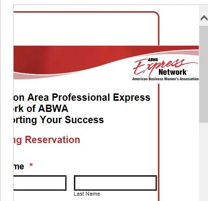
My form is working great. However, in mobile phone portrait view the banner extends beyond the border. I applied the mobile widget and unsuccessfully injected the CSS code for sizing. Looking to Jot Team for assistance.
Link: https://secure.jotformpro.com/HAPEN/Reservation
Thanks,
-
KadeJMReplied on May 13, 2015 at 12:17 PM
I see that you are having issues getting your jotform to display your logo properly.
When I inspected this problem I found a couple of issues so I have modified them via a separate test version of your form to help aid you with a potential solution to your problem.
Please check this modified demo of your form: http://form.jotform.us/form/51324545703147?
Feel free to clone the above demo form back into your account if you are happy with it.
Here's how it looks in a screenshot on my iPhone (fixed):
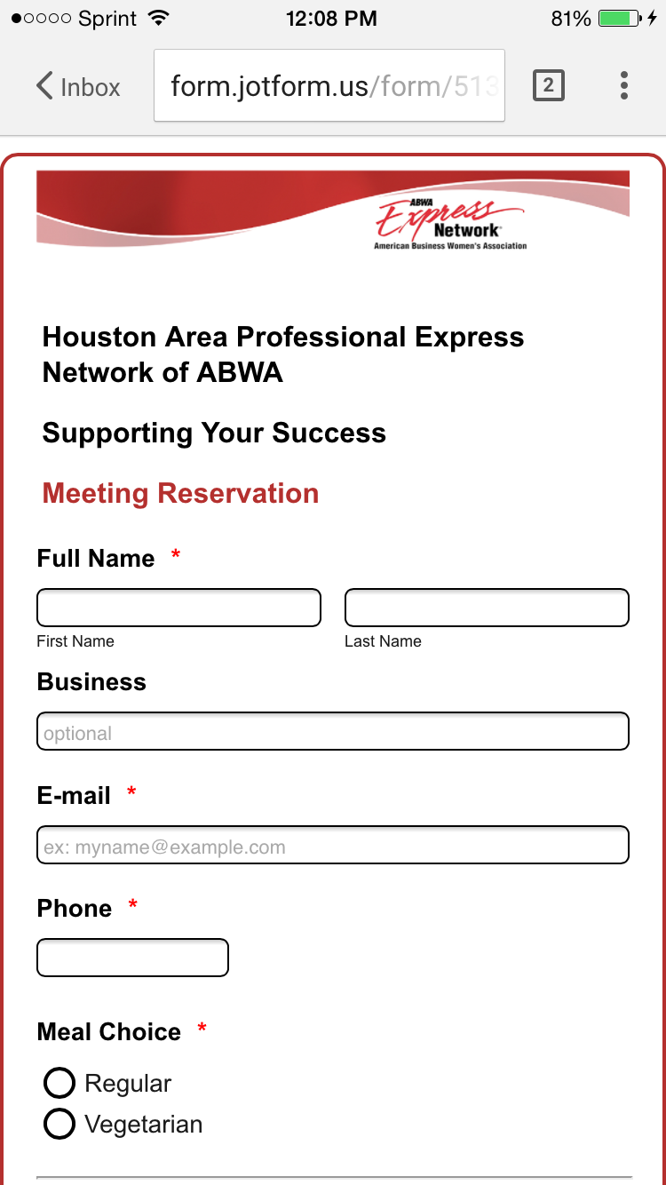
Additionally, in case you are wondering how I fixed it basically what I did was moved your Logo from the Text Field which was html into our Image Field.
I then set the width of your logo in the Image Field to 600px and changed the alignment to Left.
I also removed the mobile responsive widget since your form responsiveness is already enabled and you can only use one or the other and not both.
I hope this helps but if you need more help with any of this just let us know.
- Templates
- Integrations
- INTEGRATIONS
- See 100+ integrations
- FEATURED INTEGRATIONS
 PayPal
- Slack
- Google Sheets
- Mailchimp
- Zoom
- Dropbox
- Google Calendar
- Hubspot
- Salesforce
- See more Integrations
- Products
- PRODUCTS
- Form Builder
- Jotform Enterprise
- Jotform Apps
- Store Builder
- Jotform Tables
- Jotform Inbox
- Jotform Mobile App
- Jotform Approvals
- Report Builder
- Smart PDF Forms
- PDF Editor
- Jotform Sign
- Jotform for Salesforce Discover Now
- Support
