


-
DNZ77Asked on May 14, 2015 at 10:16 AM
Hello,
no matter what different way to put it on my site, embed, iframe, lightbox and so on, no mobile it looks different from pc. All fields change the width and also tha date fields take 3 rows instead of one.
Cna you help me please?
Site: www.lillyshome.it/contatti.html
Thank You very much
-
CharlieReplied on May 14, 2015 at 12:19 PM
Hi,
You might need to remove the "Mobile responsive" widget found in your form.

When you make your form mobile responsive, the form layout, including the field width, height and other elements of it will adjust depending on where it is being displayed. I see that your website looks the same even in mobile, so I'm guessing you would like it to be in desktop version instead?
Please do let us know if removing the mobile responsive widget gives you a better result.
Thank you.
-
DNZ77Replied on May 14, 2015 at 12:52 PM
Thanks for your answer.
I added that widget because of the behaviour of the form on mobile, just to see if something would have changed, but the issue persisted.
Now i've removed it again to let you see, but as you can see, the issue is still present.
I've tried changing the "make responsive something" attribute in the designer mode too, but nothing changed.
-
CharlieReplied on May 14, 2015 at 1:50 PM
Could you try the following.
1. Remove all the mobile responsive options, in this case I believe you have already removed the widget and disabled the responsive option in the Form Designer Tool.
2. Instead of using the default embed code, could you try using the iFrame embed code instead. Here's a guide on how to get it: http://www.jotform.com/help/148-Getting-the-Form-iFrame-Code.
If that doesn't work, we can try a custom CSS code to declare fixed widths in your form, that should prevent the layout and the fields from adjusting.
-
DNZ77Replied on May 14, 2015 at 2:34 PM
Thanks Charlie,
unfortunately i already tried to remove all the responsive options. I've also tried with iframe and lightbox, but it doesn't worked.
I've also tried setting fixed width (instead of the 100% as default) in the iframe code, but nothing.
-
CharlieReplied on May 14, 2015 at 3:28 PM
Can you check my cloned form here: http://form.jotformpro.com/form/51335849451964. You can clone it using this guide: https://www.jotform.com/help/42-How-to-Clone-an-Existing-Form-from-a-URL.
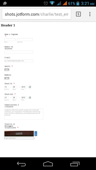
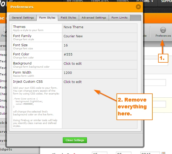
Try embedding using the iFrame, see if my cloned form displays it properly. Here's my test website: https://shots.jotform.com/charlie/test_embed_desktop.html. And this is how it looks in my mobile device. I was able to replicate the problem at first, but was managed to fixed it.
What I did is I removed all the CSS code found under the Preferences settings.
Do let us know if this works.
Thank you.
-
DNZ77Replied on May 14, 2015 at 3:35 PM
Done!!
I've just removed all the CSS code as you said, and now it works as it should!
Thank You very much!
PS. It works as iFrame, as simple html embedded code and as lightbox.
-
CharlieReplied on May 14, 2015 at 3:41 PM
Great! I'm glad that it worked, and you're most welcome.
If you needed any assistance again, please do not hesitate to open a new thread here in the forum, we'll be more than happy to help.
Thank you.
- Templates
- Integrations
- INTEGRATIONS
- See 100+ integrations
- FEATURED INTEGRATIONS
 PayPal
- Slack
- Google Sheets
- Mailchimp
- Zoom
- Dropbox
- Google Calendar
- Hubspot
- Salesforce
- See more Integrations
- Products
- PRODUCTS
- Form Builder
- Jotform Enterprise
- Jotform Apps
- Store Builder
- Jotform Tables
- Jotform Inbox
- Jotform Mobile App
- Jotform Approvals
- Report Builder
- Smart PDF Forms
- PDF Editor
- Jotform Sign
- Jotform for Salesforce Discover Now
- Support

