


-
natecraneAsked on June 16, 2015 at 3:48 PM
When I preview the form I am editing, they do not match each other. The online form's formatting is incorrect. Whereas the form edited is correct. This is the 2nd major issue I have had using JotForm and has officially put my registration behind schedule.
Also, the "view form" button is not working.
I am very disappointed with my choice and purchase of this program.
-
raulReplied on June 16, 2015 at 4:32 PM
We apologize for this inconvenience.
Please try to use the "Nova Theme" and change the font and secondary color to black.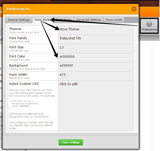
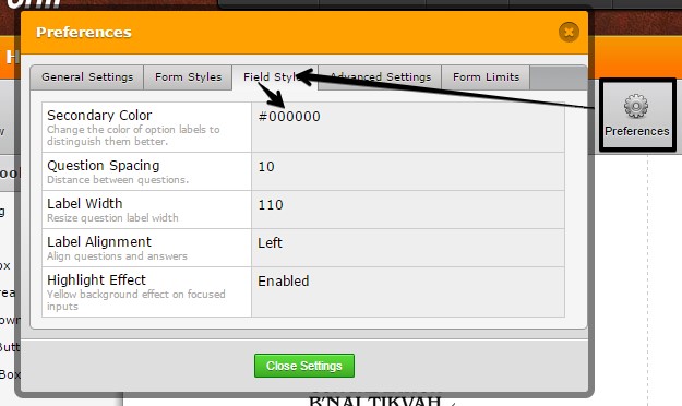
This should make your form looks the same way as in the form builder.
Please let us know if you need further assistance.
-
natecraneReplied on June 16, 2015 at 4:41 PM
The issue is not the color of the text. The issue is the formatting of the boxes under student 2, which does not match the formatting in the editing mode.
Also, the view form button does not work -
natecraneReplied on June 16, 2015 at 4:43 PM
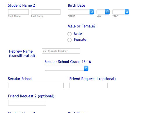
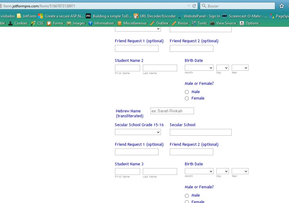
When you look at my form, you'll see "student 1" section and "Student 3" section are formatted correctly. "Student 2" section is not formatted correctly, even though it is correct in the editing form.
-
raulReplied on June 16, 2015 at 4:48 PM
Thank you for providing the additional information.
I was able to see what you mean.
You can fix this my right-clicking the "Birth Date" field under the Student Name 2 and click on the "move to a new line" option.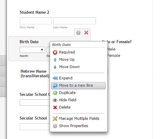
This will move the field to a new line and will make it look the way it does in the form builder.
I forgot to share with you this guide: https://www.jotform.com/help/328-How-to-Position-Fields-in-JotForm that I think would be helpful.
Also, I'm not sure if you're referring to the preview button when you say "Also, the view form button does not work". Are you not being able to see the preview window? Or you're referring to something else?
-
natecraneReplied on June 16, 2015 at 5:14 PM
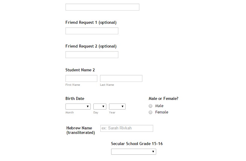
I tried as you suggested and that did not fix the problem. I have provided screenshots below so you can see two things; the formatting of student 1, 2 and 3 are exactly the same on the formatting page and the way it is displayed on the visible form is incorrect. Moving the birth date do a new line actually does nothing for my problem. My issue is that on the form Secular School grades 15-16 and Secular School should be on the same line and they are not. For some reason under student 2 it is forcing them on two different lines and this issue is not occurring for student 1 and student 3. Please advise.


-
raulReplied on June 16, 2015 at 5:39 PM
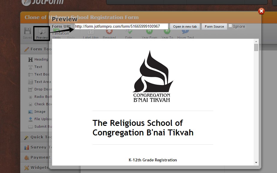
Can you please check this form: http://form.jotformpro.com/form/51665999100967 and let us know if this is how you want your form to look like? Basically, I've moved the fields for student 2 to make them look the same way as the others.
Please let us know if this is the way you want to position the fields in your form and we'll help you to do it or you can also clone the provided form to your account if you want to.
-
natecraneReplied on June 16, 2015 at 5:46 PM
This is NOT what I want it to look like. You put all of the information that I don't want on separate lines on separate lines. I want my original STUDENT 1 and STUDENT 3 format exactly how I had it. I NEED student 2 to MATCH student 1 and student 3. For some reason, regardless of Student 2 being exactly the same back end formatting as student 1 and student 3, it is breaking up secular schools grade 15-16 and secular school onto two separate lines (which is exactly what I DONT WANT and neither Student 1 or Student 3 are that way). I want student 2 to look exactly like THIS:

-
raulReplied on June 16, 2015 at 7:26 PM
Ok, I've started over and created this form: http://form.jotformpro.com/form/51667873138971 can you check it out and let us know if this looks ok?
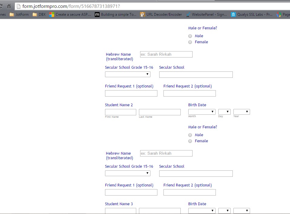
I've increased the form's width to 525px since it looked different in Chrome and Firefox. So, we were looking it differently. After, I made the change they look the same on both browsers as you can see on the pictures above.
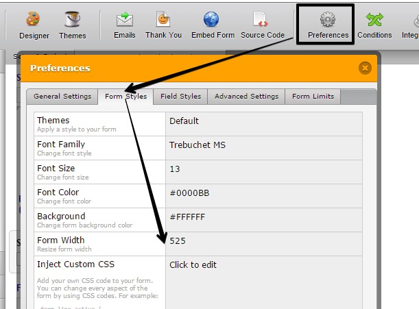
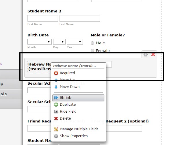
If this is how you want your form to look like you would need to change the form's width as mentioned above and shrink (right-click -> shrink) the "Hebrew Name (transliterated)" field.
-
natecraneReplied on June 16, 2015 at 7:57 PM
I followed your directions exactly and it did not fix the issue...It looks worse. The pictures you took were perfect and what I want it to look like. Here is what it looks like after i changed the width and shrunk the hebrew name transliteration box. I even tried it in Safari and it still looks incorrect. As you can see from the picture I took below student 1 is still correct and student 2 is not.

-
Chriistian Jotform SupportReplied on June 16, 2015 at 11:02 PM
Hi natecrane,
I checked your form - http://www.jotform.us/form/51546576736163 in Chrome and it is displayed like this (see screenshot below).

To fix the display of your form, can you try doing the instructions below.

I cloned your form and did the above instructions and the form looks like this (see screenshot below). You can check the cloned form here.

Do let is know if you need further assistance.
Regards.
- Templates
- Integrations
- INTEGRATIONS
- See 100+ integrations
- FEATURED INTEGRATIONS
 PayPal
- Slack
- Google Sheets
- Mailchimp
- Zoom
- Dropbox
- Google Calendar
- Hubspot
- Salesforce
- See more Integrations
- Products
- PRODUCTS
- Form Builder
- Jotform Enterprise
- Jotform Apps
- Store Builder
- Jotform Tables
- Jotform Inbox
- Jotform Mobile App
- Jotform Approvals
- Report Builder
- Smart PDF Forms
- PDF Editor
- Jotform Sign
- Jotform for Salesforce Discover Now
- Support


