


-
emclanekinsethcomAsked on June 17, 2015 at 1:39 PM
The reporting features needs some serious attention. You've been moving on and adding all sorts of features but this important tool got left in the dust... Please UPDATE!!! Below are my suggestions.
Sometimes the "Edit/Move/Delete" box goes hidden and you physically cannot delete the chart or move it or anything. Which is SO frustrating because then I basically have to start from scratch again. The bottom pie chart in my report is like this. Would appreciate if you can delete it.
Pie & Bar Charts
1. Remove extra names and allow to change font size = too distracting and they are set pretty small and don't change
2. If possible get the percentages and numbers ON the pie chart itself - would definitely increase ease of reading
3. Ability to duplicate charts - This way I don't have to resize EVERY pie chart or change the colors on EVERY chart or switch EVERY chart to %
4. In my mind bar charts are pretty much useless because they colors don't changes and its not visually easy to read.
Matrixes
1. Need matrix visuals = splitting it up is not easy to read and alot more work
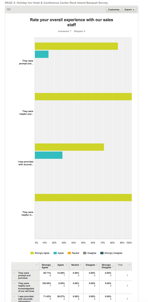
Attached is what survey monkey's look like. MUST easier to read and comprehend.
Headers
1. Need to be able to center, change colors, size, etc.
-
BJoannaReplied on June 17, 2015 at 2:09 PM
Thank you for detail explanation.
I will forward your request to our developers, but we can not give you any time frame when and if this will be implemented.
- Templates
- Integrations
- INTEGRATIONS
- See 100+ integrations
- FEATURED INTEGRATIONS
 PayPal
- Slack
- Google Sheets
- Mailchimp
- Zoom
- Dropbox
- Google Calendar
- Hubspot
- Salesforce
- See more Integrations
- Products
- PRODUCTS
- Form Builder
- Jotform Enterprise
- Jotform Apps
- Store Builder
- Jotform Tables
- Jotform Inbox
- Jotform Mobile App
- Jotform Approvals
- Report Builder
- Smart PDF Forms
- PDF Editor
- Jotform Sign
- Jotform for Salesforce Discover Now
- Support

