


-
YolantaAsked on July 10, 2015 at 6:13 PM
-
jonathanReplied on July 10, 2015 at 6:14 PM
Answered by Yolanta on July 10, 2015 at 03:53 PM
It has scaled fine but as soon as I selected one of the options under "Who
are you?" the scaling widened again and now is about double the width of my
screen. I am not able to pull the portion of the form that is off screen
... -
jonathanReplied on July 10, 2015 at 6:18 PM
Can you please try adding to your jotform http://www.jotform.ca/form/51804430777255
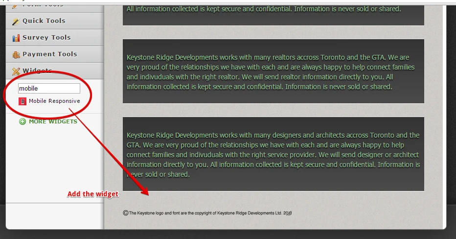
Let us know if this did not make any difference on viewing the form on mobile browsers.
Thanks.
-
YolantaReplied on July 10, 2015 at 7:03 PMI think it is a little better but still not quite right.
... -
Welvin Support Team LeadReplied on July 11, 2015 at 3:32 AM
It looks right here, however, I'm using the mobile emulation in Google Chrome so if you can tell us what's formatting is not responsive, we would be happy to look into that further. A screenshot of the issue is helpful.
Here's how you can add a screenshot to this support forum: http://www.jotform.com/answers/277033.
Thanks
-
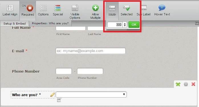
YolantaReplied on July 11, 2015 at 8:08 AMIn the drop down menu "Who are you", when you pick the 8th and 9th choice,
you get a squished column. Also in full screen, there is a lot of extra
space at the top of the form.
... -
BJoannaReplied on July 11, 2015 at 9:48 AM
I have tested you form on my Samsung Galaxy S4 and on iPhone simulator and the reason why text inside of "Who you are" is cut off, it's because of width of the field. You can increase the width of that field inside of Form Builder.
Considering the white space, you can adjust that with changing height of your iFrame code. Height is currently set to 7603px and you should change it to 1700px!important. Can you please try to replace existing code with following code to see if that will resolve your problem.
<iframe id="JotFormIFrame" style="width: 100%; height: 1700px!important; border: none; opacity: 1; visibility: visible;" src="//form.jotform.ca/form/51804430777255" width="300" height="150" frameborder="0" scrolling="no"></iframe>
Hope this will help. Let us know if you need further assistance.
- Templates
- Integrations
- INTEGRATIONS
- See 100+ integrations
- FEATURED INTEGRATIONS
 PayPal
- Slack
- Google Sheets
- Mailchimp
- Zoom
- Dropbox
- Google Calendar
- Hubspot
- Salesforce
- See more Integrations
- Products
- PRODUCTS
- Form Builder
- Jotform Enterprise
- Jotform Apps
- Store Builder
- Jotform Tables
- Jotform Inbox
- Jotform Mobile App
- Jotform Approvals
- Report Builder
- Smart PDF Forms
- PDF Editor
- Jotform Sign
- Jotform for Salesforce Discover Now
- Support


