


-
pbresultsAsked on July 30, 2015 at 12:48 PM
Hi Jotform,
I recently created a responsive form and placed it on my web-page via iframe. It looks great at full desktop size. But when I shrink the view size for testing for mobile devices, the form gets clipped off.
I imagine it is a CSS issue. I made a number of alterations to get the form flush left with my text. I don't like the indents that are always in your default styling. I'm a big fan of 0, 0 (top left) margins.
Also, my website framework is responsive. It is based on the Skeleton Boilerplate. So I am not sure if I still need your media queries, or if I should just leave them out and rely on my framework. I'm new to this responsive stuff.
Can you give me some guidance?

-
Kiran Support Team LeadReplied on July 30, 2015 at 2:34 PM
I see that margins on left and top are reduced to -px which may be causing this issue. It is necessary to have the media queries that are generated by JotForm since the form is using iframe method. The width of the form is automatically sets when the screen size is changed based on these queries. While viewing the form on a mobile device, the margins are further reduced to fit in the screen and the fields are moving further left with the changes in the CSS code.
Please refer to the guide below to make the forms response and make the necessary changes to your form to see if that helps.
http://www.jotform.com/help/311-How-to-make-forms-Mobile-Responsive
You may change the CSS code from the Form Designer so that the preview is live and you can test how it looks like on mobile devices.
Hope this information helps. Please let us know if you need any further assistance. We will be happy to help.
-
RainbowChoraleReplied on August 2, 2015 at 6:47 PM
Dear jotForm,
I did use the form designer and I did make the form responsive as you mentioned. It all works great and it looks good. And yes, at all screen sizes - the responsive features work perfectly) Except I would like to eliminate the space to the left of the form and the space at the top. I need to have my form be flush with the preceding paragraph.
I have studied the extensive CSS file that I viewed under Preferences. However I cannot find the CSS direction for the space I am referring to.
I understand that the space is there in order to accommodate the active form state. However I am fine with the padding on left to be 0 (zero) I'm more concerned with how it looks when not active. ( I hate indents)
As far as the huge amount of space at the top, I am baffled. I don't know why that exists.
So again. To be clear. I simply want my form to be flush left and have no space at the top ( at all screen sizes). Please help. Thanks.
Dave

-
Chriistian Jotform SupportReplied on August 2, 2015 at 9:47 PM
Hi Dave,
If I understand your concern correctly, you want to set the padding-left and padding-top of your form to 0. You can add the custom CSS code below in your form.
.form-line {
padding-left: 0px !important;
}
.jotform-form {
padding-top: 0px !important;
}
After adding the custom CSS code, your form would look like this.
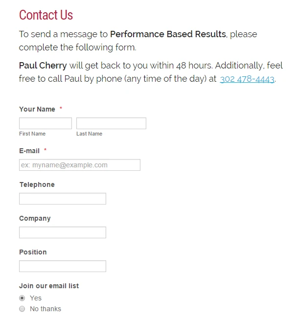
To inject custom CSS code to your form, you can follow the instructions provided in this article: How to Inject Custom CSS Codes.
Do let us know if you need further assistance.
Regards.
- Templates
- Integrations
- INTEGRATIONS
- See 100+ integrations
- FEATURED INTEGRATIONS
 PayPal
- Slack
- Google Sheets
- Mailchimp
- Zoom
- Dropbox
- Google Calendar
- Hubspot
- Salesforce
- See more Integrations
- Products
- PRODUCTS
- Form Builder
- Jotform Enterprise
- Jotform Apps
- Store Builder
- Jotform Tables
- Jotform Inbox
- Jotform Mobile App
- Jotform Approvals
- Report Builder
- Smart PDF Forms
- PDF Editor
- Jotform Sign
- Jotform for Salesforce Discover Now
- Support


