


-
macaulayscottAsked on September 11, 2015 at 12:46 PM
I have switched to an iframe embedded form to enable viewing on mobile phones. Now when the browser window size is reduced, or the form is viewed on mobile phones, other responsive elements on the page cover the form up. Please help! Thanks, James.
-
jonathanReplied on September 11, 2015 at 6:17 PM
When I check your form http://www.jotformpro.com/form/30933049146958 on your website using a mobile device emulator I was also able to see the problem.
I assume you meant this problem

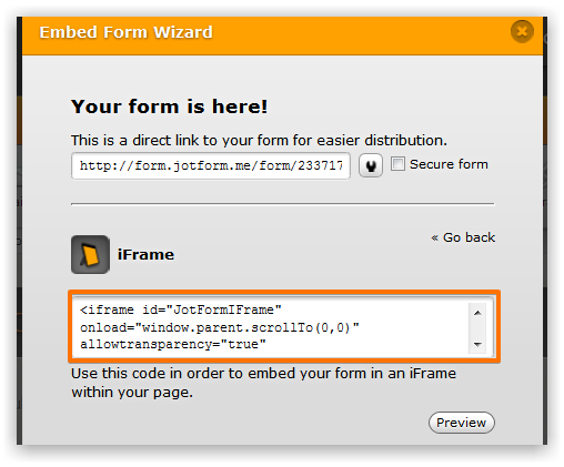
Can you please try re-embedding the form to your website using this iframe code instead
<iframe id="JotFormIFrame" onDISABLEDload="window.parent.scrollTo(0,0)" allowtransparency="true" src="//form.jotformpro.com/form/30933049146958" frameborder="0" style="width:100%; height:1196px; border:none;" scrolling="no"></iframe>
I removed the script part of the default iframe embed code. Let us try to test how it goes when on the website page.
Make sure you clear first also any previous embed code of the form, before adding the iframe code I provided.
Please let us know if this did not make any difference.
-
macaulayscottReplied on September 12, 2015 at 6:17 AM
Thanks Jonathan. You are right about the problem. I have made the suggested change and unfortunately it did not fix the issue.
-
jonathanReplied on September 12, 2015 at 6:40 PM
I apologize for the mistake. Unfortunately, I did not realize that the forum message editor had modified the embed code I provided previously.
As you can see on the message the src URL had become incorrect because it was stripped with the full path -- it was lacking http.
src="//form.jotformpro.com/form/30933049146958"
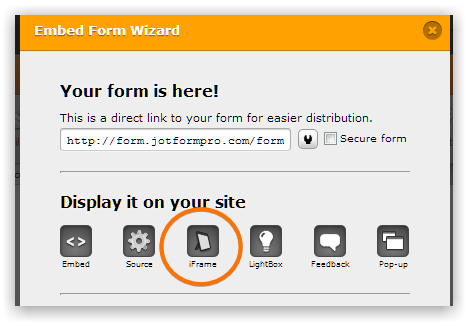
Can you please try it instead using the iframe embed code using your Form Builder.
Re-embed the iframe code using the one from the Form Builder.
user guide: https://www.jotform.com/help/148-Getting-the-Form-iFrame-Code
Please retry this first.
I understand the frustration as it it seems to be just repeating, but getting the fresh embed code do have effect.
Let us know if still did not resolve the issue.
Regards,
-
macaulayscottReplied on September 14, 2015 at 5:08 AM
Hi, I have re-embedded and the issue is not resolved.
-
CharlieReplied on September 14, 2015 at 12:39 PM
Hi,
It seems like there's a problem where the embed code is wrapped.
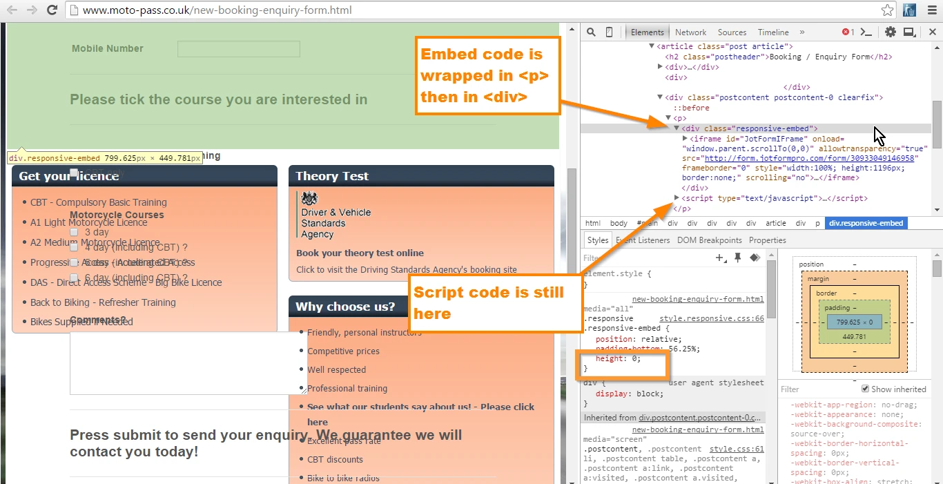
You'll noticed that the embed code is wrapped on a class element "responsive-embed" which has a height of "0". Another is that it is also wrapped in a <p> which is a paragraph tag. I would recommend removing it there and place it on a <div> element instead.
I also noticed the <script> code under the "responsive-embed", I believe it should be under or just on the same level of the iFrame code. But you could try removing it.
See if any of those suggestions would work. I hope that helps.
-
macaulayscottReplied on September 15, 2015 at 5:46 AM
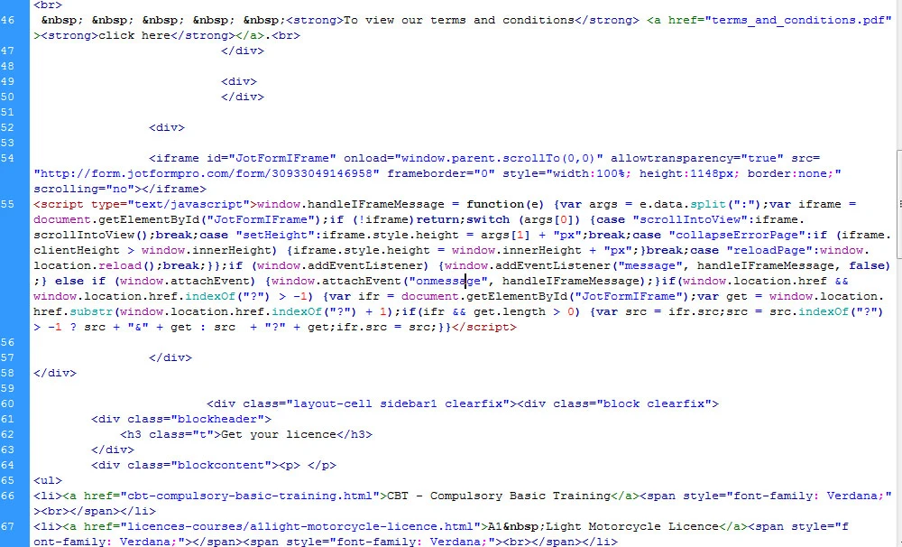
Thanks for your assistance. I have removed the responsive-embed element and the <p> tags with no effect. Regarding the <script> under the iframe I'm not sure how it gets there. it's not on the html page I am editing. I hope the screen shot below helps.
-
CharlieReplied on September 15, 2015 at 9:48 AM
Hi,
I'm checking the website link and the element class "responsive-embed" is still being added when I resized the screen window. It looks like you are using a script or you have a CSS file to make your website mobile responsive, is that correct?

I see that the class "responsive-embed" is found in the style.responsive.css, in the screenshot below you'll see the line and the CSS design for the responsive-embed. The height is set to "0" or none. Try setting it to 1000px, same with the iFrame embed code. See if adjusting that part of your CSS will make the form more responsive.

Let us know if that works.
-
macaulayscottReplied on September 17, 2015 at 10:06 AM
Excellent that's great. Thank you for your help. The form now works with the responsive layout. I changed height as suggested. It seemed the "responsive-embed" "height" needed any figure other than 0. I also had to change the code beneath "responsive-embed iframe" so the position was set to "relative" not "absolute" Thanks again.
-
CharlieReplied on September 17, 2015 at 11:37 AM
You're welcome. Glad to hear that you resolved the problem in your end.
Should you need any assistance again, please do not hesitate to open a new thread here in the forum.
Thank you.
- Templates
- Integrations
- INTEGRATIONS
- See 100+ integrations
- FEATURED INTEGRATIONS
 PayPal
- Slack
- Google Sheets
- Mailchimp
- Zoom
- Dropbox
- Google Calendar
- Hubspot
- Salesforce
- See more Integrations
- Products
- PRODUCTS
- Form Builder
- Jotform Enterprise
- Jotform Apps
- Store Builder
- Jotform Tables
- Jotform Inbox
- Jotform Mobile App
- Jotform Approvals
- Report Builder
- Smart PDF Forms
- PDF Editor
- Jotform Sign
- Jotform for Salesforce Discover Now
- Support


