


-
bhoytsternAsked on September 13, 2015 at 11:31 PM
I've been trying to embed my form on my website but it's not responsive on mobile. I've set it to be responsive on the designer and in the preferences, but it is still not responsive. I am trying to embed it within a modal. The modal seems to be responsive, but the form is not. I've attached a screenshot to show the problem. I've really been struggling with this and I haven't found any other solutions on here that work!
This specific form that I'm working on now is: http://form.jotform.me/form/52528435583461
The forms are on my website: http://www.tailoronten.com/pages/trunk-show-3
The code I am using is:<div class="boxed"><a data-toggle="modal" data-target=".bannerformmodal7">
<h1 style="float: top;">RSVP</h1>
</a>
<div class="modal fade bannerformmodal7" tabindex="-1" role="dialog" aria-labelledby="bannerformmodal7" aria-hidden="true">
<div class="modal-dialog modal-sm">
<div class="modal-content">
<div class="modal-content">
<div class="modal-header"><button type="button" class="close" data-dismiss="modal" aria-hidden="true">×</button>
<iframe id="JotFormIFrame" onDISABLEDload="window.parent.scrollTo(0,0)" allowtransparency="true" src="//form.jotform.me/form/52528435583461" frameborder="0" style="width:100%; height:100%; border:none;" scrolling="no"></iframe>
<script type="text/javascript">window.handleIFrameMessage = function(e) {var args = e.data.split(":");var iframe = document.getElementById("JotFormIFrame");if (!iframe)return;switch (args[0]) {case "scrollIntoView":iframe.scrollIntoView();break;case "setHeight":iframe.style.height = args[1] + "px";break;case "collapseErrorPage":if (iframe.clientHeight > window.innerHeight) {iframe.style.height = window.innerHeight + "px";}break;case "reloadPage":window.location.reload();break;}};if (window.addEventListener) {window.addEventListener("message", handleIFrameMessage, false);} else if (window.attachEvent) {window.attachEvent("onmessage", handleIFrameMessage);}if(window.location.href && window.location.href.indexOf("?") > -1) {var ifr = document.getElementById("JotFormIFrame");var get = window.location.href.substr(window.location.href.indexOf("?") + 1);if(ifr && get.length > 0) {var src = ifr.src;src = src.indexOf("?") > -1 ? src + "&" + get : src + "?" + get;ifr.src = src;}}</script></div>
</div>
</div>
</div>
</div>
</div>
</div>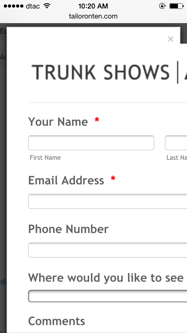
-
BorisReplied on September 14, 2015 at 11:00 AM
I have checked the page you had provided, but it looks like all the forms are embedded with Popup Embed method, as links that open new windows through JavaScript.

Your sample code provided in your post looks like an iFrame embed code, and I can't see such code anywhere on your page at the moment. Could you set up a test webpage where we could help you troubleshoot it, and look into making the embedded form mobile responsive for you if possible?
Your form itself is already made responsive when accessed directly over its link: http://form.jotform.me/form/52528435583461
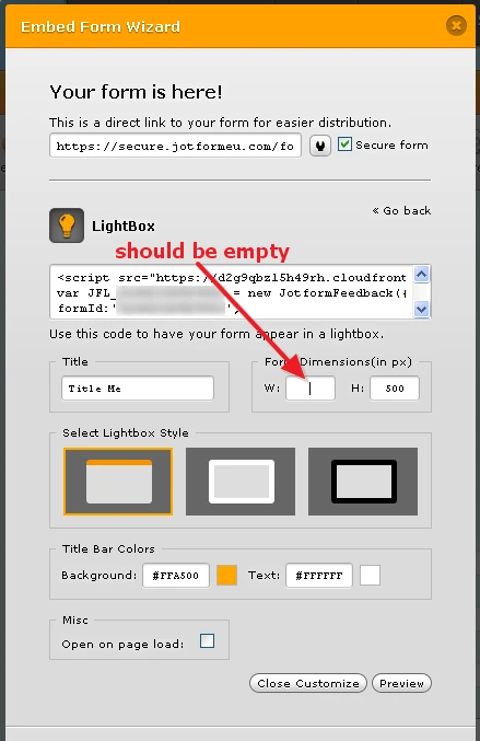
If you wish to make your forms open in a modal window, when your users click on a link, I would recommend trying our Lightbox embed method, and removing any settings from its width:
I hope this helps.
-
webcorateReplied on May 26, 2016 at 7:18 PM
that's old one. It's not working now.
-
Chriistian Jotform SupportReplied on May 26, 2016 at 9:43 PM
This is indeed an old thread, which means the suggestion may now be different for newer forms. I see that you have already posted a thread about the mobile responsiveness of your form. We shall assist you with your concern over that thread. Simply follow this link: https://www.jotform.com/answers/847887
- Templates
- Integrations
- INTEGRATIONS
- See 100+ integrations
- FEATURED INTEGRATIONS
 PayPal
- Slack
- Google Sheets
- Mailchimp
- Zoom
- Dropbox
- Google Calendar
- Hubspot
- Salesforce
- See more Integrations
- Products
- PRODUCTS
- Form Builder
- Jotform Enterprise
- Jotform Apps
- Store Builder
- Jotform Tables
- Jotform Inbox
- Jotform Mobile App
- Jotform Approvals
- Report Builder
- Smart PDF Forms
- PDF Editor
- Jotform Sign
- Jotform for Salesforce Discover Now
- Support

