


-
Martinellis4Asked on September 23, 2015 at 5:04 PM
My form seems to change format when viewed on an ipad. Can you tell me why?
I have attached the ipad screenshot.
Thanks
.PNG)
-
Chriistian Jotform SupportReplied on September 23, 2015 at 10:48 PM
Hi,
Your browser seem to change the format of the form. Have you tried using different browser? Do you still want the same styling applied as when viewed on desktop?
We will wait for your response.
Regards.
-
Martinellis4Replied on September 24, 2015 at 2:21 AM
Yes I would like the iPad to display as it looks on the laptop.
Thanks
-
Chriistian Jotform SupportReplied on September 24, 2015 at 3:42 AM
Hi,
I'm currently testing my cloned form with the custom CSS to be applied to fix it's ipad view. Please give me more time. I'll get back to you as soon as get this working.
-
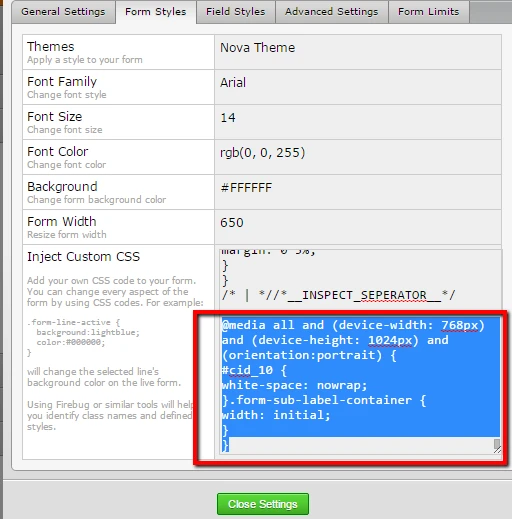
Chriistian Jotform SupportReplied on September 24, 2015 at 3:54 AM
Hi,
Can you try to inject the custom CSS below and see if it fix the styling?
@media all and (device-width: 768px) and (device-height: 1024px) and (orientation:portrait) {
#cid_10 {
white-space: nowrap;
}
.form-sub-label-container {
width: initial;
}}
To inject your custom CSS, there is a guide: How to Inject Custom CSS Codes.
Do let us know if you need further assistance.
Regards.
-
Martinellis4Replied on September 24, 2015 at 8:22 AM
Hi
That seems better but the fields still spread across the whole page?
how do I fix that?
Tm
-
KadeJMReplied on September 24, 2015 at 12:08 PM
Are you referring to the inputs for each of the fields with those stretched out the width of the screen on your device?
This? -
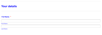
If I'm not mistaken I think you said you wanted that to look like the computer version instead? Or?

Please confirm or correct me so that we can better assist you or let us know more about how you are needing it to look.
-
Martinellis4Replied on September 24, 2015 at 4:01 PM
I would like the form to be published as it looks in your bottom picture with the smaller boxes.
Thanjs
-
MikeReplied on September 24, 2015 at 6:04 PM
We have also added the next CSS to your form in order fix the layout.
@media screen and (max-width: 480px), screen and (max-device-width: 768px) and (orientation: portrait), screen and (max-device-width: 415px) and (orientation: landscape) {
input[type=text], input[type=email], input[type=tel], textarea {
width: initial !important;
}The form should look similar on the iPad and desktop now. If you need any further assistance, please let us know.
- Templates
- Integrations
- INTEGRATIONS
- See 100+ integrations
- FEATURED INTEGRATIONS
 PayPal
- Slack
- Google Sheets
- Mailchimp
- Zoom
- Dropbox
- Google Calendar
- Hubspot
- Salesforce
- See more Integrations
- Products
- PRODUCTS
- Form Builder
- Jotform Enterprise
- Jotform Apps
- Store Builder
- Jotform Tables
- Jotform Inbox
- Jotform Mobile App
- Jotform Approvals
- Report Builder
- Smart PDF Forms
- PDF Editor
- Jotform Sign
- Jotform for Salesforce Discover Now
- Support


