


-
iMatterAsked on September 23, 2015 at 11:24 PM
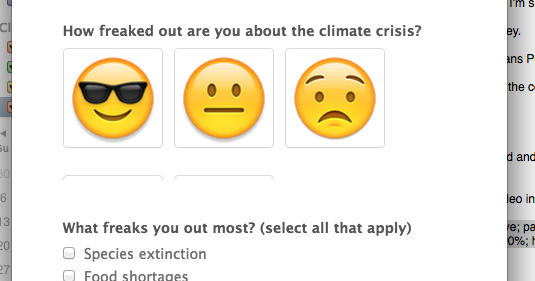
I am using the image picker widget in my form. I have the mobile responsive widget in the form. I've tested it on mobile devices and it appears to work fine (the images wrap to the next line). However, when I re-size the window on my laptop, you can't see the 2nd line of images. I've included a screen show to show the issue.
-
Mike_G JotForm SupportReplied on September 24, 2015 at 8:10 AM
I was able to reproduce the issue you're having when I cloned your form, opened in a my computer browser using the form link, and resize the browser.

Looks like the issue is with how the form responds when the browser is resized.
I have made the form Responsive by:

How-to-make-Forms-Mobile-Responsive
Then as for the result:

I hope this helps. Let us know if you need any further assistance. Thank you.
-
adamdiestelkampReplied on September 8, 2016 at 11:28 AM
I've got both the "Responsive Widget" and the box check under the "Advanced Designer" but my "Image Picker" widget still gets cut off on smaller screens.
Here is my test form: https://form.jotform.com/62514383872157

-
Welvin Support Team LeadReplied on September 8, 2016 at 1:18 PM
You have to use a real device in order to see the responsiveness of the form, especially when dealing a widget. I've checked your form using my IOS and Android devices, it is now responsive.
-
adamdiestelkampReplied on September 8, 2016 at 2:15 PM
Thanks for the reply, it appears to load correctly at whatever size the browser is (mobile or desktop), but when the browser is resized smaller after loading, the section doesn't adapt and just cuts things off.
-
Welvin Support Team LeadReplied on September 8, 2016 at 3:45 PM
I understand. But I don't think someone would resize the window just to fill the form. If you want, you can inject the following custom CSS codes to your form:
@media only screen and (max-device-width: 1024px) {
iframe#customFieldFrame_6 {
height: 377px !important;
}
}
The custom CSS will change the height of the widget to 377px when it's viewed on devices with screen resolution 1024 and below. You can also change the resolution value to 1366 (normally for laptops).
- Templates
- Integrations
- INTEGRATIONS
- See 100+ integrations
- FEATURED INTEGRATIONS
 PayPal
- Slack
- Google Sheets
- Mailchimp
- Zoom
- Dropbox
- Google Calendar
- Hubspot
- Salesforce
- See more Integrations
- Products
- PRODUCTS
- Form Builder
- Jotform Enterprise
- Jotform Apps
- Store Builder
- Jotform Tables
- Jotform Inbox
- Jotform Mobile App
- Jotform Approvals
- Report Builder
- Smart PDF Forms
- PDF Editor
- Jotform Sign
- Jotform for Salesforce Discover Now
- Support


