


-
naggarAsked on October 13, 2015 at 4:03 AM
I have tried all the mobile responsive guides to get my form to work on mobile devices with no luck, I'm currently trying with Iphone 6 IOS 9. Could you please help. Thank you.
-
Chriistian Jotform SupportReplied on October 13, 2015 at 6:31 AM
Hi,
I checked the site you provided and I noticed that when the site is viewed on smaller screen size the form is not displayed.

Can you try to re-embed the form using the iFrame embed method and see if it will fix the issue?
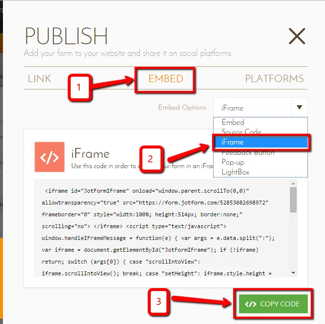
Do let us know if the issue still persists.
Regards. -
naggarReplied on October 13, 2015 at 8:13 AM
Dear Christian,
Thank you. This was the first thing that I actually tried and it never worked. I tried using the javascript as well, and lastly I tried to install the WP plugin as you can see, hasn't worked either. Can you please let me know if there is anything else to try. Thanks in advance.
-
BenReplied on October 13, 2015 at 10:53 AM
I took a look at your website and I see the issue.
This is caused by your website code. It seems that there is a rule that hides iframes on your pages if the size of the website is tablet or mobile phone size.
However, we can counter that style by adding the following CSS to your website (not the form):
@media screen and (max-width:800px) {
iframe#52573717293462, iframe[name="52573717293462"] {
display: block;
}
}My only suggestion is to change the js embed code (that is currently there) to iframe embed code since the ID that it has will be recognized by CSS, while there might be issues with js embed code as it creates the iframe (the code above will work because of the second rule, but what I mention is just in case :) )
Do let us know how it goes.
-
BenReplied on October 13, 2015 at 10:55 AM
I just wanted to mention that if you are adding the code to some CSS file or with other CSS codes, you should add it as mentioned above:
@media screen and (max-width:800px) {
iframe#52573717293462, iframe[name="52573717293462"] {
display: block;
}
}If you are adding the CSS to the page right next to the embed code, then you should use the following:
<style type="text/css">
@media screen and (max-width:800px) {
iframe#52573717293462, iframe[name="52573717293462"] {
display: block;
}
}
</style>- In order for the CSS to be recognized as such.
As mentioned, please do let us know how it goes.
-
naggarReplied on October 21, 2015 at 7:58 AM
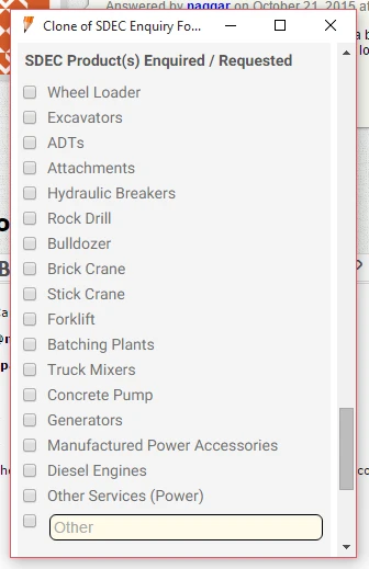
Hi we have fixed our website coding to allow for the form display on mobile devices. It's working now, but some elements of the form are not displaying appropriately, could you please advice. Thank you.
-
Chriistian Jotform SupportReplied on October 21, 2015 at 8:26 AM
Hi,
I checked the site on my mobile device. Are you referring to the overlapping check box label in your form?

To fix this, can you try to inject this custom CSS code in your form?
.form-checkbox-item label {
white-space: normal !important;
}
Do let us know if you need further assistance.
Regards. -
naggarReplied on October 21, 2015 at 8:47 AM
Yes. Can you please explain on how to do so? Thank you.
-
naggarReplied on October 21, 2015 at 8:54 AM
Ok I did. Thanks for the guide. It still looks a bit funky though on mobile view, is there is a why to make the checkbox items look more proper? they look like they are all over the place. Thank you.
-
Chriistian Jotform SupportReplied on October 21, 2015 at 9:50 AM
Can you try to inject this custom CSS code in your form?
@media screen and (max-width:480px) {
span.form-checkbox-item {
width: 90% !important;
}
}
The CSS code above will make the check box fields listed in one column only for mobile devices.
-
naggarReplied on October 21, 2015 at 9:54 AM
Ok thank you. Do I leave the other CSS I entered before still in place?
-
naggarReplied on October 21, 2015 at 10:00 AM
Ok now it looks good thank you. One last question though if you don't mind, for the long words in the regular webview, is there is a way that we have the words aligned better under the first word for example, instead of having the second and third word starting all the way below the check box?

-
victorReplied on October 21, 2015 at 11:44 AM
Hi,
To align better the labels of your checkbox you may add the following CSS code
.form-checkbox-item label {
display : block !important;
margin-left : 19px;
margin-top : -17px;
}

If the previous code works and it does not break your form. I would suggest you leave it.
If you have any other question, please feel free to ask.
Regards
-
naggarReplied on October 22, 2015 at 7:42 AM
Thank you very much. Works perfectly. Thanks again :)
-
Chriistian Jotform SupportReplied on October 22, 2015 at 8:57 AM
On behalf of my colleagues, you are welcome. If you have any further question or concern, please feel free to contact us again.
- Templates
- Integrations
- INTEGRATIONS
- See 100+ integrations
- FEATURED INTEGRATIONS
 PayPal
- Slack
- Google Sheets
- Mailchimp
- Zoom
- Dropbox
- Google Calendar
- Hubspot
- Salesforce
- See more Integrations
- Products
- PRODUCTS
- Form Builder
- Jotform Enterprise
- Jotform Apps
- Store Builder
- Jotform Tables
- Jotform Inbox
- Jotform Mobile App
- Jotform Approvals
- Report Builder
- Smart PDF Forms
- PDF Editor
- Jotform Sign
- Jotform for Salesforce Discover Now
- Support


