


-
cfransonAsked on October 15, 2015 at 10:38 AM
Hello,
I'm hoping to have my quantity fields to the right side of the question when the viewer screen is 480px or wider and then drop down under the question, the way it currently is, when the screen is narrower than 480px.
https://form.jotform.com/52694973898986
Thanks for your help!!
-
BorisReplied on October 15, 2015 at 12:18 PM
You can achieve that by adding the following custom CSS to your form:
@media only screen and (min-width:480px) {
.form-product-item {
display: block;
}
.form-product-item > label {
display: block;
float: left;
width: 50%;
padding: 0 20px 0 0;
margin: 0;
}
.form-product-item > br {
display: none;
}
.form-product-item > .form-sub-label-container {
margin-top: 0;
}
}The form would display like this:

You can add the code by opening the Designer (Setup & Embed > Designer):

And pasting it into the textbox under the CSS tab. However, you will first need to remove one part of the broken CSS codes that you have in the form, because they would be preventing this code from working:

After removing the broken lines, please add the recommended code, and save your form:

Please let us know how it goes.
-
cfransonReplied on October 15, 2015 at 3:21 PM
Hi,
I think I accomplished what you suggested and it still looks the same. Can you take another look please? Thanks!
-
CarinaReplied on October 15, 2015 at 5:56 PM
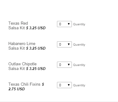
I tested the form and with a 416px screen the quantity fields are under the label:

With normal screen the quantity is on the right side:

Let us know if we can assist you further.
-
cfransonReplied on October 15, 2015 at 6:24 PM
Yes, when I use the direct link I see that the form is responsive and is reformatting correctly. I'm using an iframe imbed method and it will not work when i imbed the code. Any ideas?
I'm using the same style as other forms on my site that do reformats responsively. Like this form.
https://form.jotform.com/52810227665960
-
cfransonReplied on October 15, 2015 at 7:21 PM
OK I figured out the form is working but it only goes into the side by side position when my form is about 750px wide. That's too late.
Id like it to stay in the horizontal layout until about 480px wide. Then go into the column type layout. Is that possible?
-
KevinGarciaReplied on October 15, 2015 at 9:32 PM
Hi,
I think this can help, you should change some things in the CSS code, well your code should look like this :
@media only screen and (min-width:480px) {
.form-product-item {
display: block;
}
.form-product-item > label {
display: block;
float: left;
width: 49%;
padding: 0 20px 0 0;
margin: 0;
}
.form-product-item > br {
display: none;
}
.form-product-item > .form-sub-label-container {
margin-top: 0;width:40%;
}
}This is the result:
I hope that helps.
Regards.
-
cfransonReplied on October 15, 2015 at 10:14 PM
It does help and we''re very close. It still feels a little tight on the bigger screen. You can see that some of the prices are already starting to wrap. Can we get everything on the horizontal plane on the bigger devices?
-
KevinGarciaReplied on October 15, 2015 at 10:49 PM
I got, just paste this CSS code in the Designer, it should work.
.form-product-item {
width: 100% !important;
}
I hope that helps.
-
cfransonReplied on October 15, 2015 at 10:58 PM
That went the opposite way. I'm trying to keep the prices on the same line and that made all the prices wrap under
-
cfransonReplied on October 15, 2015 at 11:02 PM
no i take that back. it is working. Thanks i think that's good for me!!
-
BorisReplied on October 16, 2015 at 3:06 AM
On behalf of everyone who helped, you are most welcome. :)
We are happy to hear that you've got it working. If there are any further adjustments needed, please do include a link to the page where the form is embedded, so that we can check for any issues directly on that page as well.
As always, if you need any other help with your forms, please do not hesitate to open a new support thread about it, and we'll do our best to help.
- Templates
- Integrations
- INTEGRATIONS
- See 100+ integrations
- FEATURED INTEGRATIONS
 PayPal
- Slack
- Google Sheets
- Mailchimp
- Zoom
- Dropbox
- Google Calendar
- Hubspot
- Salesforce
- See more Integrations
- Products
- PRODUCTS
- Form Builder
- Jotform Enterprise
- Jotform Apps
- Store Builder
- Jotform Tables
- Jotform Inbox
- Jotform Mobile App
- Jotform Approvals
- Report Builder
- Smart PDF Forms
- PDF Editor
- Jotform Sign
- Jotform for Salesforce Discover Now
- Support


