


-
markashtonAsked on October 26, 2015 at 1:41 PM
Hi,
Website in Wordpress
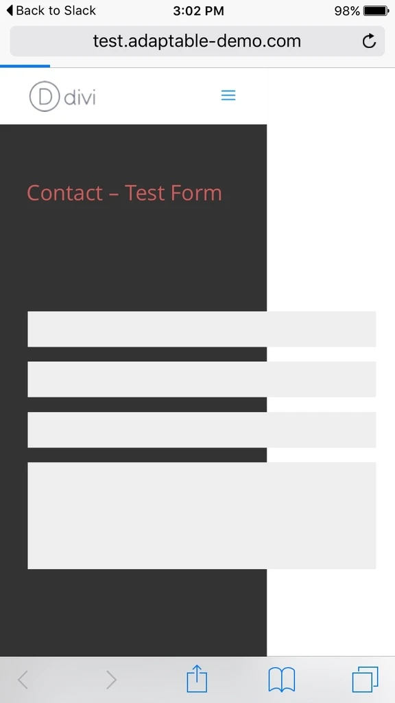
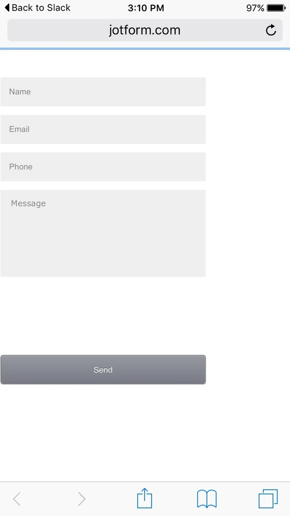
This page has an embedded jotform: http://test.adaptable-demo.com/contact/
The form works fine ... one thing though ...
Please try loading on an Ipad or Iphone. Not a simulator ... they don't work properly.
Notice the load behaviour?
The field lengths are extended for a few seconds or so. They then resize to the correct size
This has been picked up on by clients.
Can you advise the cause of this please?
Is there a remedy or will I have to live with it.
I also notice that they don't resize on an Iphone 4 ... or actually are off screen ... but the form is set to responsive
Any ideas.
Many thanks
Regards Mark
-
BJoannaReplied on October 26, 2015 at 3:23 PM
My colleague KadeJM tested your embedded form and he was able to replicate mentioned issue.
He was also able to replicate it on stand alone form.
You can fix this issue by adding Mobile Responsive widget to your form.
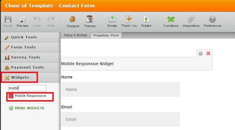
He was not able to replicate mentioned issue on my cloned form when I added Mobile responsive widget.
Hope this will help. Let us know if you need further assistance.
-
markashtonReplied on October 26, 2015 at 5:56 PM
genius ...
added the widget and everything looks great except one thing ....
I noticed the submit button on desktop is a bit long....
Then I tried dragging the browser window inwards on Chrome on a 1920px desktop to show different resolutions and CSS breaking points and noticed that the length of the submit button, i.e. behaviour of the Submit button, varies wildly to that of the fields.
Is there some CSS that will enable the Submit button to behave in keeping with the fields ... i.e. the same length.
Thanks ... that would be fantastic ... Appreciate all the help
Regards Mark
-
David JotForm Support ManagerReplied on October 26, 2015 at 9:13 PM
Can you please try injecting this code: http://www.jotform.com/help/117-How-to-Inject-Custom-CSS-Codes
.form-submit-button{
width: 50% !important;
}

Let us know if that helps.
- Templates
- Integrations
- INTEGRATIONS
- See 100+ integrations
- FEATURED INTEGRATIONS
 PayPal
- Slack
- Google Sheets
- Mailchimp
- Zoom
- Dropbox
- Google Calendar
- Hubspot
- Salesforce
- See more Integrations
- Products
- PRODUCTS
- Form Builder
- Jotform Enterprise
- Jotform Apps
- Store Builder
- Jotform Tables
- Jotform Inbox
- Jotform Mobile App
- Jotform Approvals
- Report Builder
- Smart PDF Forms
- PDF Editor
- Jotform Sign
- Jotform for Salesforce Discover Now
- Support


