
-
sankalpoAsked on October 30, 2015 at 8:56 AM
i have built a form, which looks great on iOS safari mobile when viewed at the direct link:
https://form.jotform.me/52987431587470?
but when i embed this in an iframe on my site, it is no longer responsive. see:
i have done this iframe embed using strikingly.com, but i have also tested this with squarespace, and have already tried using many css implementations on both the strikingly and from within the custom css injection on jotform - nothing has worked
i also asked the strikingly support to help, and they tried, but ultimately said:
"the responsive design inside an iframe is not something we can control, because it's entirely provided by the source of the iframe. To really make sure it's perfect, you'll have to contact the people at Jotform and get them to make certain fields or the map fit on smaller screens!"
would very much appreciate any help with this!
sg
-
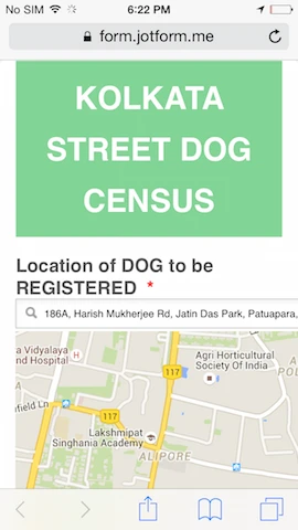
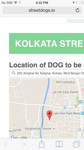
sankalpoReplied on October 30, 2015 at 8:59 AM
here are screenshots of the responsive jotform & the nonresponsive embedded iframe
-
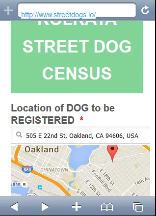
David JotForm SupportReplied on October 30, 2015 at 1:02 PM
Hi,
I checked your page on mobile and it does appear to be mobile responsive:
Is it still not showing properly on your end? I checked on both IOS and Android, both showed the form properly.
-
sankalpoReplied on October 30, 2015 at 3:05 PM
thank you for checking this out. unfortunately from my end - on two different iphones (5c & 5) - the form on streetdogs.io does not show properly (it looks like what i posted in the 2nd image in my 2nd post above). and this is happening even though the form on the original jotform page is rendering fully responsive
i'm wondering if there is something in my version of iOS safari that is "adjusting" the view from responsive to not (perhaps based on the width of some field in the form)? and whether that could be blocked to force it to stay responsive like the original jotform
i say this also because i also tried simply creating a DNS mask - putting a whole page frame that just shows the original jotform...and even that is showing in the nonresponsive way!
thanks again for your thoughts on this. let me know what you think?
-
David JotForm SupportReplied on October 30, 2015 at 4:14 PM
You can try adding mobile responsive CSS to the form:
http://www.jotform.com/help/117-How-to-Inject-Custom-CSS-Codes
@media only screen
and (min-device-width : 320px)
and (max-device-width : 480px) {
.form-all {
width: 320px !important;
}
.form-line {
padding-top: 0px !important;
padding-bottom: 0px !important;
padding-left: 3px !important;
}
img.form-image {
max-width: 100% !important;
height: auto !important;
}
#id_1.form-line {
padding-left: 36px !important;
padding-right: 36px !important;
}
}And adjusting the the min/max widths to see if it will include the width of your phone. I tried on a few different devices though and each one the embedded form looked to be mobile responsive.
- Templates
- Integrations
- INTEGRATIONS
- See 100+ integrations
- FEATURED INTEGRATIONS
 PayPal
- Slack
- Google Sheets
- Mailchimp
- Zoom
- Dropbox
- Google Calendar
- Hubspot
- Salesforce
- See more Integrations
- Products
- PRODUCTS
- Form Builder
- Jotform Enterprise
- Jotform Apps
- Store Builder
- Jotform Tables
- Jotform Inbox
- Jotform Mobile App
- Jotform Approvals
- Report Builder
- Smart PDF Forms
- PDF Editor
- Jotform Sign
- Jotform for Salesforce Discover Now
- Support