


-
NGHSAsked on November 11, 2015 at 12:35 PM
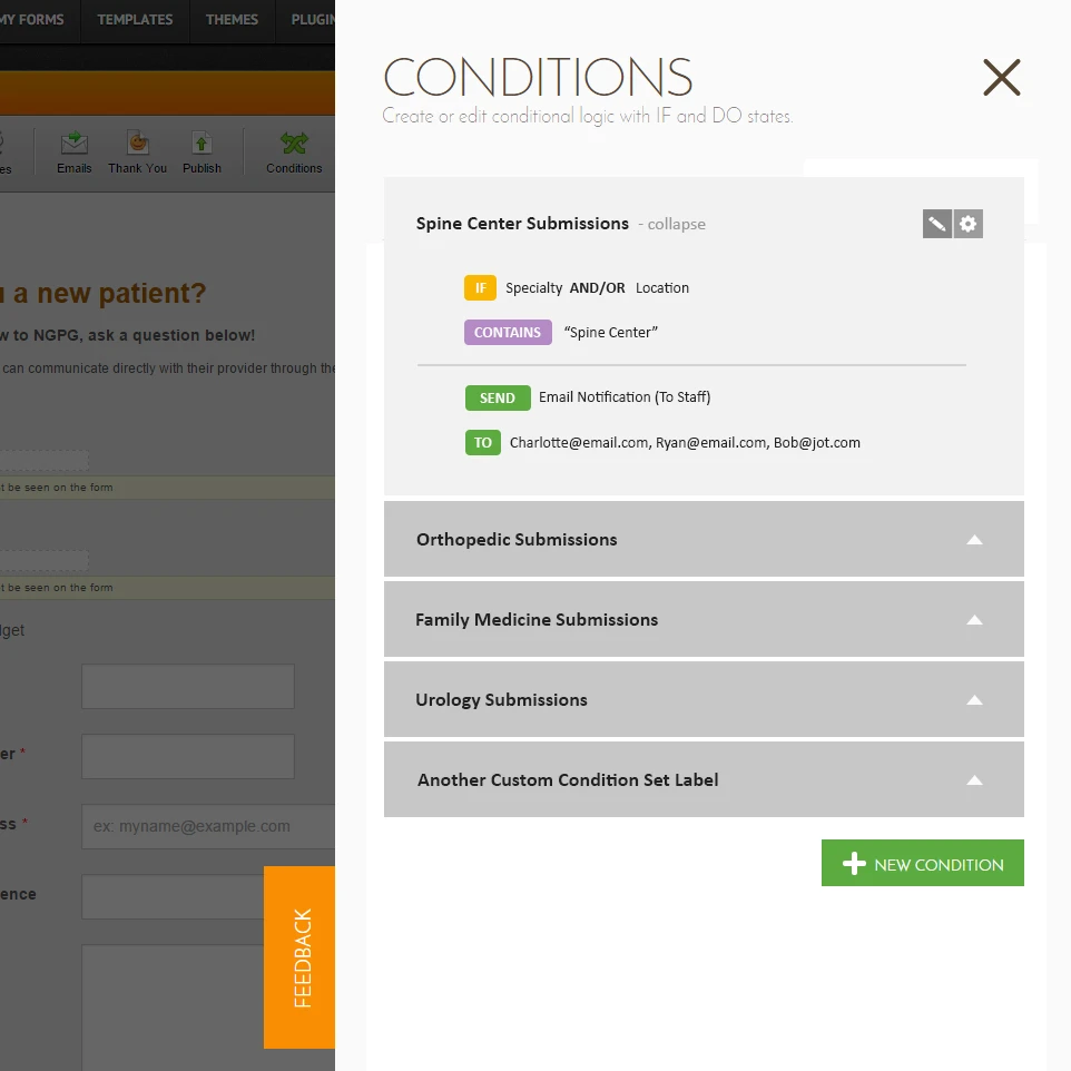
Hey guys, you do great work. I appreciate the awesome updates to the UI! I've been looking at the Conditions section and thought I could improve upon what you have. Your current UI is simple, which I love. But it is a little confusing when I see all the text with shapes/symbols. This kind of UI is much easier for my brain to process at a glance. Using an accordion to collapse conditions until I want to explore them deeper. Custom condition headings to make them make more sense. All (mostly) matching your branding. Enjoy!
-
David JotForm SupportReplied on November 11, 2015 at 2:20 PM
Hi,
Thank you for the recommendation. I will forward this along to our development team to have a look.
-
NGHSReplied on November 11, 2015 at 2:58 PM
You're welcome!
- Templates
- Integrations
- INTEGRATIONS
- See 100+ integrations
- FEATURED INTEGRATIONS
 PayPal
- Slack
- Google Sheets
- Mailchimp
- Zoom
- Dropbox
- Google Calendar
- Hubspot
- Salesforce
- See more Integrations
- Products
- PRODUCTS
- Form Builder
- Jotform Enterprise
- Jotform Apps
- Store Builder
- Jotform Tables
- Jotform Inbox
- Jotform Mobile App
- Jotform Approvals
- Report Builder
- Smart PDF Forms
- PDF Editor
- Jotform Sign
- Jotform for Salesforce Discover Now
- Support

