
-
ashtutorsAsked on November 26, 2015 at 8:53 AM
Hi,
I've got my sign up form set up on a blog post, and all is working correctly.
Except, on an iPhone, the 2 input boxes are showing out of place and it looks bad.
I've got the mobile responsive widget on the form, but it doesn't appear to be fixing the issue.
I'd appreciate some guidance.
Many thanks.
Geoff
-
Welvin Support Team LeadReplied on November 26, 2015 at 10:05 AM
Try adding the following custom CSS codes in the form. Please add it to the bottom:
.form-input {
display: block !important;
}
Here's how to add the codes: http://www.jotform.com/help/117-How-to-Inject-Custom-CSS-Codes.
Thanks
-
ashtutorsReplied on November 26, 2015 at 10:26 AM
Thanks Welvin - I've tried that but no joy.
The 2 input boxes are way over to the left, everything else is centred.
The CSS says that there are 4 errors - and that was BEFORE I added your code.
Thanks.
Geoff
-
Welvin Support Team LeadReplied on November 26, 2015 at 10:56 AM
I've fixed the errors and added the custom CSS codes to your form. Can you check again?
The errors are like this (in the designer):
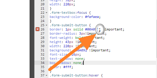
There is an extra semicolon in the area. That should be added after the !important declaration.
Thanks
-
ashtutorsReplied on November 27, 2015 at 4:19 AM
Thanks for that Welvin. There are no errors showing up on the CSS now.
I've replaced the iframe code again on the site, and tried it again on my iPhone.
Still having the same issue though. the 2 input boxes in portrait orientation are misplaced off to the left.
Any other ideas would be gratefully appreciated.
(And I have to say, Jotform's support must be amongst the very best in the world! More people should know about it.)
-
mert JotForm UI DeveloperReplied on November 27, 2015 at 5:02 AM
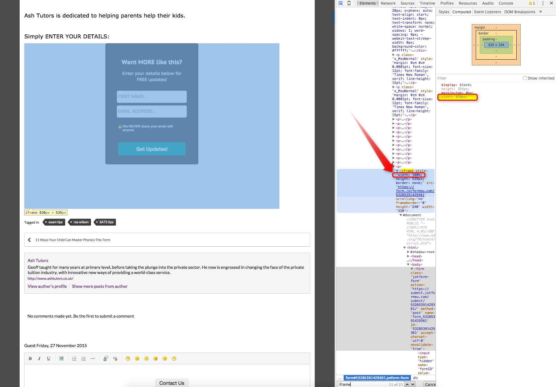
I checked your form and replicated the same issue. I assume that you set your form's width "100%" when you were getting the IFrame embed code. By doing this, your form's width is taking the width of the div.
To avoid that issue, please set the width close to the "300px". You can see the example of the modified IFrame embed code from the below. As it is seen, the width is changed.
<iframe
id="JotFormIFrame"
onDISABLEDload="window.parent.scrollTo(0,0)"
allowtransparency="true"
src="https://form.jotform.com/53302486090956"
frameborder="0"
style="width:300px;
height:539px;
border:none;"
scrolling="no">
</iframe>
I hope this one will work for you. Please let us know the results.
-
ashtutorsReplied on November 27, 2015 at 6:11 AM
Thanks Mert.
No, I haven't changed anything. I got the form directly from one of the templates, and the errors, as well as this issue, have come along with it!
I've done as you've suggested and this has fixed the issue.
Once again, many thanks for a fantastic service!
Geoff :)
-
mert JotForm UI DeveloperReplied on November 27, 2015 at 7:21 AM
Geoff, you are most welcome and also thank you for your great words. I'm glad to see that it works for you.
For your other questions, support team is ready to help you as always.
Have a great day.
- Templates
- Integrations
- INTEGRATIONS
- See 100+ integrations
- FEATURED INTEGRATIONS
 PayPal
- Slack
- Google Sheets
- Mailchimp
- Zoom
- Dropbox
- Google Calendar
- Hubspot
- Salesforce
- See more Integrations
- Products
- PRODUCTS
- Form Builder
- Jotform Enterprise
- Jotform Apps
- Store Builder
- Jotform Tables
- Jotform Inbox
- Jotform Mobile App
- Jotform Approvals
- Report Builder
- Smart PDF Forms
- PDF Editor
- Jotform Sign
- Jotform for Salesforce Discover Now
- Support