


-
mgcaledonian13Asked on November 26, 2015 at 4:48 PM
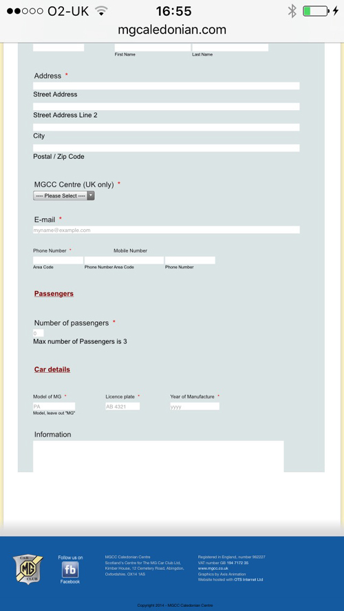
I have an issue with the iPhone not displaying correctly see attached file and the one shown below.
I have to have the PC Screen with the large amount of "blue" blank space to get the form to show without the bottom missing from the "furher information" field downwards on an ipad. With it showing this way on a PC the is cut off as shown in the Screen shot for the iphone.
I am using iframe code in this case
I have used both an alteration in % and in px but neither solved the problem it just increases the space on the PC form.
Suggestions please
-
David JotForm Support ManagerReplied on November 26, 2015 at 6:12 PM
Please try the following:
1) Remove the Iframe code from your page.
2) Get a fresh Iframe code: http://www.jotform.com/help/148-Getting-the-Form-iFrame-Code
a) Before you embed the code, paste it in a text editor like WordPad, you will notice two part of codes, only copy and embed the iFrame part in your webpage, example:

b) Make sure to set the proper height to show it without the extra "blue" empty space, and set scrolling property to "yes", so the submit button is shown in mobile views, example:

Let us know if you need more help, and if you have another question, please open a new thread we will be glad to assist you.
-
mgcaledonian13Replied on November 28, 2015 at 5:20 PM
BDAVID
Thanks that worked a treat.
Willy Scott
-
David JotForm Support ManagerReplied on November 28, 2015 at 7:04 PM
You are welcome! Feel free to contact us any time, we are here to assist you.
- Templates
- Integrations
- INTEGRATIONS
- See 100+ integrations
- FEATURED INTEGRATIONS
 PayPal
- Slack
- Google Sheets
- Mailchimp
- Zoom
- Dropbox
- Google Calendar
- Hubspot
- Salesforce
- See more Integrations
- Products
- PRODUCTS
- Form Builder
- Jotform Enterprise
- Jotform Apps
- Store Builder
- Jotform Tables
- Jotform Inbox
- Jotform Mobile App
- Jotform Approvals
- Report Builder
- Smart PDF Forms
- PDF Editor
- Jotform Sign
- Jotform for Salesforce Discover Now
- Support


