


-
candycartonsAsked on December 2, 2015 at 8:32 AM
I'm rebuilding my forms so that they are mobile compatible.
My issue is with the image slider. I have researched for hours in the forums and tried many different methods of attempting to get the image slider to play nice when viewed from mobile.
Currently, I have the mobile widget installed and all CSS removed.
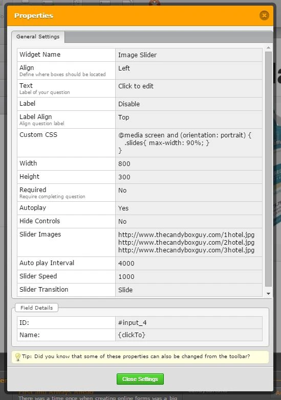
The slider is squished from left to right, and not resized in proportion.
 Page URL: http://www.thecandyboxguy.com/testform
 -
SammyReplied on December 2, 2015 at 10:34 AM
Kindly try adding the following CSS to your slider widget's custom CSS tab
@media screen and (orientation: portrait) {
.slides{ max-width: 90%; }
}
-
candycartonsReplied on December 2, 2015 at 11:07 AM
I injected the custom CSS. Slider is still squished
-
MikeReplied on December 2, 2015 at 1:36 PM
You can try adding the next CSS to the Image Slider widget.
.slidesjs-control img {
height: auto !important;
}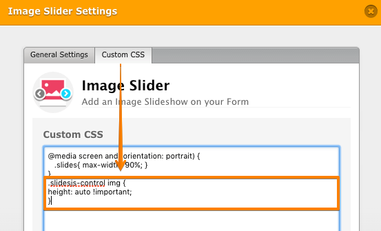
And next CSS to the form itself to fix the widget height on mobile devices.
@media only screen and (max-width: 40em) {
iframe {
height: auto !important;
}
}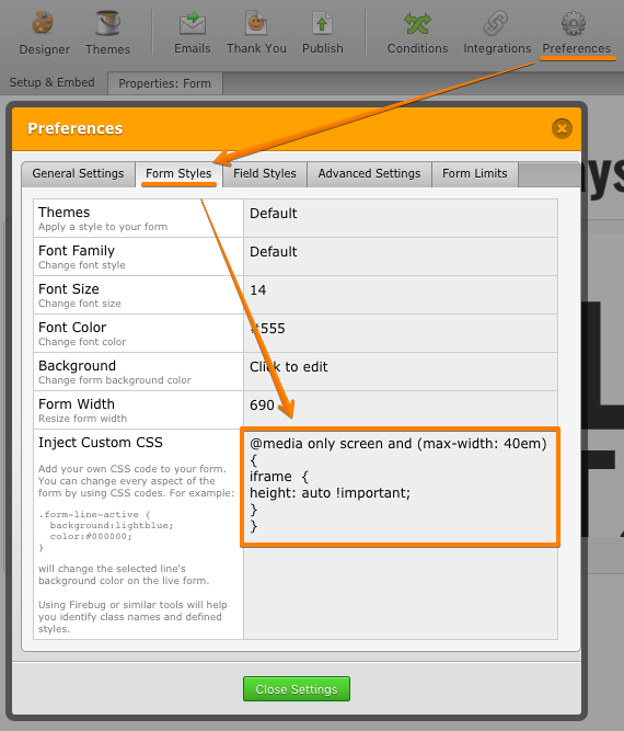
It should fix the aspect ratio issue.
-
candycartonsReplied on December 2, 2015 at 2:09 PM
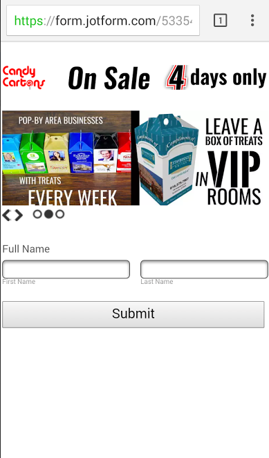
While it did fix the aspect ratio, now there is a large gap below the slider, between the actual images and the controls. It looks like it is defaulting to the 300 pixel height that is set in the slider properties.

-
jonathanReplied on December 2, 2015 at 3:22 PM
I checked the page on the mobile browser, but it wasn't as responsive as it appears yet.

Although the slider widget control is properly aligned and have less gap between the images on top.
Allow more time to check on this. We will get back to you with update shortly.
Thanks.
-
jonathanReplied on December 2, 2015 at 3:32 PM
Can you please try first re-embedding the form in your website http://www.thecandyboxguy.com/testform/ using its iframe embed code?
user guide: -Getting-the-Form-iFrame-Code
I am suggesting this because when I checked the form using its direct URL on mobile browser, the expected responsiveness works.

although the gap bet image and slider control is now apparent. Which I think can be adjusted with the correct CSS code.
We need to see first how the form behaves on the website itself (in terms of responsiveness) so we can properly make the adjustment to fix the slider control position issue.
Thanks.
-
candycartonsReplied on December 2, 2015 at 6:18 PM
I have implement the iFrame embedding between the <body> tags of the html. The gap still exists. Thank you for helping me with this, having the slider work properly is critical in my marketing.
http://www.thecandyboxguy.com/testform
-
Elton Support Team LeadReplied on December 2, 2015 at 9:19 PM
Please understand that the image slider widget is not yet designed to work properly on mobile. However, you can try the following to remove the gap you mentioned on mobiles.
First, inject this CSS codes inside the image slider widget under Custom CSS.
@media only screen
and (min-device-width : 375px)
and (max-device-width : 667px)
and (orientation : portrait){
.slidesjs-container {
height: 150px !important;
}
}
@media only screen
and (min-device-width : 320px)
and (max-device-width : 568px)
and (orientation : portrait) {
.slidesjs-container{
height: 125.778px !important;
}
}
Next is, inject this CSS codes in your form.
@media only screen
and (min-device-width : 375px)
and (max-device-width : 667px)
and (orientation : portrait) {
iframe#customFieldFrame_4{
height: 183px !important;}
}
@media only screen
and (min-device-width : 320px)
and (max-device-width : 568px)
and (orientation : portrait) {
iframe#customFieldFrame_4{
height:158px !important;
}
}
These codes will work on iPhone 5 & 6 - portrait mode.
Example:
iPhone6

iPhone5

Here's a cloned form with these changes https://form.jotform.com/53357783857977?.
Feel free to clone this form if you like.
Hope this helps!
-
candycartonsReplied on December 3, 2015 at 8:48 AM
Thank you for the help. Since the solution does not work in landscape I will need to figure out another solution. I'll try to find another slider that I can host outside the form, and paste above the form in the html.
-
beril JotForm UI DeveloperReplied on December 3, 2015 at 10:29 AM
We would appreciate it if you could try to add the CSS code below:
@media screen and (max-width:500px){
.custom-field-frame,
.slidesjs-container,
.slidesjs-control {
width: 100% !important;
}
}
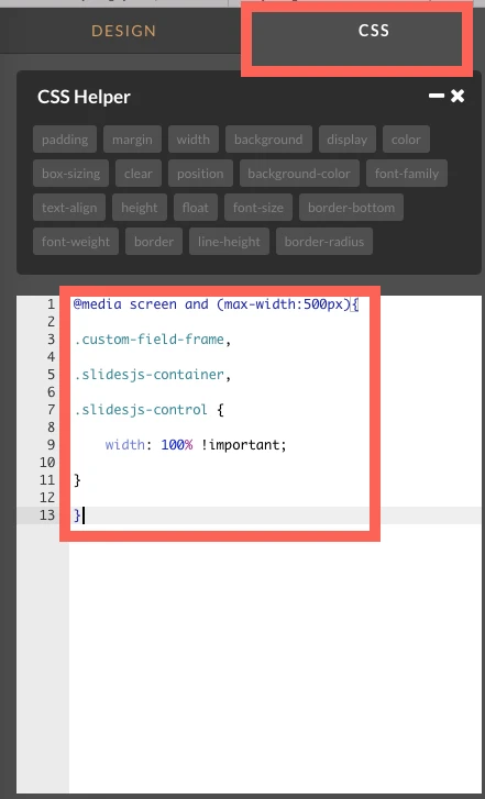
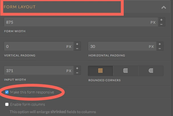
Also please, check the Make this form responsive from Designer.
I hope it will work.
If you have any question or issues, please do not hesitate contacting us. We will be happy to assist you.
-
candycartonsReplied on December 3, 2015 at 11:16 AM
Tried it. The slider is still squished left to right. At this point it would seem there is no solution, except to live with the slider squishing the graphics or having a large gap below it.
Do you anticipate updating the slider anytime soon to play nice on mobile?
Given the nature of forms being viewed mostly on a mobile devices these days, I am surprised the slider hasn't been updated?
-
David JotForm Support ManagerReplied on December 3, 2015 at 12:39 PM
Seems like you removed the slider from your form. This is quite odd, I just tried the form provided by my colleague Elton, and it seems to look fit fine, did you clone it?

We could send a request to our widget team to make the slider optimized for mobile view, but there is no time-frame for an implementation.
-
candycartonsReplied on December 3, 2015 at 12:49 PM
I did remove the slider. I'm going to simply post the images one after the other. I'll try the slider again at a later date and see if it's mobile friendly.
-
beril JotForm UI DeveloperReplied on December 3, 2015 at 12:55 PM
We are sorry for this inconvenience this might have caused.
I hope it will work properly.
Please , let us know the result.
If you have any questıon or issues, please do not hesitate contacting us. We will be glad to assist you.
- Templates
- Integrations
- INTEGRATIONS
- See 100+ integrations
- FEATURED INTEGRATIONS
 PayPal
- Slack
- Google Sheets
- Mailchimp
- Zoom
- Dropbox
- Google Calendar
- Hubspot
- Salesforce
- See more Integrations
- Products
- PRODUCTS
- Form Builder
- Jotform Enterprise
- Jotform Apps
- Store Builder
- Jotform Tables
- Jotform Inbox
- Jotform Mobile App
- Jotform Approvals
- Report Builder
- Smart PDF Forms
- PDF Editor
- Jotform Sign
- Jotform for Salesforce Discover Now
- Support


