


-
varshavanAsked on December 6, 2015 at 11:36 PM
Hi,
I have added mobile responsive widget on my form which works great except with one small thumbnail size image. it actually a google map image embedded with clickable url. Unfortunately it gets expanded and becomes blur when form resolution is small fitting mobile screen.Is there any way i can stop expanding that small image? It should remain in fixed size no matter what is the screen size is.
Form url is attached below.
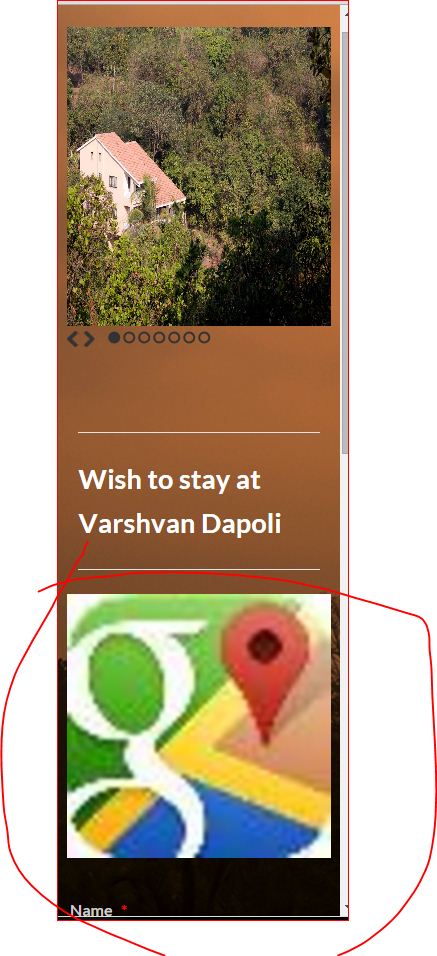 Page URL: https://form.jotform.me/53272112137445
 -
BenReplied on December 7, 2015 at 1:46 AM
To fix this you should just add this CSS to your form:
#id_37 img {
max-height: 42px;
max-width: 42px;
}You can add it by following these steps: Inject Custom CSS Codes
As soon as you save your form you can test it out and you will no longer experience any issues as before.
Do however let us know how it goes :)
-
varshavanReplied on December 7, 2015 at 6:43 AM
Thanks Ben,
Issue is resolved by adding CSS code.
- Templates
- Integrations
- INTEGRATIONS
- See 100+ integrations
- FEATURED INTEGRATIONS
 PayPal
- Slack
- Google Sheets
- Mailchimp
- Zoom
- Dropbox
- Google Calendar
- Hubspot
- Salesforce
- See more Integrations
- Products
- PRODUCTS
- Form Builder
- Jotform Enterprise
- Jotform Apps
- Store Builder
- Jotform Tables
- Jotform Inbox
- Jotform Mobile App
- Jotform Approvals
- Report Builder
- Smart PDF Forms
- PDF Editor
- Jotform Sign
- Jotform for Salesforce Discover Now
- Support
