


-
motomarketingAsked on December 7, 2015 at 3:56 PM
I'm trying to create 2 columns, where the name, phone, and email is on the left side, while the comment box is on the right. See: https://form.jotform.com/53195949557978
However, I'm having trouble making the form look balanced. As you notice, there is a huge spacing between "Your Name" and "Phone Number". I cannot figure out how to fix this.
-
jonathanReplied on December 7, 2015 at 5:34 PM
Please review the user guide as well.
user guide: http://www.jotform.com/help/328-How-to-Position-Fields-in-JotForm
and you will need to add CSS code like this
I applied this update on your form http://www.jotformpro.com/form/53195949557978. Please check if its in accordance to your needs.
Let us know if you need further assistance.
-
motomarketingReplied on December 9, 2015 at 1:03 PM
Hi,
Thank you. However, I notice the form now looks terrible on mobile devices:

-
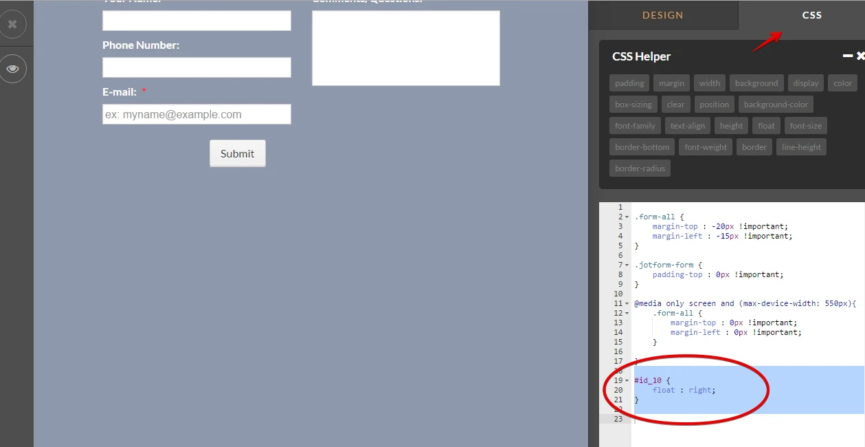
BorisReplied on December 9, 2015 at 3:49 PM
Thank you for very much for providing the screenshot and letting us know about it. I believe that the problem comes from the padding of 50 pixels that the form has on both its left and its right side.
We can actually override that with a small bit of CSS, so that when the form is viewed on a device with a narrow screen, there is no padding on the sides of the form. The custom CSS would be this:
@media only screen and (max-width: 640px) {
.form-section {
padding: 0px;
}
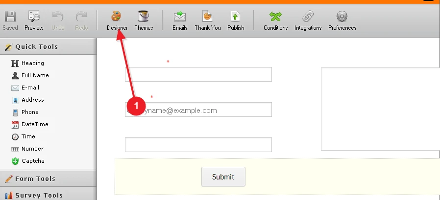
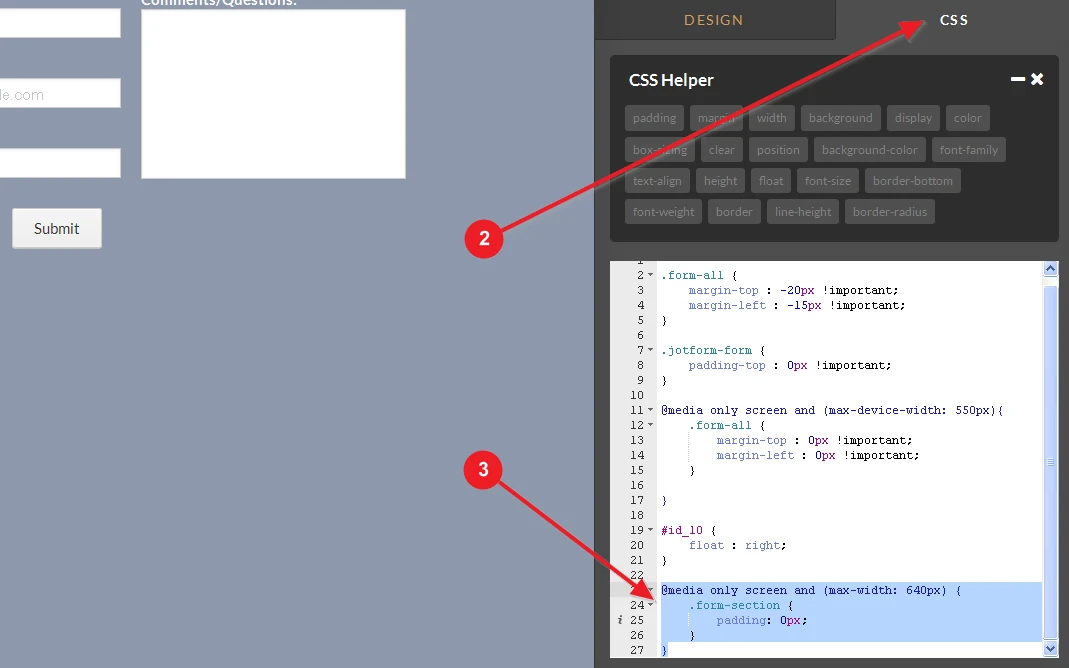
}You can add the custom CSS code by opening your form in the Designer, and pasting it into the textbox under the CSS tab. Please refer to images below for visual guidance:
Please let us know if this resolves the issue with the form on mobile devices, and also please do let us know if you need further assistance in getting the form tweaked to your liking. We will be happy to help.
-
motomarketingReplied on December 9, 2015 at 8:59 PM
Thank you for your quick reply. While that looks better now, is it not possible to display each field on it's own line (meaning the Comment box would be under Phone Number) when viewed on a mobile device?
-
jonathanReplied on December 9, 2015 at 10:28 PM
Can you please share to us the URL of your website where you have embedded the form http://www.jotformpro.com/form/53195949557978
I test the form using its URL and it looks fine on mobile browser

If its embedded on a website, we will test it as well on the website page.
Thanks.
-
motomarketingReplied on December 10, 2015 at 10:01 PM
http://danehrenkrantzconsulting.com
Scroll down to the bottom. As you can see, part of the wording also gets cut off.
-
Chriistian Jotform SupportReplied on December 11, 2015 at 2:46 AM
Hi,
I am currently checking your form. Will get back to you as soon as I find a fix.
-
Chriistian Jotform SupportReplied on December 11, 2015 at 3:03 AM
Hi,
If you want each field to take one line, you can do so by moving the "Comment" field down and expanding all the fields. Please see below GIF.

Please note that this will also change the arrangement of fields in desktop view.
I noticed that the cut-off label is the "Comments/Questions". If you just want to fix the cut off words in mobile, there are 2 workarounds:
1. Make the wrapper of the form wider. You can add the ff. CSS to your website:
.section_wrapper.mcb-section-inner {
max-width: 280px !important;
}
OR
2. Add space in between words of the label "Comments/Questions" (i.e. make it "Comments / Questions"). Please see below.

Do let us know if you need further assistance.
- Templates
- Integrations
- INTEGRATIONS
- See 100+ integrations
- FEATURED INTEGRATIONS
 PayPal
- Slack
- Google Sheets
- Mailchimp
- Zoom
- Dropbox
- Google Calendar
- Hubspot
- Salesforce
- See more Integrations
- Products
- PRODUCTS
- Form Builder
- Jotform Enterprise
- Jotform Apps
- Store Builder
- Jotform Tables
- Jotform Inbox
- Jotform Mobile App
- Jotform Approvals
- Report Builder
- Smart PDF Forms
- PDF Editor
- Jotform Sign
- Jotform for Salesforce Discover Now
- Support


