


-
jqspeerAsked on December 10, 2015 at 6:04 PM
Hi.. My form does not show correctly on mobile devices (IOS and Android). When I embed the form it is fine on a PC but it does not appear the same on mobile devices. My Problem is that the section of my website runs out of room because the form becomes very tall due to increased spacing of elements. I have tried all the embed methods and I noticed that when I use the iframe when embedding the form embeds the same way as it looks on mobile.... even on a pc. an example of my form can be viewed here...
http://www.soul-therapies.com/bookindianheadmassage
the screen shots below shows hoe the form appears on mobile... instead of the date being on 1 line it is on 3. how can i fix this? Please help.
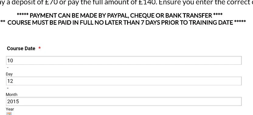
-
Chriistian Jotform SupportReplied on December 10, 2015 at 8:43 PM
Hi,
I checked your form and I noticed that the Responsive Form setting of your form is set to No. Please try to set the Responsive Setting to Yes and see if it will fix the issue? To set the Responsive Form setting to Yes, just follow the instructions provided below.

Do let us know if you need further assistance.
Regards. -
jqspeerReplied on December 11, 2015 at 1:49 PM
Hi I tried this and still no joy... If I make my webpage section where the form is embedded longer it will work but I dont like this view on a mobile device and I want to make it appear the same on all devices. eg have the date element on one line instead of 3 etc. Could it possibly be something to do with the iframe width settings? If not can you please recommend a fix.
Thank-you
-
Mike_G JotForm SupportReplied on December 11, 2015 at 8:01 PM
Thank you for giving us more information. I understand that you have embedded your form using the iframe code. iframe takes the entire space allotted for it in your website.
You can try to add this CSS codes to your form using this guide: How-to-Inject-Custom-CSS-Codes
div#cid_14 span.form-sub-label-container input{width: 44px !important;
}
div#cid_14 span.form-sub-label-container{
position: relative !important;
display: inline-block !important;
width: 69px !important;
}
.date-separate{
width: 10px !important;
}
div#cid_14 {
position: relative !important;
display: inline !important;
}
Then, try to check your form embedded on your website.
I hope this helps. Let us know how it goes. If you're still having issues, it would be great if you can post another screenshot.
Thank you.
-
jqspeerReplied on December 12, 2015 at 4:44 AM
Hi... Thanks for the quick reply. I added the CSS at the end of the existing CSS on my form and it partially worked for the date field however, the field label is not in line with the field input. See below screenshot.

I dont have to use the iframe method but when I previously used this it showed my form the way I dont want it... even on a pc... so thats why I assumed that it might be something to do with iframe or how my host lets you embed html. If I use any other embed method it looks fine on a pc but wrong on a mobile device.
Adding this css fixes the problem for all embed methods however I really need the label and input fields to be in line.
Above the date input is in line but the course date is above. In the next field 'your name', 'first name' and 'last name' are all above each other. I have lots of fields on my form so I want them all to be in line but not necessarily a set width.... just as long as they are in line from left to right.
Can the CSS be modified to have the field label and input in line?
Can I add more/modified CSS to apply the date field fix to all fields in my form?
Once again thank-you for your help!
-
BJoannaReplied on December 12, 2015 at 1:22 PM
I am not exactly sure which field label is not in line with the field input.
I have checked your website on my Samsung Galaxy S4 and your website is not responsive.

Also submit button is cut off, so your uses will not be able to submit your form. Probably there are script conflict between form scripts and your website scripts. Because of that we recommend using of iFrame code.
You can also try to add Mobile responsive widget to your form.
I have cloned your form and added mobile responsive widget to my form. My standalone form looks like this on my mobile.

Also responsive form will not look exactly the same as desktop form, because form will adjust to size of device.
I think that first you need to embed your form with iFrame code, so that your users are able to submit it and then tell us which part of responsive form you want to change.
Looking forward to your reply.
- Templates
- Integrations
- INTEGRATIONS
- See 100+ integrations
- FEATURED INTEGRATIONS
 PayPal
- Slack
- Google Sheets
- Mailchimp
- Zoom
- Dropbox
- Google Calendar
- Hubspot
- Salesforce
- See more Integrations
- Products
- PRODUCTS
- Form Builder
- Jotform Enterprise
- Jotform Apps
- Store Builder
- Jotform Tables
- Jotform Inbox
- Jotform Mobile App
- Jotform Approvals
- Report Builder
- Smart PDF Forms
- PDF Editor
- Jotform Sign
- Jotform for Salesforce Discover Now
- Support


