


-
xagolabAsked on December 11, 2015 at 8:42 AM
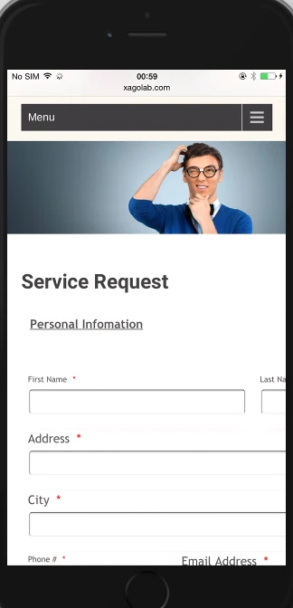
I am just curious, even though I have set the forms to be responsive in JotForm (I have 3 forms designed in Jotform for my website), why cannot I take full advantage of the width of the allocated space on a desktop/laptop browser and yet the form is responsive in mobile phones.
If you currently see my forms, they look confined so that it can be seen properly on mobile phones. But on desktop/laptop browser, there is plenty of blank spaces between the form and the next column.
How can this be fixed so that the form looks like a form designed for workstations and yet be fully responsive on mobile devices?
The forms are located at:
http://www.xagolab.com/servicerequest
http://www.xagolab.com/contact
BTW: My site is set for "under construction" mode. If you are ready to tackle this, please let me know and I can disable the mode so that you can view them.
-
BJoannaReplied on December 11, 2015 at 11:46 AM
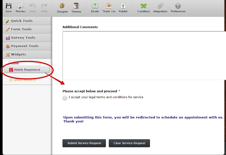
I have inspected your forms and only one of them is responsive. You can make your forms responsive by adding Mobile responsive widget to the form.

If you need further assistance, please disable the mode on your website so that we can inspect your forms there.
-
xagolabReplied on December 11, 2015 at 12:23 PM
So, can I extend the form fields to take up full width on my website? Adding Mobile Responsive widget will make it responsive regardless of full width on website?
-
xagolabReplied on December 11, 2015 at 12:55 PM
OK. I tried your solution and increased the field size to see. Now the form scrolls horizontally on my iPhone 6. Form looks fine on workstation but not on mobile phone.
What other option do I have?
-
xagolabReplied on December 11, 2015 at 1:00 PM
Can the form width be set to 100% instead of 700px that I have set right now. I think limiting to px is forcing the site to scroll on mobile phones.
-
BJoannaReplied on December 11, 2015 at 2:28 PM
You can try to add this code:
.form-all {
width: 100%!important;
}
However I am not sure if it will help. How did you embed your form? We recommend using of iFrame code: http://www.jotform.com/help/148-Getting-the-Form-iFrame-Code
If we could inspect and test your forms on your website, maybe we would be able to find solution for your issue.
-
xagolabReplied on December 11, 2015 at 2:55 PM
I will open up the site for you to take a look at it. Please check the following links
-
BJoannaReplied on December 11, 2015 at 4:32 PM
I have inspected your website and I saw that there is blank spaces between the form and the next column.
You can increase width of your form and then also increase width of your text box field to reduce the white space.
To change the width of a text box, click it and in the toolbar click the Size button, change the value to suit your requirements and save the form:

To increase width of the form go to Preferences, select Form styles tab and change Form Width.

I have also inspected your forms on my Samsung Galaxy S4 and two of them are shown properly. This form is not responsive: http://www.jotform.us/form/53425747375160
You need to add Mobile responsive widget to that form as well.
Here is my demo form where I have changed width of the form and size of some text box fields.
https://form.jotform.com/53445848896980?
Hope this will help. Let us know if you need further assistance.
-
xagolabReplied on December 11, 2015 at 4:50 PM
I increased the form width to 750px and also increased the first field to 40 each (first and last name) in my "service request" link. On my iPhone, it scrolls horizontally.
http://www.xagolab.com/servicerequest
-
xagolabReplied on December 11, 2015 at 4:56 PM
Please see the attached screenshot

-
xagolabReplied on December 11, 2015 at 10:15 PM
Any other suggestions, anyone?
-
Kevin Support Team LeadReplied on December 12, 2015 at 11:51 AM
Hi,
Unfortunately, I have not an Iphone, but I have tried loading your form in a simulator and I can see it's been displayed properly :

Which embedded method are you using ?
-
xagolabReplied on December 12, 2015 at 2:17 PM
Somehow SERVICE REQUEST is working fine. But please check the following and you will notice
http://www.xagolab.com/contact
Thanks
-
xagolabReplied on December 12, 2015 at 2:26 PM
sorry. I thought SERVICE REQUEST was working on mobile device as responsive. But it's not
http://www.xagolab.com/servicerequest
-
jonathanReplied on December 12, 2015 at 7:04 PM
I was able to see the issue as well when I test the website on mobile browser.
But I can see the form http://www.jotform.us/form/53426146046149 is not yet using the Mobile Responsive widget on it. Can you please try adding it to the form?
Save the form and test again on mobile browser if it makes any difference.
Let us know of the results.
Thanks.
-
xagolabReplied on December 12, 2015 at 7:10 PM
On SERVICE REQUEST form (which you see in your screenshot of my site), I do have "Mobile Responsive" widget at the top if you see the form in Jotform. Other 2 links I haven't added because I want to see what it takes to get at least one of them to be mobile responsive.
Once it does become responsive, I will duplicate the process in other 2 links/forms as well.
Thanks
-
jonathanReplied on December 12, 2015 at 8:14 PM
Thank you for the explanation. I missed seeing the Mobile Responsive widget being on the form http://www.jotform.us/form/53426146046149, so it had already.
When I checked though using only the form URL on the mobile browser, it was working as intended.

I checked how the form was embedded and I see it was using script embed.

it is possible that script conflict could be causing issue as well.
Have you tried embedding already using the form iframe embed code instead?
Please try also and test if not yet.
We will wait for your updated response.
Regards,
-
xagolabReplied on December 12, 2015 at 9:00 PM
I was merely using the Jotform plugin for wordpress to get my forms going. But I can try embedding the iFrame code and see how it behaves. Will let you know shortly.
Thanks
-
xagolabReplied on December 12, 2015 at 9:25 PM
new to wordpress but how am I adding iFrame code to the page? On workstation form shows but only 1/3rd of it. On mobile device it shows all codes and no form whatsoever
-
xagolabReplied on December 12, 2015 at 9:32 PM
somehow code was copied wrong I guess. but workstation shows fine and mobile shows all the codes and no form
-
Kevin Support Team LeadReplied on December 12, 2015 at 10:05 PM
Hi,
I have checked the link to your website and I can see it's showing the code instead of the form :

Try embedding this code :
<iframe
id="JotFormIFrame"
onDISABLEDload="window.parent.scrollTo(0,0)"
allowtransparency="true"
src="https://form.jotform.com/53426146046149"
frameborder="0"
style="width:100%;
height:2000px;
border:none;"
scrolling="no">
</iframe>
Let us know if it works, if not, we will be glad to assist you.
Regards.
-
xagolabReplied on December 12, 2015 at 10:10 PM
actually the workstation shows fine. it's only the mobile now that is showing the code instead of the form.
I can try the code you mentioned above and see.
-
xagolabReplied on December 12, 2015 at 10:12 PM
Tried your code. Workstation shows fine but now mobile does not show the form or the code whatsoever
-
Mike_G JotForm SupportReplied on December 12, 2015 at 10:56 PM
Thank you so much for the quick updates. I have checked your each of the link you have provided and here's what I found.
http://www.xagolab.com/servicerequest

I have inspected the form on this page but I'm not seeing any embedded form from Jotform.


Did you put back the normal embed script for this page? I have inspected it and the form was embedded using the normal embed script and not the iframe code.

http://www.xagolab.com/contact

Same as above the form on this page is not embedded as an iframe.

You can get the iframe code of your form with the help of this guide: Getting-the-Form-iFrame-Code
May we know what type of iPhone were you using when you encountered such issue? Also, may we know its iOS version and the browser you're using on the phone when testing it?
We will wait for your response. Thank you.
-
xagolabReplied on December 12, 2015 at 11:03 PM
The only form that we are currently working on is SERVICE REQUEST because I didn't want to overload with various different mobile responsive issue on other forms.
If I can get SERVICE REQUEST to work fine, I think I will be able to duplicate the process on other pages that holds the form.
Jotform is not in my sidebar. They are only on main body of the pages where form exists.
-
Mike_G JotForm SupportReplied on December 12, 2015 at 11:34 PM
Thank you for pointing that out and I'm sorry for the confusion. I have inspected your website more and again I don't see the iframe code of your form embedded on the Service Request page.
I tried replicating your website on a local host and embedded this iframe code:
<iframe
id="JotFormIFrame"
onDISABLEDload="window.parent.scrollTo(0,0)"
allowtransparency="true"
src="https://form.jotform.com/53426146046149"
frameborder="0"
style="width:100%;
height:2000px;
border:none;"
scrolling="no">
</iframe>
 May I request for you to embed your form using the iframe code to the Service request page so we can view if on the actual website.
We will wait for your response. Thank you.
-
xagolabReplied on December 12, 2015 at 11:40 PM
I added your code. mobile device doesn't show anything. A blank content on mobile phone.
-
Mike_G JotForm SupportReplied on December 13, 2015 at 12:33 AM
I'm sorry for any inconvenience this have caused you. Upon checking your website, http://www.xagolab.com/servicerequest/, I'm still not seeing the iframe code when I view your website's page source.

Please make sure the iframe code is embedded properly to the mentioned website. It is possible that it appears blank on mobile because it is not really embedded at all and it might be showing on your workstation(desktop/laptop) because it is just saved on your browser's cache.
Looking forward on your reply. Thank you.
-
xagolabReplied on December 13, 2015 at 12:41 AM
OK. I re-added. I can see the form on my mobile device and workstation but on mobile device it still has horizontal scroll.
-
Mike_G JotForm SupportReplied on December 13, 2015 at 3:32 AM
I would suggest you add this CSS codes to your form using this guide: How-to-Inject-Custom-CSS-Codes
@media only screen and (max-width: 40em){
.form-submit-button, .form-submit-print, .form-submit-reset {
display: block;
}
}
I can also see that your form is cut off, you may want to increase the height of the iframe embedded on your form to 2550px or whatever is necessary.
I hope this helps. Let us know if you need any further assistance. Thank you.
-
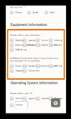
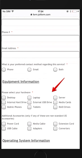
xagolabReplied on December 13, 2015 at 8:55 AM
it is slightly better. However here are some concerns still showing up on mobile device
1. my header image has approx. 10px of white space on the right side on mobile device
2. form is not centered on the mobile screen. has approx. 10px of white space on left side on the mobile device
3. some of my long worded check boxes are overlapping each other
Thanks
PS: I have increased the height to 2600px in the iFrame
-
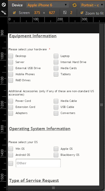
jonathanReplied on December 13, 2015 at 10:39 AM
Can you please take a screenshot also on how it currenly looks on your mobile device browser?
You can include the sceenshot again when you respond.
I currenlty do not have the necessary mobile device browser to test, but I used developer device emulator which is a proven useful tool.
Currenlty it looks fine already when I test again on your website.

We will wait for your updated response.
-
xagolabReplied on December 13, 2015 at 10:42 AM
What you show in your video screenshot is what I have too. You can see the margins on either side and text overlapping in some of the check boxes
-
jonathanReplied on December 13, 2015 at 11:14 AM
Thank you for pointing it out. I'll check on how to fix the issue with those multiple checkboxes text/label.
I'll get back to this shortly.
-
xagolabReplied on December 13, 2015 at 11:17 AM
By the way, by setting a height to xxxx px, I have blank space showing on my workstation. No blank space on mobile device.
I tried setting it to auto, but it was only showing first 2 lines of the form on workstation. Any way to fix that so that it looks more fit for workstation and mobile device?
Thanks
-
Kevin Support Team LeadReplied on December 13, 2015 at 11:32 AM
Hi,
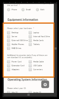
In regards to the text in the checkbox fields, is this issue what are you talking about ?
If so, you can fix it by adding the next CSS code in the Designer tool :
@media screen and (max-width: 480px)
.form-multiple-column[data-columncount="4"] .form-radio-item, .form-multiple-column[data-columncount="4"] .form-checkbox-item {
width: 50%;
}
Let me know if it helps you.
In regards to the blank space, I will work in order to fix it, I will get you back as soon as I have a way to do it.
Thanks.
-
jonathanReplied on December 13, 2015 at 11:34 AM
Hi,
How about just setting the spread column of the multiple chekboxes to just 3...
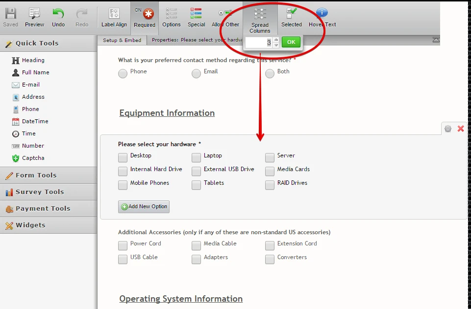
it works when I test it on both mobile and desktop browser.
this is an option you may want to try already.
My colleague was also checking for other solution as well.
Thanks.
-
xagolabReplied on December 13, 2015 at 11:47 AM
I did try setting it up for 3 columns. But as mentioned earlier, this will make the form look odd in bigger screen. It will look like the form is designed for small screen but viewing in desktop wide screen.
Ultimately I guess our goal is that the form is designed and bound by the content area (theme bound) of the site for workstations and it is supposed to be adaptable to any screen viewed on
-
xagolabReplied on December 13, 2015 at 11:55 AM
I think my CSS is all confused. Kevin_G: I added your CSS and it didn't help.
So here is what I have so far in my CSS and let me know which one to keep, which to delete, which to modify.
.form-all {
margin-left: 0px; margin-top: 0px !important;}.form-all {margin-top: -40px !important;}
.form-all {background: none;}#cid_64 span
.form-checkbox-item {width: 300px !important;}
@media only screen and (max-width: 40em){.form-submit-button, .form-submit-print, .form-submit-reset {display: block;}}
@media screen and (max-width: 480px).form-multiple-column[data-columncount="4"]
.form-radio-item, .form-multiple-column[data-columncount="4"] .form-checkbox-item {width: 50%;}
Thank you
-
David JotForm Support ManagerReplied on December 13, 2015 at 12:48 PM
Please remove the whole CSS code, and inject this one instead:
.form-all {
margin-left: 0px;
margin-top: 0px !important;
}
.form-all {
margin-top: -40px !important;
}
.form-all {
background: none;
}
#cid_64 span.form-checkbox-item {
width: 300px !important;
}
@media only screen and (max-width: 40em){
.form-submit-button, .form-submit-print, .form-submit-reset {
display: block;
}
}
@media only screen and (max-width: 480px) {
.form-checkbox-item {
width: 50% !important;
}
}
This is should fix the issue:
Here is my cloned version, you can test it: https://form.jotform.com/53465449351965?
When you apply the changes, if they don't reflect, try clearing your mobile browser's cache. Let us know if you need more help.
-
xagolabReplied on December 13, 2015 at 1:12 PM
OK. That worked. However, I have huge blank space after the form and before the footer in workstation browser ONLY. Mobile phone shows no blank space
Also the mobile phone view has cut off the SUBMIT and CLEAR button. Users cannot submit form from mobile phone
Thanks
-
David JotForm Support ManagerReplied on December 13, 2015 at 2:46 PM
That space is due to the height of your Iframe code:

Please reduce it, it seems like it's at 2500px, could you please try setting 2000px instead:

On regards of the form cutting off on mobile view, try one of these two solutions:
1) Add this CSS code in your page: http://www.xagolab.com/servicerequest/
<style type="text/css">
@media only screen and (max-width: 480px) {
iframe#JotFormIFrame{
height: 2550px !important;
}
}
</style>
This should be the result:

2) If by any chance solution one did not work, go to your Iframe embedded code, and edit the scrolling property, instead of "no", type "yes":

Let us know if you need more help, we will be glad to assist you.
-
xagolabReplied on December 13, 2015 at 3:04 PM
I used the SCROLLING to YES option because it was easier and I was already in my iFrame edit mode. I changed the height to 1800px and it works great
Having said so, everything works perfectly. No issues thus far.
So I have few questions that come to mind.
1. Do I need keep the "Mobile Responsive" widget on the form?
2. Do I say YES to "Responsive Form" in form Preferences?
3. Do I have to use iFrame or can I use the form shortcode for Wordpress?
4. What was the real and generic code that made the form responsive?
5. Can the true responsive code be updated in "Mobile Responsive" widget so that not just me using in the future but help others who may run into this problem in the future.
A widget that genuinely does responsive form will be ideal for all the users of JotForm making JotForm very versatile.
I sincerely thank you and everyone who participated in this thread in helping me solve this problem. My next challenge will be the other 2 forms that I have on my page to make it responsive going through steps discussed in this thread unless there will be a quick fix (drag/drop) option to come.
Thank you all....
-
Mike_G JotForm SupportReplied on December 13, 2015 at 4:58 PM
On behalf of my colleagues who worked with you with your concern, you are most welcome! All of it will not be possible if you didn't provide us the information necessary for us to solve your issue, so thank you also.
With regards to your other questions,
1. Do I need keep the "Mobile Responsive" widget on the form?
2. Do I say YES to "Responsive Form" in form Preferences?
I would suggest you keep the Mobile Responsive widget and Responsive Form enabled. Because the solution given to you above was made with it and was based with it being on your form. Removing those might cause another issue.
3. Do I have to use iFrame or can I use the form shortcode for Wordpress?
You can use either of the code, but we, base on experience, would prefer using the iframe code since it may prevent conflict between scripts on your websites and the scripts on your form.
4. What was the real and generic code that made the form responsive?
5. Can the true responsive code be updated in "Mobile Responsive" widget so that not just me using in the future but help others who may run into this problem in the future?
I believe there is no real generic code that you can use especially when you are embedding something from a different source to your website. The form itself without it being embedded on a website is mobile responsive in nature if "Mobile Responsive" widget is added or Responsive Form option is enabled as necessary. But since the form is embedded on a website, there might be a need for some tweaks particularly in CSS that needs to be done to match the style/format of the website where the form is embedded.
I understand that you still have two(2) forms that need to be formatted like the form from your Service Request page. Should you encounter any difficulties, or if you have any questions, please feel free to get back to us and we will be glad to help you anytime.
Cheers!
-
xagolabReplied on December 13, 2015 at 5:22 PM
I sincerely thank you all. Since the site is live and accessible to the public, I was very concerned to not break anything to hinder the business, especially the workstation side.
Prompt response and joint effort from everyone on timely basis had made everything possible.
I will keep everyone posted if I encounter any issues on the other 2 forms
Cheers!
-
jonathanReplied on December 13, 2015 at 6:32 PM
On behalf of my colleague, you are welcome! :)
Contact Us anytime should you require our assistance on JotForrm
Regards
-
xagolabReplied on December 13, 2015 at 11:22 PM
I have added somewhat similar codes on my other 2 forms and all worked just fine on Workstation and mobile device.
It's an achievement that wouldn't have been possible without JotForm's team effort.
Thanks again.
Should I design any future forms and have questions, I will look up to your team to help me solve minor or major issue, should I encounter any issue.
-
beril JotForm UI DeveloperReplied on December 14, 2015 at 9:23 AM
First of all, on behalf of all our colleagues involved, you are kindly welcome. :)
Thank you for your kind words. We really appreciate it and we're very excited to hear how beneficial it has been to you!
We are very glad to hear that the issue has been resolved for you.
If you require any further information, feel free to contact us. We are happy to help you whenever you need us.
- Templates
- Integrations
- INTEGRATIONS
- See 100+ integrations
- FEATURED INTEGRATIONS
 PayPal
- Slack
- Google Sheets
- Mailchimp
- Zoom
- Dropbox
- Google Calendar
- Hubspot
- Salesforce
- See more Integrations
- Products
- PRODUCTS
- Form Builder
- Jotform Enterprise
- Jotform Apps
- Store Builder
- Jotform Tables
- Jotform Inbox
- Jotform Mobile App
- Jotform Approvals
- Report Builder
- Smart PDF Forms
- PDF Editor
- Jotform Sign
- Jotform for Salesforce Discover Now
- Support


 May I request for you to embed your form using the iframe code to the Service request page so we can view if on the actual website.


