


-
adamclermanAsked on December 17, 2015 at 11:09 PM
I've tried for countless hours and tried multiple solutions I found that you provided others, but am not having any luck. My form looks to be of one size on jotform, but when I embed it on my website, it gets taller and the spacing gets bigger. An example can be found at http://www.phillyareaagent.com/purl/pg/formtestpage
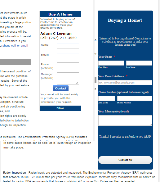
I wanted to replace the Zillow form I have at http://www.phillyareaagent.com/purl/pg/buyers but have had no luck replicating it (ideally, I'd like it to look the same, but cannot figure out how to only set background colors in certain places, and the main thing is the size which I would like to be comparable.
Thanks so much, I appreciate it!
-
SammyReplied on December 18, 2015 at 4:29 AM
The reason the form appears at it is is because the section occupied by it is narrower than when it is access via the direct link.
The form being responsive in nature resizes to accommodate the change in width.
A remedy will be to add the form in its own line on your page as opposed to positioning it beside the text.
-
adamclermanReplied on December 18, 2015 at 11:23 AM
Sorry, I'm not following, but I do want the form to be beside the text. I set the form width to the width of the space beside the text, but it is the height I am concerned about. I just took out the mobile responsive widget and I believe it looks slightly better, but there is still a lot of extra blank space above and below the header ("Buying a Home?") which does not appear in jotform itself (it is very tight). Is there a remedy to this? Thanks so much!
-
SammyReplied on December 18, 2015 at 12:48 PM
Kindly add the following CSS code to your form via the designer, this will adjust the margin of the header and the text below it respectively, you can tweak the values to suit you preferences.
#cid_24 {
margin-top: -20px;
padding: 0;
}
#id_29 {
margin-top: -40px;
padding: 0;
}
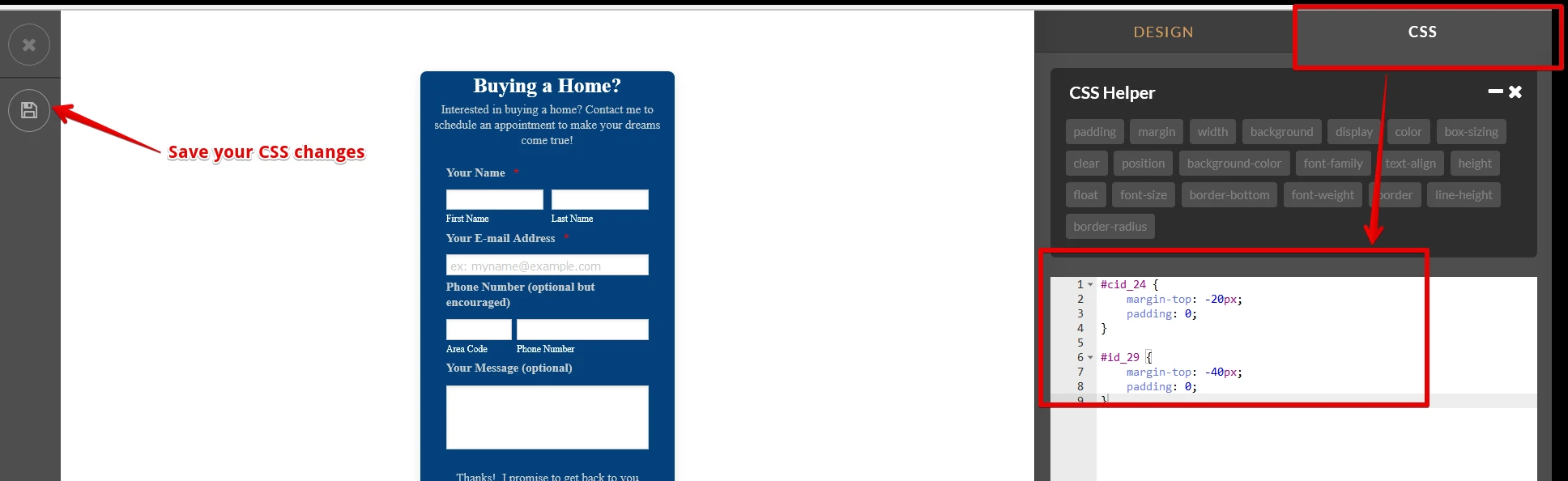
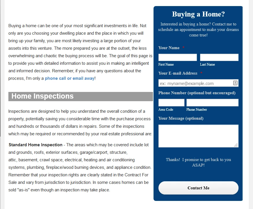
The resulting effect should be similar to this.
- Templates
- Integrations
- INTEGRATIONS
- See 100+ integrations
- FEATURED INTEGRATIONS
 PayPal
- Slack
- Google Sheets
- Mailchimp
- Zoom
- Dropbox
- Google Calendar
- Hubspot
- Salesforce
- See more Integrations
- Products
- PRODUCTS
- Form Builder
- Jotform Enterprise
- Jotform Apps
- Store Builder
- Jotform Tables
- Jotform Inbox
- Jotform Mobile App
- Jotform Approvals
- Report Builder
- Smart PDF Forms
- PDF Editor
- Jotform Sign
- Jotform for Salesforce Discover Now
- Support