


-
randavictorAsked on December 26, 2015 at 6:49 AM
How can i change the text fields attribute from text to tel?
as i want it to open the mobile number pad instead of the text pad.
knowing that the numb pad opens only when the type is set to "tel"
while i don't want the area prefix in the tel, I just want the text fields to open below numb. pad.
-
BorisReplied on December 26, 2015 at 8:54 AM
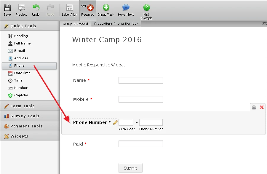
We do not have the option for changing the type attribute of a Text field into tel. However, our Phone field is automatically of type="tel", so it is best to collect phone numbers through our Phone field:
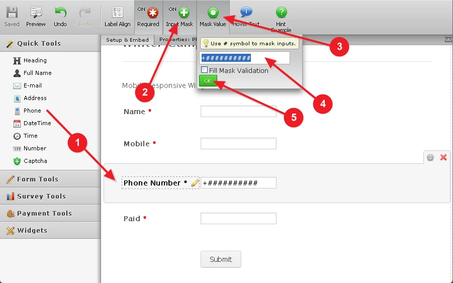
If you want the Phone field to have only a single input box, rather than two separate ones for area and phone numbers, you can achieve this by using an Input Mask on your Phone field:
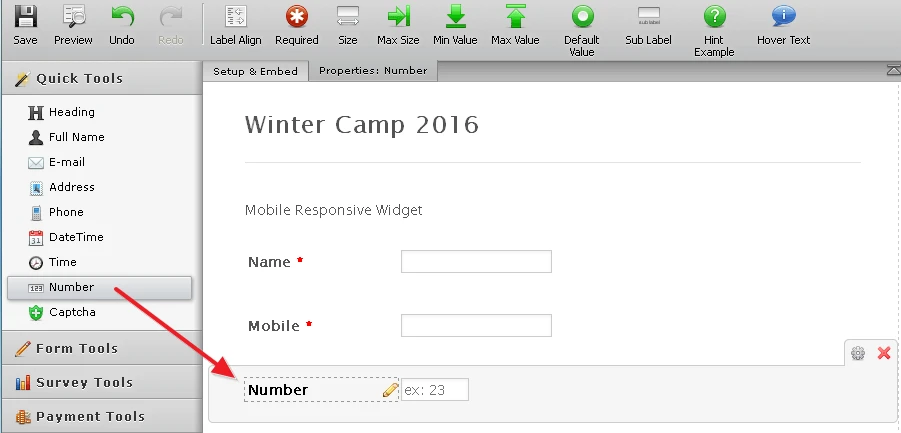
Alternatively to the above methods with type="tel", you can try using a type="number" field by adding a Number field to your form:
Please let us know how it goes, or if you need further assistance with setting it up, and we will be happy to help.
-
randavictorReplied on December 26, 2015 at 10:05 AM
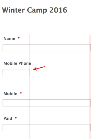
issue 1:
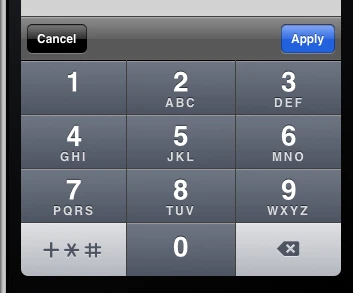
Making it as "number" = don't open the number pad keyboard. (in previous screenshot)
issue 2:
Making it as "Phone" prevent it from taking the full width in mobile view as below screenshot
(it's very important to have them all mobile friendly)
-
randavictorReplied on December 26, 2015 at 10:09 AM
Knowing that I already activated the responsive button to keep all fields aligned and responsive whatever the device size is.
-
BorisReplied on December 26, 2015 at 12:11 PM
I see what you mean by issue 2.
CSS that is making the Phone field mobile responsive with separate area and number fields, is actually limiting the size when only one (masked) field is used:

We can fix this easily by simply injecting a CSS code that will make sure that the phone field takes full width, when there are no separate area and number boxes. The CSS code we would inject is this:
@media only screen and (max-width:40em) {
[data-type="control_phone"] .form-sub-label-container:only-of-type {
width: 100% !important;
margin-right: 0 !important;
}
}You can inject CSS codes by opening your form in the Designer, and pasting the code at the bottom of the textbox under the CSS tab:

In your particular case, there seems to be an error in the existing custom CSS because a closing } brace of the @media query is not present. Before adding the above recommended code, please add one } brace at the end of your existing custom CSS, and then add the code recommended above.

Your CSS should end up looking like this:

And by saving those changes, your form would look mobile responsive:

I would additionally recommend that you change the Mask Value of your Mobile Phone field to at least 9 or 10 # signs - so that your users can enter a number that is 9 or 10 digits long.
If there is anything else we can help you with, please let us know, and we will be happy to do so. :)
-
randavictorReplied on December 26, 2015 at 12:22 PM
Yes!
This solved the problem , it worked just great!
Thank you.
-
jonathanReplied on December 26, 2015 at 3:17 PM
Thank you for the onfirmation that problem is solved.
Contact us again anytime if you need further assistance.
Regards
- Templates
- Integrations
- INTEGRATIONS
- See 100+ integrations
- FEATURED INTEGRATIONS
 PayPal
- Slack
- Google Sheets
- Mailchimp
- Zoom
- Dropbox
- Google Calendar
- Hubspot
- Salesforce
- See more Integrations
- Products
- PRODUCTS
- Form Builder
- Jotform Enterprise
- Jotform Apps
- Store Builder
- Jotform Tables
- Jotform Inbox
- Jotform Mobile App
- Jotform Approvals
- Report Builder
- Smart PDF Forms
- PDF Editor
- Jotform Sign
- Jotform for Salesforce Discover Now
- Support


