


-
SMDCAsked on February 2, 2016 at 4:44 PM
I have gone to Preference-General Settings and changed the form style to be responsive and I have gone into Designer and also checked the box to make the form responsive but my jotform does not appear to be responsive on a mobile phone.
Is there a way to fix this? This form is a clone of a previously responsive form that has only been updated with design details and current information. I have worked many hours on it and do not have time to start over because the form must go live tomorrow.
Please advise on how to make it look well on a mobile phone.
https://form.jotform.com/60243989173968
Thank you.
Jennifer
-
Elton Support Team LeadReplied on February 2, 2016 at 11:27 PM
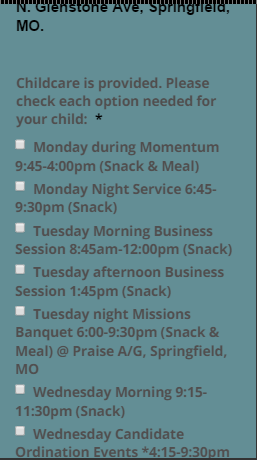
Your form appears to be rendering properly on mobile. It is mobile responsive except the radio button and checkbox text which does not wrap properly on mobile.
Please inject this CSS codes to your form, this should fixed it.
@media screen and (max-width: 480px){
.form-radio-item, .form-checkbox-item {
white-space: normal;
}
}
Guide: https://www.jotform.com/help/117-How-to-Inject-Custom-CSS-Codes (paste it at the bottom part)
Result:
-
SMDCReplied on February 3, 2016 at 11:45 AM
I entered the code as you instructed.
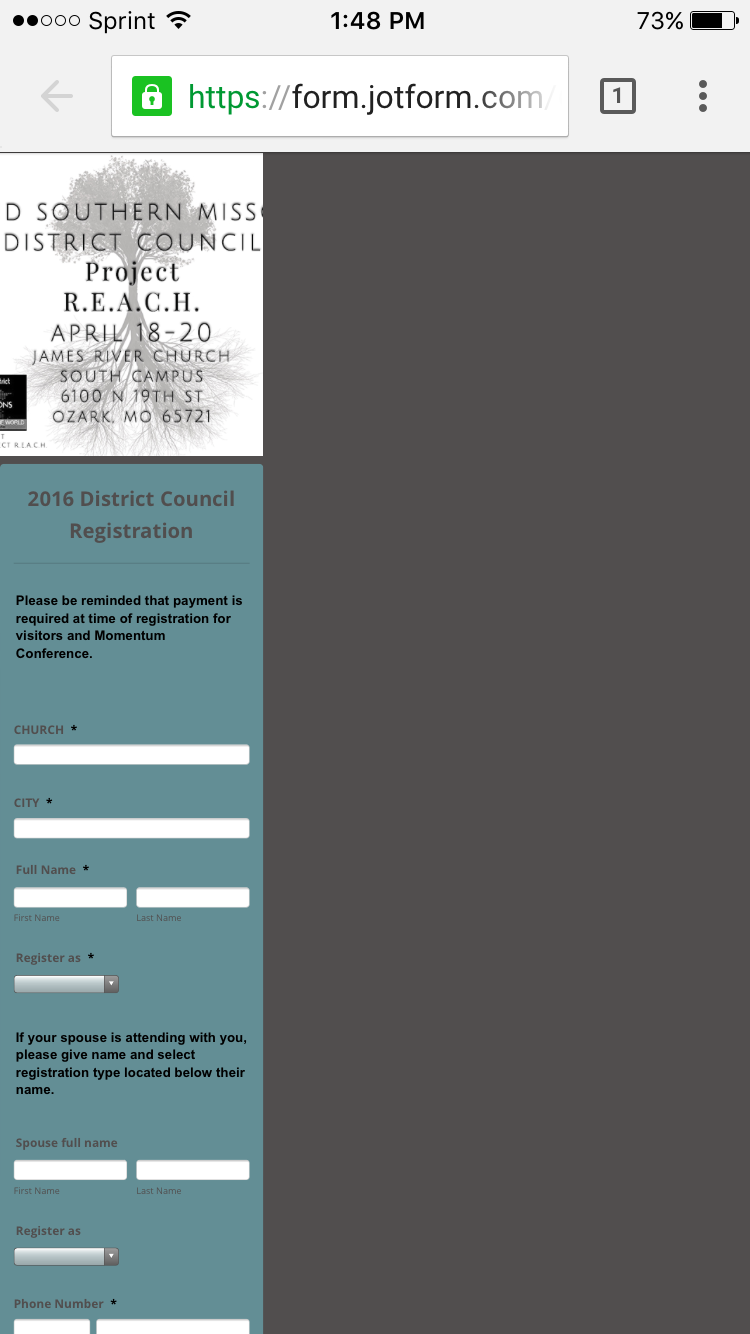
The form does not fill the phone portrait screen view. It's very skinny to the left. None of the text can be read.
How is this mobile friendly? How can I make it more viewer/user friendly?
Is there a setting too large?
Does the CSS code have a glitch?
Is the graphic above too large?
-
KadeJMReplied on February 3, 2016 at 1:53 PM
Please allow us some time to assist with rectifying this situation as I'm able to confirm that after viewing your form it is not yet displaying properly. We will respond as soon as we can with an update to help correct the problem.
Here is what I see now:
-
KadeJMReplied on February 3, 2016 at 2:10 PM
UPDATE - I believe I've found the problem and a fix.
Since you're using the Custom CSS to Make it fit Mobile more accurately all you need to do is DISABLE the Mobile Responsive Option in your Form Properties.
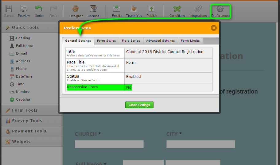
That in turn will give you a better result to fit mobile as seen below.

-
SMDCReplied on February 3, 2016 at 2:37 PM
That is much better. The actual form fits the screen. The header photo did not adjust to fit. Are there certain dimensions I should be following or is there a way to auto-adjust when opening on a phone? See comparison between first photo of phone screenshot and second photo of PC screenshot.


-
Welvin Support Team LeadReplied on February 3, 2016 at 5:19 PM
Please try injecting the following custom CSS codes to your form:
.form-all::before {
background-size: contain !important;
}
Or
.form-all::before {
background-size: 100% !important;
}
Here's how to inject: http://www.jotform.com/help/117-How-to-Inject-Custom-CSS-Codes.
-
SMDCReplied on February 4, 2016 at 1:39 PM
Definitely, that code has the form looking much better. There is little gap between the image and the text of the form but I can work with that unless you have a fix for that.

-
Kevin Support Team LeadReplied on February 4, 2016 at 3:53 PM
Inject this CSS code:
@media screen and (max-width: 480px){
.form-all::before {
top: -250px;
}
.supernova .form-all{
margin-top: 260px;
}
}
It will display the form properly on mobile devices.

-
SMDCReplied on February 5, 2016 at 4:31 PM
Yes, that worked. Thank you very much!!!
-
Kevin Support Team LeadReplied on February 5, 2016 at 5:56 PM
Great to know that and you're welcome.
Do not hesitate to contact us if you need more help, we will be happy to assist you.
- Templates
- Integrations
- INTEGRATIONS
- See 100+ integrations
- FEATURED INTEGRATIONS
 PayPal
- Slack
- Google Sheets
- Mailchimp
- Zoom
- Dropbox
- Google Calendar
- Hubspot
- Salesforce
- See more Integrations
- Products
- PRODUCTS
- Form Builder
- Jotform Enterprise
- Jotform Apps
- Store Builder
- Jotform Tables
- Jotform Inbox
- Jotform Mobile App
- Jotform Approvals
- Report Builder
- Smart PDF Forms
- PDF Editor
- Jotform Sign
- Jotform for Salesforce Discover Now
- Support


