


-
Esther17Asked on February 10, 2016 at 4:55 AM
Hi there,
I've created a simple one box and button form for subscribing to an email newsletter and on a computer it looks great, but on my iphone, it's moved up a lot, on a ipad the button goes underneath instead of on the right, on a kindle fire, the button moves a bit out of place as well.
Any way to fix this? The link is: www.ekdesigns.co.uk/pvh (it's at the bottom just before the footer).
Thanks!
Esther.
-
CharlieReplied on February 10, 2016 at 9:35 AM
I checked your website, I noticed that the website itself is not mobile responsive. It has a desktop like layout even when viewed on mobile devices.
Here's how it looks like in my end:
In an iPhone 5 emulator

In an iPad 2

In Amazon Kindle Fire

If this is how you would like your website to be viewed, then you can try using the iFrame embed code instead. Here's a guide that you can refer to: http://www.jotform.com/help/148-Getting-the-Form-iFrame-Code
Let us know if that works.
-
Esther17Replied on February 10, 2016 at 11:46 AM
Thanks for your response. I changed the code to iframe and made the html fragment a bit bigger but it's still the same on the ipad and my phone.. on the kindle the button is just slightly lower than the box which isn't a big deal.. I would however like the phone and ipad to look okay.. is there a way?
Thanks!
-
CharlieReplied on February 10, 2016 at 1:48 PM
Unfortunately, it's quite hard to troubleshoot this one as it seems to be more related on how your website's design interprets or adjust the element that is holding the embed code.
I noticed that the fragments seems to have an absolute positioning, I believe the browsers are making some adjustments as it is basing the position of the elements on a device that has a smaller resolution. That is one reason. I'm not sure if you are using a website builder or manually changing the website code.
I'll try to investigate this further, I'm having problems on trying to recreate your website in my end so that I can test my changes.
-
CharlieReplied on February 10, 2016 at 2:13 PM
I presume you want the text box and the submit button side by side, is that correct?
You can use this custom CSS code:
#id_1 {
width: 60% !important;
}
#id_2 {
width: 40% !important;
}
Also, add a width on your form-submit-button element in your existing CSS code.
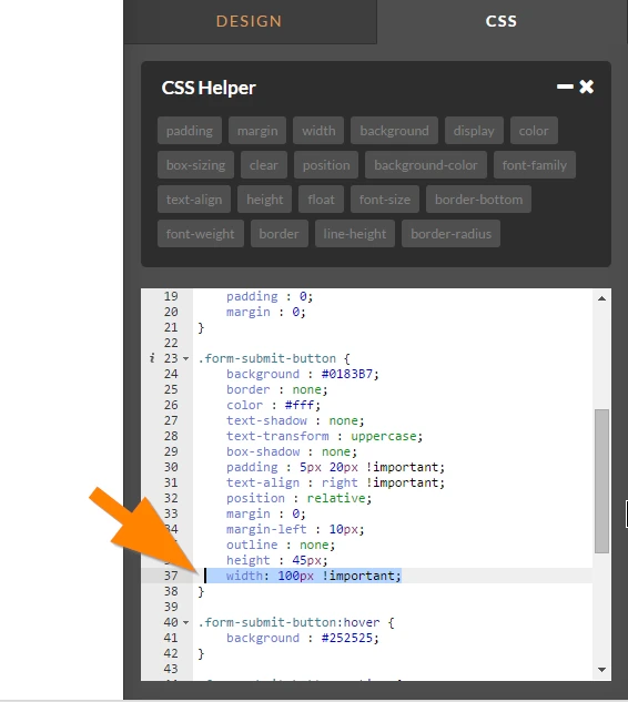
Set the width on the form-submit-button to 100px.
After that, the reason why the form is moving up is that the element <div id="frag_3"> position is set to absolute, and the top value is 1481px. When viewed on a mobile device, it is quite short, you can increase it to 1500px. That should align it properly. This is how it looks like when the "top" value in that element is adjusted:

However, please note that the elements are in px, the positioning of the elements may differ depending on the resolution and display to where it is being viewed. Usually, instead of using absolute and "px", the use of "relative" and % is much more common to make sure that the layout are proportionate. Others use tables to make sure that the elements will position as they should be regardless of the device. For now, I can only recommend checking the formatting of your layout and see how you can fixate the element for the form.
I hope that helps.
-
Esther17Replied on February 10, 2016 at 2:53 PM
Hi there,
Thanks for your help! I added the code you suggested and it corrected the button issue on the ipad.. however, by moving the html fragment down to make 1500 px at the top, makes the correct ones like on the computer and kindle too far down so I don't suppose there's another way of writing the code that would make it the same on all devices?
Thanks!
-
BorisReplied on February 10, 2016 at 4:47 PM
As my colleague noticed above, the issue is actually with the fragment element that is holding the form. It is unfortunately something that should be fixed on the side of your website, and can't be fixed from JotForm's end.
If you are able to add custom CSS to your website, you can actually specify different CSS for your elements on different screen resolutions, by using @media queries:
http://www.w3schools.com/css/css_rwd_mediaqueries.asp
This allows you to have different top positions for #frag_3 element on various screen resolutions, for example:
@media only screen and (min-device-width : 768px) and (max-device-width : 1024px){
#frag_3 { top: 1500px !important; }
}The above CSS code would target only iPads, and force the fragment to have "top" position of 1500 pixels only on iPads. As your website is not made to be mobile responsive, you will have to create CSS codes such as the above manually for different screen sizes and resolutions.
I hope this helps.
-
Esther17Replied on February 20, 2016 at 5:34 AM
Sorry for a late reply - I was waiting on my software's company to help me figure out where the code went, but I managed (after no reply from them) to figure it out myself! Thank you very much, it worked perfectly!
-
BorisReplied on February 20, 2016 at 6:38 AM
You are most welcome, we are happy to hear that you've managed to resolve the issue. :)
If there is anything else we can help you with, please let us know by simply opening a new support thread, and we will be there to assist you.
- Templates
- Integrations
- INTEGRATIONS
- See 100+ integrations
- FEATURED INTEGRATIONS
 PayPal
- Slack
- Google Sheets
- Mailchimp
- Zoom
- Dropbox
- Google Calendar
- Hubspot
- Salesforce
- See more Integrations
- Products
- PRODUCTS
- Form Builder
- Jotform Enterprise
- Jotform Apps
- Store Builder
- Jotform Tables
- Jotform Inbox
- Jotform Mobile App
- Jotform Approvals
- Report Builder
- Smart PDF Forms
- PDF Editor
- Jotform Sign
- Jotform for Salesforce Discover Now
- Support


