


-
peturrpAsked on March 1, 2016 at 6:07 AM
Hi,
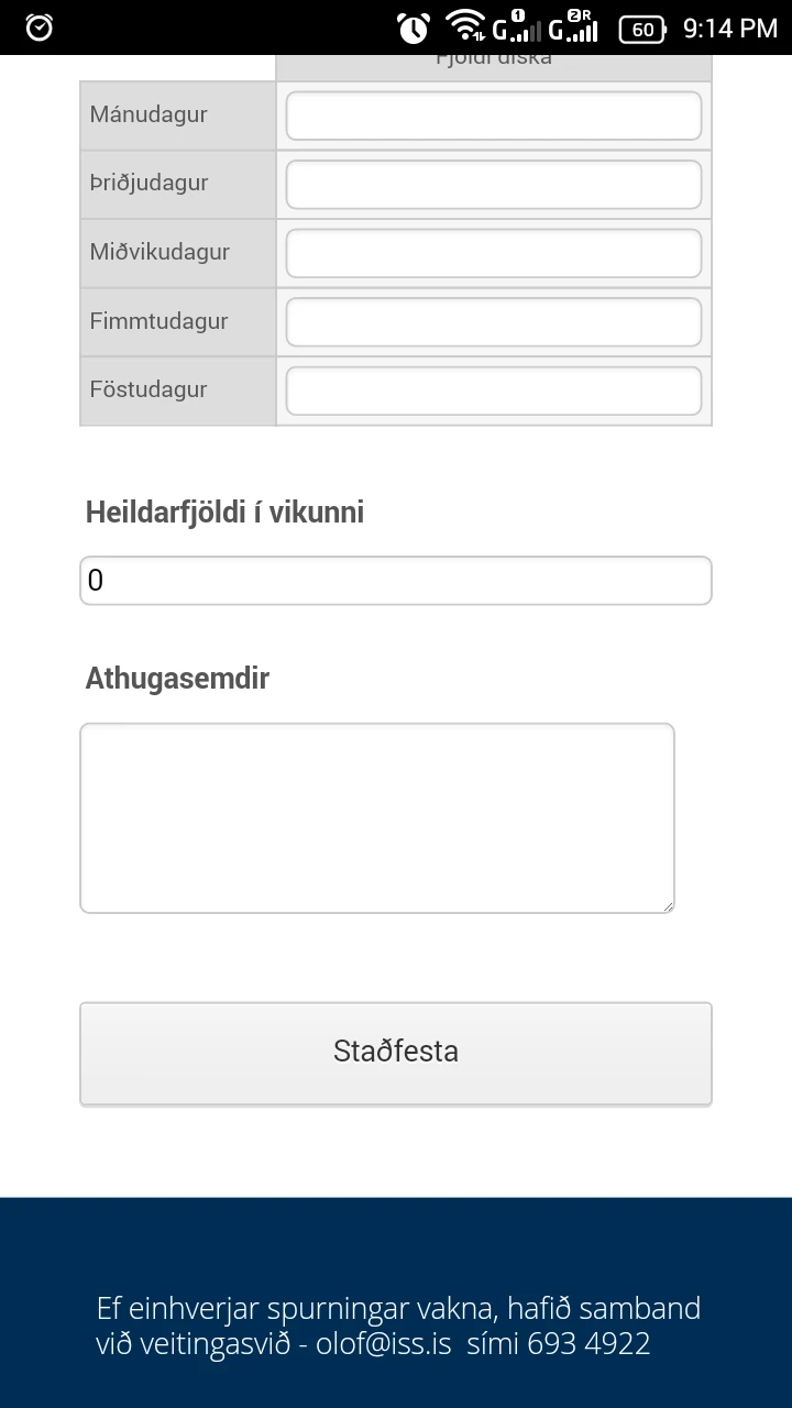
I have this form in an responsive Adobe Muse.
http://diskatalning.iss.proa.is/borgarholtssk%C3%B3li.html
It disappear when viewed on an mobile device. Disappear around 600px in Chrome.
I see it shrink down in Adobe Muse all the way down to 320 px but not in browser.
Pls. advice.
Reg.
Petur
-
CharlieReplied on March 1, 2016 at 8:25 AM
I checked your website in an Android Kitkat 4.4 device and on a iPhone 6 iOS 9, and it is not cut off in my end.
Android device Kitkat 4.4.4.
Here's my test in iPhone 6.

I presume your users are being redirected on the phone version of the website, is that correct? If it is being cut off, you'll probably need to adjust the height of the parent element holding the embed code, that should display the cut off part of the form.
Let us know if you are still having problems on this.
-
peturrpReplied on March 1, 2016 at 8:40 AM
Hi,
Sorry, I had to change this to static/unresponsive version.
But here is the responsive.
http://dtalning.responsive.proa.is/borgarholtssk%C3%B3li.html
Does not work below 600 something px.
Reg.
Petur
-
CharlieReplied on March 1, 2016 at 10:00 AM
Unfortunately, this seems to be more related to your actual website and not on the form. Please check the parent elements to where the form is nested, and the CSS code and scripts that is associated with the responsiveness of the website.
It seems like the content is being displayed "none" or moved at the back when the screen width size is less than 600px.
You can also try re-embedding the form using the iFrame embed code that we have, you can get that code by following this guide: http://www.jotform.com/help/148-Getting-the-Form-iFrame-Code. See if you'll get the same results if you used the iFrame embed code.
We'll wait for your response.
- Templates
- Integrations
- INTEGRATIONS
- See 100+ integrations
- FEATURED INTEGRATIONS
 PayPal
- Slack
- Google Sheets
- Mailchimp
- Zoom
- Dropbox
- Google Calendar
- Hubspot
- Salesforce
- See more Integrations
- Products
- PRODUCTS
- Form Builder
- Jotform Enterprise
- Jotform Apps
- Store Builder
- Jotform Tables
- Jotform Inbox
- Jotform Mobile App
- Jotform Approvals
- Report Builder
- Smart PDF Forms
- PDF Editor
- Jotform Sign
- Jotform for Salesforce Discover Now
- Support


