


-
kranaiAsked on March 3, 2016 at 1:51 PM
Hi
Re: Insight Axadmeny Contact Form for Mobile
No issues of contact form in desktop view...but below are issues when viewing on mobile.
I have injected code fr mobile friendly that your friend gave for another form. I have set responsive in designer and builder. Below are areas I need to sort out:
You can see the desktop version at www.insight-acad and reduce width of browser you can see the mobile versio1. Why is each in mobile version the input boxes get wider?
2. look at my submit and Reset buttons both fields have stretched to occupy full length of the mobile screen width. I need to reduce the size as seen in the desktop version.
3.I need to reduce the input email text field ...at the moment full stretch 0f mobile width...
4 adjust the first name and second name fields as cell (need to get approval for this activity)
rgds
kish
-
David JotForm SupportReplied on March 3, 2016 at 3:40 PM
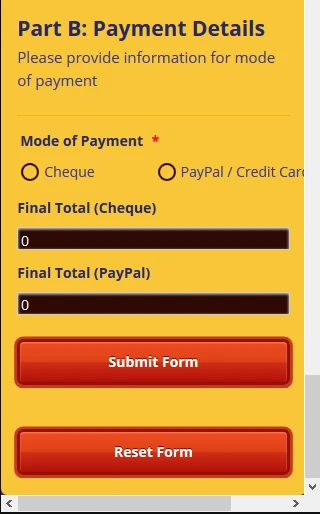
In the mobile CSS, the field widths are set to 100% of the width of the device. It is done so that each field is on its own line and is fully visible on smaller devices. The same goes for the submit and reset buttons. Here is how your form looks on mobile for me:
If you were to put the submit and reset buttons next to each other, which is possible, they were be much smaller and squished together.
If you would like to do so, the mobile code would be:
@media only screen and (max-width: 480px){
.form-submit-reset {
max-width : 40%;
}
}
@media only screen and (max-width: 480px){
.form-submit-button {
max-width : 40%;
}
}
@media only screen and (max-width: 480px){
#id_4 {
max-width : 50%;
}
}You can adjust the size of both buttons. The third ID will adjust the width of the email field. Here is my test form with the CSS added:
-
kranaiReplied on March 3, 2016 at 9:04 PM
Hi
This query is on the Insight Academy Contact Form
I inserted the code you gave in the form...I feel having both buttons (submit and reset) on the same line looks much better.
As for the third line to adjust email field did not work correctly...can you check...
Also can you also give me the css code for prefix, first name and second name of "Your Name" field.
I wamt to adjust them so that it looks neat in the mobile version at the moment the prefix too long and first name and second name field squash together.
Also u notice that in the mobile for the telephone the hypen (-) is forced into the next line should be on the same line as area code and phone number.
thanks
kish
-
Ashwin JotForm SupportReplied on March 4, 2016 at 1:41 AM
Hello Kish,
I have injected the following custom css code in your form and that seems to have fixed the phone number field issue:
@media only screen and (max-width: 480px){
#id_4 {
max-width : 30%;
}div#cid_19 {
max-width : 50%;
}#input_19_area {
width : 82%;
}}
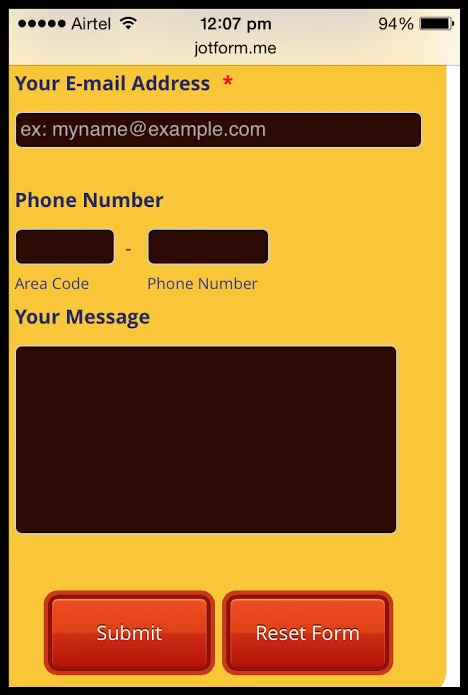
Rest of the form field along with the submit & reset button is being displayed correctly in mobile device. Please check the screenshot below:
Hope this helps.
Do get back to us if you need any other changes.
Thank you!
-
kranaiReplied on March 4, 2016 at 2:12 AM
Hi Ashwin
Thanks for the update...you only have solved one of my queries. Please read email again above where I also for the mobile display
I asked to
1. reduce the email field
2. need to adjust the prefix, first and second name fields
If u can give me the code I will adjust the width accordingly ...
rgds
kish
-
BJoannaReplied on March 4, 2016 at 5:05 AM
To reduce the size of email filed on mobile devices, please add this CSS code:
@media only screen and (max-width: 480px){
#input_16 {
max-width : 80%!important;
}
}
After you add this code you form will look like this on mobile devices.

Full name filed is in one line. I am not sure how you want to adjust Prefix field. If you want that Prefix field looks like this,

please add this code:
@media only screen and (max-width: 480px){
input#prefix_15 {
width: 115%!important;
}
}
here is my cloned form where I addeddd mentioned CSS code: https://form.jotform.com/60632468203956
If I did not understood you correctly, please explain in more details how would you like to adjust Prefix field. If possible provide us a screenshot.
Hope this will help. Let us know if you need further assistance.
-
kranaiReplied on March 4, 2016 at 5:34 AM
Hi
I inserted the email code I cannot see the change the width is the same.
As for the name field
I want the pre-fix field to be the smallest compared to the first and second name field. As the pre-fix will only have max 4 characters (Mr, Ms, Miss, Mrs, Dr Prof) as long we can see max 5 characters that will fine. Then adjust the first name and second name t have of equal width .
The form u shod be changing should be: Insight Academy Feedback Form
-
mert JotForm UI DeveloperReplied on March 4, 2016 at 8:24 AM
To reduce the width of the email on mobile platforms, you can adjust "max-width" value (on red marked area) like the following:
@media only screen and (max-width: 480px){
#input_16 {
max-width : 50%!important;
}
}
After applying this, the preview will be like the below on mobile devices:

To shrink the size of the "Prefix" you need to get the source code of your form, because we need to do some actions on its HTML. After getting it, search the keyword "prefix_15" (green marked area) in it, then add the rule "font-size:8px" (blue marked area) like the below:
<label class="form-sub-label" for="prefix_15" id="sublabel_prefix" style="min-height: 13px; font-size:8px"> Prefix </label>
Please, see the results from the below:

For setting the max length for "Prefix", we need to modify the HTML again. By adding the "maxlength="5"", we can easily achieve this. Again, search the keyword "q15_yourName[prefix]" (green marked area) in it, then add the rule "maxlength="5"" (blue marked area) like the below:
<input class="form-textbox" type="text" name="q15_yourName[prefix]" size="4" id="prefix_15" maxlength="5">
For further assistance, please do let us know.
Thanks.
-
kranaiReplied on March 4, 2016 at 8:48 PM
Hi Mert
I think I am getting instructions from many different support people each not knowing the chain of events. So let me start fresh here. I have not included the change shown above I want to make sure this is right for the right form.
For Insight-Academy Contact Form:
I only need 2 things to be done: If you view the form from a mobile (www.insight-acad.com) you will notice there is a gap between the prefix and first name after injecting some CSS code to correct the prefix field.
So the prefix field is okay perfect no changes required here.
Now I only need to to adjust the first name and last name fields so that it takes the gap have both field of equal size so that the gap is used up. Don't forget to have a small gap between the first name and last name,
No change for email field, no change for phone number and no change message and submit and reset buttons.
Please take the correct form as stated above.
thanks
kish
-
Ashwin JotForm SupportReplied on March 5, 2016 at 2:01 AM
Hello Kish,
Sorry for the confusion.
That means actually you only have one requirement i.e. remove the space between the prefix and first name field.
Please inject the following custom css code in your form and that should solve your problem:
@media only screen and (max-width: 480px){
[data-type="control_fullname"] .form-sub-label-container:first-child {
margin-right: -18% !important;
}
}
Do get back to us if you need any other change.
Thank you!
-
kranaiReplied on March 5, 2016 at 10:06 AM
Hi Ashwin
re: For Insight-Academy Contact Form:
All looks nice now...just the way I want on the mobile.
Last issue when I tested to submit a test message using the form the end part when you see the thank you message on the screen causes the view on the mobile to shift to right and look like it is not conforming to the 480px width...and it stays that way unit I refresh the screen.
Can u please test by sending a message on your mobile...and see/watch what happens at the tail-end. Need to correct that part ...then I am finish with this form.
thanks
kish
-
Ashwin JotForm SupportReplied on March 5, 2016 at 1:44 PM
Hello kish,
I am not sure if I have understood your question correctly. I did send a test submission in your form and the thank you message is displayed correctly. Please check the screenshot below:

I would suggest you to please share a screenshot of the issue you see in your mobile device and we will take a look. The following guide should help you how to upload image in forum post: http://www.jotform.com/answers/277033
We will wait for your response.
Thank you!
-
kranaiReplied on March 6, 2016 at 12:31 PM
Hi Ashwin
re: For Insight-Academy Contact Form:
Yes you are right it works as you mentioned and I also now see the same view as your screen shot.
My question now is..after you see this Thank You Message...it remains in this view...dont we need to get back form view again....at the moment the only way I can do this if do a refresh of the page.
Is there a better way the this...may be display this message for 30secs and return the form view?? is this possible???
Appreciate your help
rgds
kish
-
Ashwin JotForm SupportReplied on March 6, 2016 at 1:24 PM
Hello Kish,
We cannot answer multiple questions in one thread. As your latest question is a new topic, I have moved it to a new thread and you will be answered here: http://www.jotform.com/answers/788428
Thank you!
- Templates
- Integrations
- INTEGRATIONS
- See 100+ integrations
- FEATURED INTEGRATIONS
 PayPal
- Slack
- Google Sheets
- Mailchimp
- Zoom
- Dropbox
- Google Calendar
- Hubspot
- Salesforce
- See more Integrations
- Products
- PRODUCTS
- Form Builder
- Jotform Enterprise
- Jotform Apps
- Store Builder
- Jotform Tables
- Jotform Inbox
- Jotform Mobile App
- Jotform Approvals
- Report Builder
- Smart PDF Forms
- PDF Editor
- Jotform Sign
- Jotform for Salesforce Discover Now
- Support


