


-
kranaiAsked on March 4, 2016 at 10:11 PM
Hi
I am starting a new thread specifically for this form titled "Insight Academy Registration Form".
There is no changes required in the normal view all changes required are for the Mobile view.
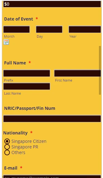
So if you were to look at the form from the Designer preview for Mobile device you will notice that most of my fields are either stretched too long, or some overflowing two lines, or some cannot be viewed with the 480px width screen of a mobile device.
All I want is to ensure the whole form to be presentable when viewed using mobile device.
Thanks
kish
-
Chriistian Jotform SupportReplied on March 5, 2016 at 3:07 AM
I checked your form and it appears to be mobile responsive.

However, I did notice that the first label for Nationality and Dietary Requirements overlap.


To fix the issue, simply inject this custom CSS:
#label_input_21_1::before, #label_input_21_2::before {
margin-left: 20px;
}
label#label_input_21_1, label#label_input_21_2 {
padding-left: 20px;
}
#label_input_16_1::before, #label_input_16_2::before {
margin-left: 28px;
}
label#label_input_16_1, label#label_input_16_2 {
padding-left: 28px;
}
Here's a guide on how to inject css: How to Inject Custom CSS Codes
Here's how the radio buttons should appear after:


You can check out the demo form where I tested the css by following this link: https://form.jotform.com/60641232159955
If you need further assistance, do let us know.
-
kranaiReplied on March 5, 2016 at 11:03 AM
Hi
ReL Insight Academy Registration Form
First of all I am aware it is in Mobile Responsive mode as I set it. What I request was that the appearance is not the same as the desktop view and I want to make it same as near as possible.
I do not see what you are seeing based on your animation above . When I preview using Designer for Mobile device I see the following:

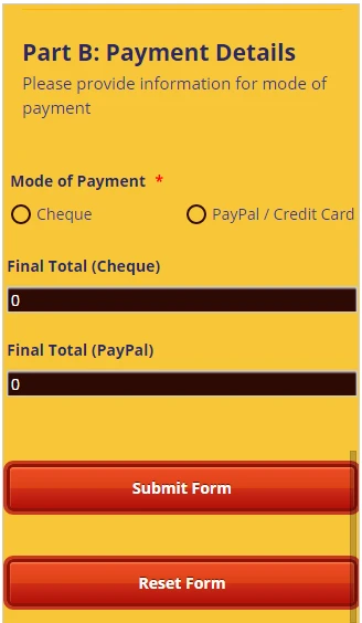
You can see from above u are NOT able to see the full page I have scroll horizontally to that.

Look at the submit button totally wrapped. Also notice Dietary requirements still overlapping despite injecting the CSS code you gave. Same for the Nationality see below

What I want is to get the above problems corrected AND the following:
I want to reduce the following input fields size: At the moment most of these fields are spanning the width of the screen (480px) as I assume these are set at 100%. I want to adjust them until it looks presentable.
You only need to send me the css code with recommended values and I will play around with the number till I am happy.
The following fields I need to adjust need their CSS code: Please test and see if it works first
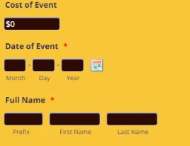
1. cost of event
2. NRIC Passport
3. email
4. Phone number fields
5 Designation
6 Department
7 Final Total (Cheque)
8 Final Total (PayPal)
9 Final Cost Workshop (select PayPal and u will see this field)
Thanks alot
Rgds
Kish
-
jonathanReplied on March 5, 2016 at 9:08 PM
The mobile responsive preview tool in the Form Designer is a very generic and simplified tool.
You cannot really depend on it as your basis on how the form really would behave on actual mobile browser.
I suggest you test them instead on actual mobile browser, or use emulators that were specifically designed to test mobile browsers.
I test your jotform http://www.jotform.me/form/60454628430453 on Iphone browser emulator and this is how it looks.

From what I have observed so far, the form have accomodated and was able to properly respond to the mobile browser. Non of the fields were overlapping or being cut-off when viewed in the browser.
Please test/check your form on any actual mobile device browser you can test it on so that you will be able to properly assess how the form is actually working when using mobile.
Thanks.
-
kranaiReplied on March 6, 2016 at 1:06 PM
Hi Johnathan
Okay when I viewed using my mobile I see what you are seeing. However I still want to reduce some of the fields on the mobile view.
I want to reduce the following input fields size: At the moment most of these fields are spanning the width of the screen (480px) as I assume these are set at 100%. I want to adjust them until it looks presentable.
You only need to send me the css code with recommended values and I will play around with the number till I am happy.
The following fields I need to adjust need their CSS code: Please test and see if it works first
1. cost of event
2. NRIC Passport
3. email
4. Phone number fields
5 Designation
6 Department
7 Final Total (Cheque)
8 Final Total (PayPal)
9 Final Cost Workshop (select PayPal and u will see this field)
10 Company name
11. Contact Person (HR/Finance)
Thanks a lot. Appreciate your help.
Rgds
Kish
-
jonathanReplied on March 6, 2016 at 4:23 PM
I checked again your jotform http://www.jotform.me/form/60454628430453 and I see that there were already existing custom CSS codes for @media that adressess most of the fields you mentioned.

From I get on this thread, the only custom CSS that was mentioned was for the labels only.
Did you add the @media 480 CSS to your form?
We need to clafiry if there was previous purpose for the additions of these CSS codes, or we can just remove them to tidy up the codes.
-
kranaiReplied on March 6, 2016 at 8:57 PM
Hi Johnathan
Re: Insight Academy Registration Form
There maybe some request before for @media 480 CSS. I can't remember. Anyway please tidy up the code...BUT do not change anything from my current desktop view. As it is seen from the desktop the form is perfect no changes required at the moment.
The only changes that I request was always of the form view on a mobile device.
Can you please tidy the code to have one header for the @media screen...for the mobile and have all the changes with regard to mobile within this block.
Please let me know the CSS code you have included for all the fields I mentioned above with some initial recommended values. Then I will adjust the values further to my satisfaction from my end.
So those code pertaining to my desktop view please DO NOT remove them...those pertaining to mobile view please re-arrange and tidy it up together with the additional codes you will giving.
Thanks alot
Best Rgds
Kish
-
Chriistian Jotform SupportReplied on March 6, 2016 at 10:23 PM
Here's the code for the fields that you listed.
@media screen and (max-width: 480px){
#input_32 { /*cost of event*/
width: 300px;
}
#input_17{ /*NRIC passport*/
width: 300px;
}
#input_4{ /*email*/
width: 300px;
}
#input_6_country{ /*phone number*/
width: 90px;
}
#input_6_area{ /*phone number*/
width: 90px;
}
#input_6_phone{ /*phone number*/
width: 90px;
}
#input_19{ /*designation*/
width: 300px;
}
#input_20{ /*department*/
width: 300px;
}
#input_39{ /*Final Total cheque*/
width: 300px;
}
#input_40{ /*Final Total cheque*/
width: 300px;
}
#input_33_donation{ /*Final Cost*/
width:90px;
}
#input_26{ /*Company Name*/
width:300px;
}
#input_30{ /*Contact Person*/
width:300px;
}
}
You can change the value of the highlighted code to adjust the width of the field to your preference. Simply inject this css to your form by following this guide: How to Inject Custom CSS Codes
If you need further assistance, do let us know.
-
kranaiReplied on March 6, 2016 at 11:57 PM
Hi
Re: Insight Academy Registration Form
Johnathan said he will tidy up the code in my current form before inserting the new code as he felt there might be redundant css code.
Can u let me know which codes for the MOBILE view I can delete in the current form before inserting the code you gave me above.
I await your reply injecting the above code.
rgds
kish
-
Chriistian Jotform SupportReplied on March 7, 2016 at 1:27 AM
I checked the css code and I can see that they are required for the appearance of the form. For your convenience, I have tidied up the css code for mobile in your form so you don't need to delete anything. Inserting the new code that I provided should not affect the other css code for mobile that is already there.

Do let us know how it goes.
Cheers. -
kranaiReplied on March 7, 2016 at 2:31 AM
Hi
Great manage to change all the fields mentioned...there still some more I need
1. Seminar/Workshop title
2. Cheque Number (select Cheque potion and u will see this field )
3. Date of event ...the hypen (-) is forced into the next line this needs correcting
In addition, if you try and select any of the button options (which has 3 options) you will notice that second and third selections don't display at the right place. This applies for BOTH the desktop and Mobile view. So when u send code please let me know which is for desktop and which is for mobile. The buttons with 3 options that are giving problems are Nationality, and Dietary Requirements,
Lastly clarification input_39 and input_40 have the same description above in your email..need to differentiate them one should be Final Total (Cheque) and one should be Final Total (PayPal)
Thanks
kish
-
Chriistian Jotform SupportReplied on March 7, 2016 at 4:06 AM
This code should fix the issue with the buttons in Nationality and Dietary Requirements. This code applies for both desktop and mobile.
#label_input_21_1::after, #label_input_21_2::after {
margin-left : 20px;
}
#label_input_16_1::after, #label_input_16_2::after {
margin-left : 28px;
}
The following code is for mobile and should be inserted inside the @media screen and (max-width: 480px){....} css code.
#input_14{ /* seminar workshop title */
width: 300px;
}
#input_28{ /* cheque number*/
width: 300px;
}
Remove the previous css code for #input_40 and replace it with this one.
#input_40{ /*Final Total paypal*/
width: 300px;
}
-
kranaiReplied on March 7, 2016 at 5:08 AM
Hi Christian
Re: Re: Insight Academy Registration Form
Thanks again for the additional codes...okay the Radio buttons are working okay.
However I tried reducing Seminar Workshop width to 200px ...no effect ...wondering if you got the input number correct?
You have not answered item 3 from above Date of event ...the hypen (-) is forced into the next line this needs correcting
Now I need to changes to the Full name:
I want to reduce the prefix just to hold 6 characters and then space created by this reduction to be evenly distributed between first and last name. Don't forget we still need the small gap between first name and last name. Also do not extend the current length of Full name from what it is now.
For Phone Number
need to shift area code left just before the hypen then similarly shift the phone number to the left
Lastly when u select Cheque as mode of payment you will notice there is a block text that appear at the bottom. Only issue is how to get the 3 lines of address centralised as it shown in the desktop view?
Sorry about asking a lot of questions..I am doing step by step so that we don't get confused on what is needed. We are almost there....Appreciate your help esp with your comment fields included..this way I know exactly what to change...this is a very useful addition u have included...
The above are 5 items to be looked at.
Rgds
Kisg
-
KadeJMReplied on March 7, 2016 at 10:02 AM
Thank you for your feedback about this. Mobile can be a bit finicky more often than not requiring several adjustments here and there to get it just right.
We will look into assisting you with this furthermore which will take some additional time and then we will respond to you again later as soon as we are able and have something more.
-
kranaiReplied on March 7, 2016 at 1:49 PM
Hi Christian
Any update on the above request made on 7th March at 05:08 AM? Appreciate your kind reply
rgds
kish
-
HubersonReplied on March 7, 2016 at 4:46 PM
Hello,
Can you please try adding the 'Mobile Responsive' Widget to your form and see if it do the job for you. You might also need to comment out the custom CSS for mobile view to test the Widget on your form.
-
HubersonReplied on March 8, 2016 at 1:10 PM
Hello Kish,
The problem with your form is that it contains a lot of custom CSS conflicts. Even if we were able to provide some custom code it would be difficult to get accurately what you need.
I have made two clones of your form, one with the 'Mobile Responsive' Widget (no custom Code) and another with the CSS code already added to the form with some tweaks. Also I commented out the block of code that are repeating or causing the form to display improperly.
Clone with Mobile Responsive WIDGET
I have tested both form on Android and IPhone and they display perfectly.
One of the most important aspect in Responsive Web Design is consistency, I can tell you personally I do not notice any inconsistency between the Desktop and Mobile view of that form. For example the Seminar Workshop field is aesthetically correct on mobile as is span the full-width of the screen. Though this is personal choice.
You can test the clone to see which one suit you best and make the necessary modifications.
Thanks!
-
kranaiReplied on March 8, 2016 at 9:49 PM
Hi Huberson
Thanks a lot for the comparison. I am aware of the view with Mobile Responsive. As you said it is a personal choice. I am not in favour of having fields spanning the whole width of the mobile screen. That is why I am adjusting some of the fields in Mobile view to make it look presentable. I hope you see where I coming from.
To continue where I left off I need help for the request I made on 7th March at 05:08 AM above. I need some adjustments in some of fields as I have described if that is possible.
Look forward in hearing from you.
Best Rgds
Kish
-
jonathanReplied on March 8, 2016 at 10:58 PM
Please try this process to refresh:
#1 Clone the form to have another copy.
#2 Use the Clone version
#3 Remove all the CSS codes in the form (we are now using the clone version).
#4 Add the CSS codes provided by our colleague Christian.
=================================================
@media screen and (max-width: 480px){
#input_32 { /*cost of event*/
width: 300px;
}
#input_17{ /*NRIC passport*/
width: 300px;
}
#input_4{ /*email*/
width: 300px;
}
#input_6_country{ /*phone number*/
width: 90px;
}
#input_6_area{ /*phone number*/
width: 90px;
}
#input_6_phone{ /*phone number*/
width: 90px;
}
#input_19{ /*designation*/
width: 300px;
}
#input_20{ /*department*/
width: 300px;
}
#input_39{ /*Final Total cheque*/
width: 300px;
}
#input_40{ /*Final Total cheque*/
width: 300px;
}
#input_33_donation{ /*Final Cost*/
width:90px;
}
#input_26{ /*Company Name*/
width:300px;
}
#input_30{ /*Contact Person*/
width:300px;
}
}
===========================================
and
#label_input_21_1::after, #label_input_21_2::after {
margin-left : 20px;
}
#label_input_16_1::after, #label_input_16_2::after {
margin-left : 28px;
}
The following code is for mobile and should be inserted inside the @media screen and (max-width: 480px){....} css code.
#input_14{ /* seminar workshop title */
width: 300px;
}
#input_28{ /* cheque number*/
width: 300px;
}
Remove the previous css code for #input_40 and replace it with this one.
#input_40{ /*Final Total paypal*/
width: 300px;
}
===============================================
This will be all in the cloned version of the form. So the original form will be safe for any changes modification.
Check if the process provide you the custom style form you need.
Thanks.
-
kranaiReplied on March 9, 2016 at 12:15 AM
Hi Johnathan
I am confused what we are trying to achieve here. If I follow what you say it will take me back to where I was before I modified the values of each field. I do not want that. All the CSS code that your colleague gave me had initial values (in yellow) that I tweaked to my liking. So as it stands now the form view is what I want.
The only thing now I need to add is the additional request I asked for in my email dated 7th March at 05:08 AM.
What you are asking will undo all my changes I have ...and thats not what I want.
Hope the above make sense.
rgds
kish
-
Chriistian Jotform SupportReplied on March 9, 2016 at 1:38 AM
I understand that you want to make some tweaks in your form. I have seen your additional requests from this thread. Please allow me some time to work on these requests. I will inform you on this thread once I have done so. Regards.
-
Chriistian Jotform SupportReplied on March 9, 2016 at 4:34 AM
The following css should fix the 5 issues with the form. You can inject these inside the @media screen and (max-width: 480px){....} css code.
#cid_14 { /*seminar workshop title*/
width: 200px;
}
#cid_6 span.form-sub-label-container:first-child { /*phone number*/
width: 75px!important;
}
/*--Full Name--*/
#prefix_3 {
width: 70px;
}
#cid_3 span.form-sub-label-container:first-child {
margin-right: 10px;
width: 70px!important;
}
#cid_3 span.form-sub-label-container {
padding-right: 10px;
}
/*--------*/
/*--Cheque--*/
#input_28 {
margin: 0 95px;
}
abel.form-sub-label {
text-align: center;
}
/*--------*/
#cid_15 span.date-separate { /*Date*/
position: absolute;
margin-top: -23px;
margin-left: 40px;
}
If you need further assistance, please let us know.
-
kranaiReplied on March 9, 2016 at 12:05 PM
Hi Christian (Please ask Christian to attend to this..don't mind waiting until he is available. Only he know s what is going with this form).
Christian the form is now looking good, Thanks for the code above however one part did not work..
1. Cheque ccs code you mis-understood my request I do not want to centralise the field. This is what I want...select Cheque radio button now can you a block of text appearing at the bottom just before submit button. Now do you see 3 lines of address....well I want those 3 lines to be centralised to the screen width. Is this possible. I want it to look the same as you view in desktop.
2. the cid_15 span.date code did not work as it suppose to...you now see the hyphens (-) above the fields. The hyphen should appear in between the Month and Day and one between Day and Year.
3. There is the original code #input_14{ /* seminar workshop title */ width: 300px;} in the form...do I leave it or delete it?
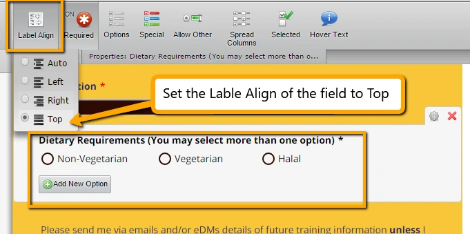
4. In the desktop view the Dieatary Requirements (You may....) appears wrapped. Can the the label span the width of the screen as you see in the mobile view?
5. by the way what the difference between when you code #cid_14 and #input_14?
Almost complete...once we get the above done.
Best Rgds
Kish
-
Chriistian Jotform SupportReplied on March 11, 2016 at 4:31 AM
1. You can use the css below to center align the address
#text_37 p:not(:first-child) {
text-align: center!important;
padding-left: 0!important;
}
2. The date seems to appear fine on my end. Can you send me a screenshot of the hyphen on your end?
3. You can delete the seminar workshop field.
4. You can achieve the requirement by setting the Label Align of the field to Top.
5. The #cid_14 is the wrapper for the #input_14, and so adjusting the #cid_14 should adjust the field properly.
This thread seems to be getting long. If you want, you may try hiring a programmer that can assist you with changing the css quickly, as I may not be able to reply to your concerns as quickly as possible.
Regards.
-
kranaiReplied on March 11, 2016 at 9:00 AM
Hi Christian
Thanks for your reply. Well corrected all thats needs to be done. As for date what you see (your snap shot above) I am not seeing on my mobile...yours look correct mine shows differently. Below is a snapshot of my mobile view of the date field...u will notice the hyphens are on a different line.

Hiring a programmer will be costly for a small company like mine. I appreciate your help for this form..I am now having the a view on mobile that I want to see.
I have last question which needs just a clarification: suppose you have a question with just one radio button and somebody selects it and his choice will be shown what happens he suddenly decides to change his choice hence want to undo the selection...is this possible? At moment I can't undo the selection unless I reset the whole form which u may not want that as you may have fill a lot of fields and do not want to redo all.
Apart from the above I finish with this ...thanks again Christian....
best rgds
kish
-
mert JotForm UI DeveloperReplied on March 11, 2016 at 9:41 AM
Hi Kish,
First of all, you can use the following CSS to overcome hyphens problem for "Date of Event" field. Please, copy and paste it from the below:
.form-textbox.validate[required], .date-separate {
display: none !important;
}
You can see the results on the iPhone 6s from the following image:

For your other question, I will suggest you to use "Check Box" field instead of using "Radio Button" field. With that one, you can undo the selected option. Please, check the test run:

For further assistance, please do let us know.
Thanks.
-
kranaiReplied on March 11, 2016 at 10:53 AM
Hi Mert
Thanks ...all resolved ...your code just doesn't display the hyepn...that is fine...spent too much time on this filed alone...I will live without the hyphens...
Thanks alot
rgds
kish
-
mert JotForm UI DeveloperReplied on March 11, 2016 at 11:00 AM
Kish, you are most welcome. Yes, you are right, I chose to hide them after spending so much time to fix their alignments:) If you have any other questions in the future, please do let us know.
Best regards.
- Templates
- Integrations
- INTEGRATIONS
- See 100+ integrations
- FEATURED INTEGRATIONS
 PayPal
- Slack
- Google Sheets
- Mailchimp
- Zoom
- Dropbox
- Google Calendar
- Hubspot
- Salesforce
- See more Integrations
- Products
- PRODUCTS
- Form Builder
- Jotform Enterprise
- Jotform Apps
- Store Builder
- Jotform Tables
- Jotform Inbox
- Jotform Mobile App
- Jotform Approvals
- Report Builder
- Smart PDF Forms
- PDF Editor
- Jotform Sign
- Jotform for Salesforce Discover Now
- Support


