


-
printspazAsked on March 23, 2016 at 3:40 PM
When we select responsive on the forms they work great with the desktop and tablets, but on the mobile phones you still have to scroll to the side as the fields overlap and go off the form canvas? How do we get the form to be responsive on mobile the same as it does on tablet?
 Page URL: http://www.outlaunched.com/#!blank/p0sbd
 -
Nik_CReplied on March 23, 2016 at 4:42 PM
You need to turn on the responsive option in the form Preferences. Please take a look at the following guide on how to do that:

Please let us know if this works for you.
-
printspazReplied on April 11, 2016 at 2:26 PM
Hello,
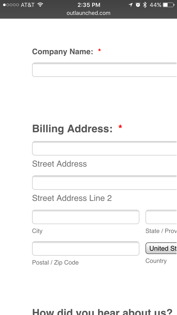
Thank you for your feedback, I never new that existed and it is great to know. I made the updates and they seem to work fine on Desktop screens and Tablets, but on my Mobile Phones the Responsive Form is still showing the same and not fitting the screen width. Please see below link on your mobile phone.
http://www.outlaunched.com/#!blank/d12ua
Thank you<
CJ -
KadeJMReplied on April 11, 2016 at 4:06 PM
I took a peek at this on your webpage on my iPhone and I can confirm that it certainly doesn't appear to be mobile there.
However, when I compared it to the standalone form to figure out if it's the form or the website I found it's mobile.
This means something in your webpage is preventing the mobile responsive from working properly.
I noticed the top of your webpage appears to be mobile but apparently the bottom isn't.
Is that part of another iframe that's separate on your page maybe?
Please allow us some time to look into this a bit more to see if we can assist in a feasible solution.
Form on your Webpage:
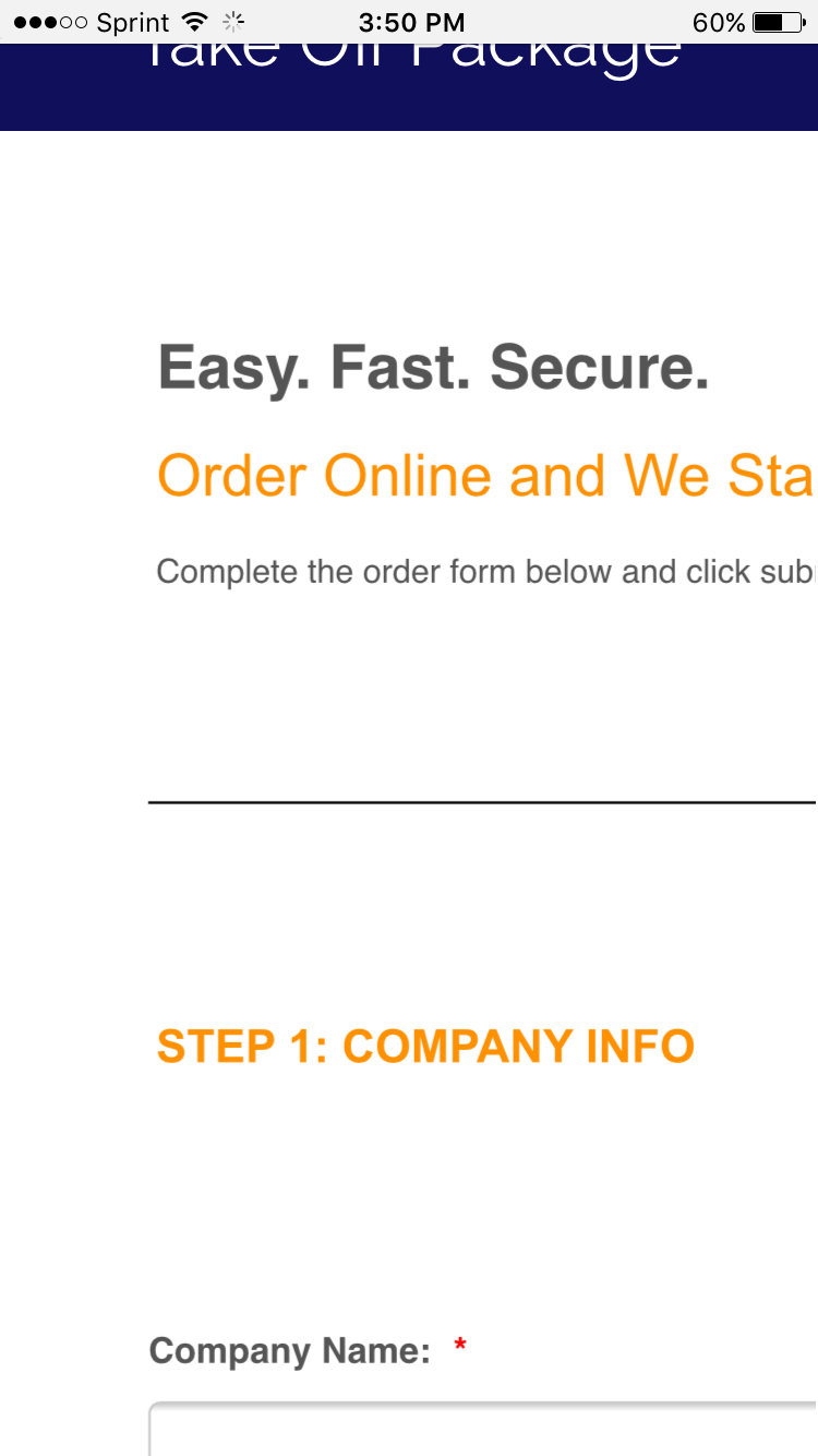
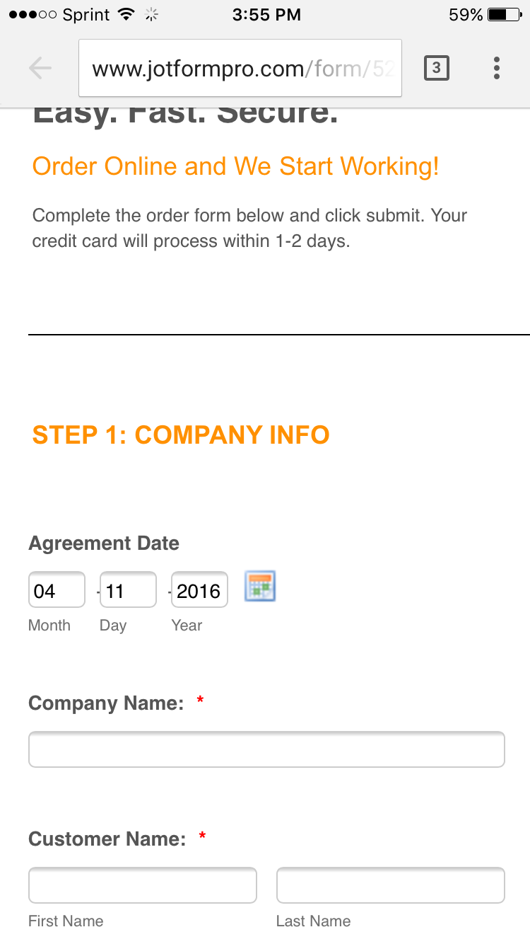
Form by Itself:
-
printspazReplied on April 25, 2016 at 5:36 PM
Hi there I am still needing help with this issue please. To clarify our situation. Now on the tablet and the mobile, these forms are not responsive. In the previous message you mentioned that something is blocking them on the page? Right now this site is a WIX.com site and on each page I have just the header, footer, and one strip of content at the top under the header with the Price Package name. Under that strip in the body content I have 1 large box with this form Iframed. There is nothing else on the page but those elements. please help. Thank you so much.
-
jonathanReplied on April 25, 2016 at 10:15 PM
I test the embedded form on your website http://www.outlaunched.com/#!blank/d12ua and I can see the form was not responsive on the mobile browser
However using the form only URL http://www.jotformpro.com/form/52726449498976 show a better responsive result.
As my colleague previously mentioned, other factor from within your website could be the cause why the form was not mobile responsive when within the website.
To test this further, can you try to embed a different form on this website? Try a very basic form with only a fiew basic info fields on it. Then, let us test how the form will perform on the website when using mobile browser.
We will wait for your updates.
Thanks.
- Templates
- Integrations
- INTEGRATIONS
- See 100+ integrations
- FEATURED INTEGRATIONS
 PayPal
- Slack
- Google Sheets
- Mailchimp
- Zoom
- Dropbox
- Google Calendar
- Hubspot
- Salesforce
- See more Integrations
- Products
- PRODUCTS
- Form Builder
- Jotform Enterprise
- Jotform Apps
- Store Builder
- Jotform Tables
- Jotform Inbox
- Jotform Mobile App
- Jotform Approvals
- Report Builder
- Smart PDF Forms
- PDF Editor
- Jotform Sign
- Jotform for Salesforce Discover Now
- Support


