


-
PHSwendyAsked on March 29, 2016 at 10:48 AM
On https://form.jotform.com/60746258663161, my form displays great everywhere except for iPhones, Nexus phone and other similarly sized devices. It is the text at the top of the form that doesn't shrink in size but renders over each other. How do I fix this?
 Page URL: https://form.jotform.com/60746258663161
 -
Kevin Support Team LeadReplied on March 29, 2016 at 1:34 PM
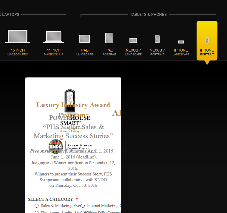
I checked your form and noticed the same than you, I checked it and I found that you have added some custom CSS to display the header properly on a desktop device; however, this CSS code is not allowing to display the header properly on mobile devices, this is because you are using a "Heading" field and in the text displayed below you are using a "Text" field.
I decided to clone your form and try do fix this issue, keeping the header as you currently have will need to add a lot of CSS code to fix the layout on mobile devices, I think that the best way to achieve it would be making some changes on your form, this is what I did and it worked, the text is not being displayed over other fields, here are the steps.
First, I removed all the custom CSS code that you added, this was only to have a clean form and this also helped me to find the correct way to fix it, once the code was removed I removed the heading field as well, leaving only the text field, the one where you have added after the text "Award Entry Application".
Now, on the text field you need to add the image and the text that you had in your header, to add the text simply edit the HTML and paste the same text you have in your header.

Now, you need to add the image, you need to add the image beside the text "AWARD ENTRY APPLICATION" as shown in the image below:

Once the image is added click on it and set the alignment to left:

Click on complete and this is how it should look:

The next step is adding this CSS code:
@media screen and (max-width: 480px), screen and (max-device-width: 768px) and (orientation: portrait), screen and (max-device-width: 415px) and (orientation: landscape){
#cid_27 h1:first-child {
width : 87%;
}
[data-type="control_text"] #cid_27 img {
width : 50%;
height : 50%;
}
}
div#cid_33 {
border-color : transparent;
background : transparent;
}
#cid_27 .heading {
float : none !important;
}
This will be the result on a desktop computer:

This will be the result on mobile devices:

Here is the link to my cloned form: https://form.jotform.com/60884690938977.
Feel free to test it and if you want you may clone it as well, this guide will help you with that: http://www.jotform.com/help/42-How-to-Clone-an-Existing-Form-from-a-URL.
You should be able to inject your CSS to change the color and size of the fonts, but be careful adding a text to change the margin or padding could distort the layout.
Do let us know if this works as you need and if you need help when trying to apply it to your form.
-
PHSwendyReplied on March 30, 2016 at 7:59 AM
Thank you so much for the detailed instructions, Kevin. It worked! (Due to a time constraint, I just cloned your test form. I usually implement solutions myself in order to learn the what and why. )
Next issues:
Is it possible to have the text in the radio button section wrap evenly at the beginning? I had responsive css here but now it doesn't seem to work. This section also now overlaps on my iPhone.
Also, on my iPhone, it appears the Casa Spazio logo near the bottom of the form is stretching vertically. Can this be resolved?
Again -- I really appreciate your successful input! :)
-
mert JotForm UI DeveloperReplied on March 30, 2016 at 10:05 AM
On behalf of my colleague, you are most welcome. Your last post isn't following the subject from the your first question, so I needed to move it into another account. You can easily reach it from the link below:
https://www.jotform.com/answers/805936
It will be answered in short.
- Templates
- Integrations
- INTEGRATIONS
- See 100+ integrations
- FEATURED INTEGRATIONS
 PayPal
- Slack
- Google Sheets
- Mailchimp
- Zoom
- Dropbox
- Google Calendar
- Hubspot
- Salesforce
- See more Integrations
- Products
- PRODUCTS
- Form Builder
- Jotform Enterprise
- Jotform Apps
- Store Builder
- Jotform Tables
- Jotform Inbox
- Jotform Mobile App
- Jotform Approvals
- Report Builder
- Smart PDF Forms
- PDF Editor
- Jotform Sign
- Jotform for Salesforce Discover Now
- Support


