


-
ipbr21054Asked on March 31, 2016 at 5:59 AM
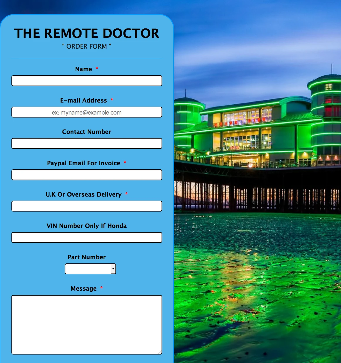
Here is the form http://form.jotformeu.com/form/60903019595357
Currently the form is centered to the page with its new background.
When viewing on the pc you can see that the form obscures the main part of the image.
I would like to be able to position the form left of center etc.
Thus when you then view it on a pc the main part of the image can be seen.
However i MUST have the form centered like it currently is for mobile & tablets viewing.
When viewing this form on iphone or ipad pretty much 99% of the background image is not seen anyway hence why i need it still centered for mobiles & tablets etc.
Please could you clone my form or edit my form BUT show me where you added new code or edited original code so i can then adjust it etc to my liking.
Many Thanks
Have a nice day.
-
mert JotForm UI DeveloperReplied on March 31, 2016 at 10:29 AM
Hi there,
By injecting custom CSS to your form, you can easily achieve this objective. Below, you will find the necessary code. Please, inject it with the method provided.
@media screen and (max-width: 1365px){
.form-all {
float: none;
}
}
@media screen and (min-width: 1366px) and (max-width: 2400px){
.form-all {
float: left;
}
}
Please, try this one and let us know the results.
Regards.
-
ipbr21054Replied on March 31, 2016 at 11:19 AM
Hi,
Thanks for that.
I applied the same code to one of my other forms but the form does not position itself on the left but stays centered ?
Here is the form 60712393428355 if you could take a look for me.
-
mert JotForm UI DeveloperReplied on March 31, 2016 at 11:29 AM
Hi again,
I assume the media query skips the rule because of the resolution; but we don't need to define it, we can simply use the following. On mobil devices, it will align centered because of the lack of space. So, delete the previous one and apply the one from the below:
.form-all {
float: left !important;
}
Also, you can see the results from the below:
Please, do let us know the results.
Thanks.
-
ipbr21054Replied on March 31, 2016 at 11:33 AM
So delete all this
@media screen and (max-width: 1365px){
.form-all {
float: none;
}
}
@media screen and (min-width: 1366px) and (max-width: 2400px){
.form-all {
float: left;
}
}
And just use this
.form-all {
float: left !important;
}
IS THAT CORRECT ?
-
mert JotForm UI DeveloperReplied on March 31, 2016 at 11:38 AM
Yes, it is correct. Those ones were for the detect resolution differences between mobile and desktop; but as I explained on my previous post, I realized that we don't need to use them. So, just paste the last one.
-
ipbr21054Replied on March 31, 2016 at 11:45 AM
cheers
-
mert JotForm UI DeveloperReplied on March 31, 2016 at 11:46 AM
Glad to hear that, you are most welcome. For your further questions, please do let us know.
Regards.
- Templates
- Integrations
- INTEGRATIONS
- See 100+ integrations
- FEATURED INTEGRATIONS
 PayPal
- Slack
- Google Sheets
- Mailchimp
- Zoom
- Dropbox
- Google Calendar
- Hubspot
- Salesforce
- See more Integrations
- Products
- PRODUCTS
- Form Builder
- Jotform Enterprise
- Jotform Apps
- Store Builder
- Jotform Tables
- Jotform Inbox
- Jotform Mobile App
- Jotform Approvals
- Report Builder
- Smart PDF Forms
- PDF Editor
- Jotform Sign
- Jotform for Salesforce Discover Now
- Support
