


-
netruckAsked on April 2, 2016 at 1:32 PM
-
Elton Support Team LeadReplied on April 2, 2016 at 6:19 PM
Inject this CSS codes to your form, this should display radio buttons properly on mobile.
@media screen and (max-width:480px){
.form-multiple-column[data-columncount="5"] .form-radio-item,
.form-multiple-column[data-columncount="5"] .form-checkbox-item {
width: 100%;
}
.form-checkbox-item label, .form-radio-item label {
word-wrap: normal;
}
.form-multiple-column {
margin-left: 0;
}
}
Guide: https://www.jotform.com/help/117-How-to-Inject-Custom-CSS-Codes
Result:
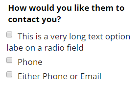
I can also see that you have existing CSS codes injected to your form. If by chance the above CSS codes doesn't work, it might let us know so we can assist you further.
-
netruckReplied on April 3, 2016 at 10:45 PM
Thank you! This has helped with the radio button - but it didn't fix the checkboxes. Any help with that? Attached is a screen
 capture of the checkboxes.
 -
Chriistian Jotform SupportReplied on April 4, 2016 at 12:29 AM
You can inject the css code below to fix the checkboxes.
@media screen and (max-width:480px){
.form-multiple-column[data-columncount="3"] .form-checkbox-item {
width: 100%;
}
}

Here's a cloned demo that you can see in action: https://form.jotform.com/60940147858968
If you need further assistance, please let us know.
Regards.
- Templates
- Integrations
- INTEGRATIONS
- See 100+ integrations
- FEATURED INTEGRATIONS
 PayPal
- Slack
- Google Sheets
- Mailchimp
- Zoom
- Dropbox
- Google Calendar
- Hubspot
- Salesforce
- See more Integrations
- Products
- PRODUCTS
- Form Builder
- Jotform Enterprise
- Jotform Apps
- Store Builder
- Jotform Tables
- Jotform Inbox
- Jotform Mobile App
- Jotform Approvals
- Report Builder
- Smart PDF Forms
- PDF Editor
- Jotform Sign
- Jotform for Salesforce Discover Now
- Support


