


-
EngplasticsAsked on April 6, 2016 at 4:01 PM
Hi even after using iframes my these 2 forms are not mobile responsive.
https://www.jotform.com//?formID=60523583166254
https://www.jotform.com//?formID=60524107258249
Can you guys help me please.!
-
BJoannaReplied on April 6, 2016 at 5:16 PM
I have inspected your forms and only submit button is not responsive. You can make submit button responsive by Injecting this CSS code to your form:
@media only screen and (max-width: 480px){
.form-submit-button {
width : 100%!important;
}
}
Inside of this guide you can find how to Inject Custom CSS to your form:
http://www.jotform.com/help/117-How-to-Inject-Custom-CSS-Codes
In case that you have issue with your embedded forms, please provide us URL of your website so that we can inspect your forms there.
Hope this will help. Let us know if you need further assistance.
-
EngplasticsReplied on April 6, 2016 at 8:16 PM
I must say, you guys are awesome.
Thank you.
-
EngplasticsReplied on April 6, 2016 at 8:44 PM
Hi,
I checked on android phone, it works perfect but on iphone it is not responsive and it does not show submit button.
-
jonathanReplied on April 7, 2016 at 12:03 AM
Hi,
Were the form embedded on a website? If they were, can you share also to us the URL of your website so that we can check and test them as well.
I cheked using just the form URL's on an Iphone simulator and they were responsive and Submit button is available
https://www.jotform.ca/form/60524107258249
https://www.jotform.ca/form/60523583166254

It is possible that the mobile browser you used just need to be refreshed. Please try that option as well and then test/check again.
Let us know if still not resolve.
Thanks.
-
EngplasticsReplied on April 7, 2016 at 9:33 AM
These are the links:
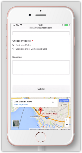
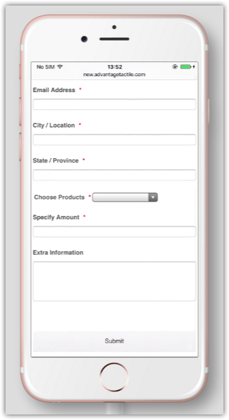
http://new.advantagetactile.com/contact.html
http://new.advantagetactile.com/quote.html
I checked again and again but iphone shows no submit button as well as it does not show it is responsive.
Although it works fine on android phone.
-
CharlieReplied on April 7, 2016 at 11:28 AM
Your forms are embedded on your website using the default script code. It seems like the script code is conflicting with your other resources, which causes some unresponsive layout when viewed on an iPhone device.
Could you please try using the iFrame embed code of JotForm? You can find it by following this link: https://www.jotform.com/help/148-Getting-the-Form-iFrame-Code. I understand you have already tried it but please do try it again and we'll check it further. Please do make sure to remove the old embed code before adding the iFrame embed code.
We'll wait for your response.
-
EngplasticsReplied on April 7, 2016 at 2:36 PM
I tried it again.
Did not work.
-
BJoannaReplied on April 7, 2016 at 3:04 PM
Unfortunately I do not have iPhone to test your embedded form. I have test it on my Samsung Galaxy S4 and it is responsive.
Please try to remove script part of your iFrame code to see if that will resolve your issue. Embed only code this part of the code:
<iframe
id="JotFormIFrame"
onDISABLEDload="window.parent.scrollTo(0,0)"
allowtransparency="true"
src="https://form.jotform.com/60524107258249"
frameborder="0"
style="width:100%;
height:539px;
border:none;"
scrolling="no">
</iframe>
Let us know if you need further assistance.
-
EngplasticsReplied on April 7, 2016 at 3:20 PM
I modified little bit of css and it shows responsive but it is not the correct way making it responsive.
.form-textbox {
width : 100%;
}
.form-single-column {
width : 100%;
display : block-line-height;
}
.form-textarea {
width : 100%;
}
.form-submit-button {
width : 100% !important;
}
@media only screen and (max-width: 480px){
.form-submit-button {
width : 100% !important;
}
.form-textbox {
width : 100% !important;
}
}
I mentioned this already. android phones were fine but it was not good on iphones.
-
BJoannaReplied on April 7, 2016 at 3:28 PM
If I understood correctly, you were able to resolve your issue by adding CSS code you provided, to your form.
Considering that I do not have iPhone, I was not able to test your form and to see what was causing the issue.
Feel free to contact us if you have any other questions.
-
EngplasticsReplied on April 7, 2016 at 4:18 PM
I just want a better solution if possible.
if you can then please help me out when you can test it on iphone.
-
MikeReplied on April 7, 2016 at 4:57 PM
I have checked both pages in iPhone browser via https://www.browserstack.com/, but have not noticed any issues.
Are you still able to reproduce some issues when using iPhone?
- Templates
- Integrations
- INTEGRATIONS
- See 100+ integrations
- FEATURED INTEGRATIONS
 PayPal
- Slack
- Google Sheets
- Mailchimp
- Zoom
- Dropbox
- Google Calendar
- Hubspot
- Salesforce
- See more Integrations
- Products
- PRODUCTS
- Form Builder
- Jotform Enterprise
- Jotform Apps
- Store Builder
- Jotform Tables
- Jotform Inbox
- Jotform Mobile App
- Jotform Approvals
- Report Builder
- Smart PDF Forms
- PDF Editor
- Jotform Sign
- Jotform for Salesforce Discover Now
- Support


