-
melodicsoundsAsked on April 11, 2016 at 1:06 PM
2 things:
a). In my form: https://form.jotform.com/60967271989980 while being on mobile... in the Stripe fields, the "Tarjeta de Crédito" and "Código de Seguridad" are really confused ... they look really bad.. can we insert some CSS or how to fix so it looks good like in the desktop? The Security Code should be smaller... and the subtext should be below the field.
Same with "Mes de vencimiento" thees a / that makes the subtext move down.
b). In the same form if in your "Description" field you have a big big text or a long text, while being on the preview widget its look really messed up... there is no responsive in there... the screen goes as big as the text lenght... see pictures:
In this pic you see the really long text making all the form become bigger to the right.
see the submit button becoming big to the right...
Help with all this please.
-
CharlieReplied on April 11, 2016 at 3:05 PM
Could you please try the following to resolve the first problem in your credit card text boxes:
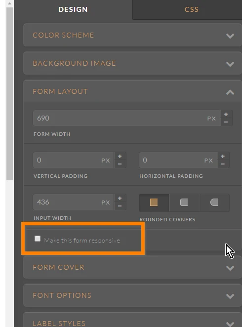
1. First, enable the mobile responsive in your Form Designer Tool:

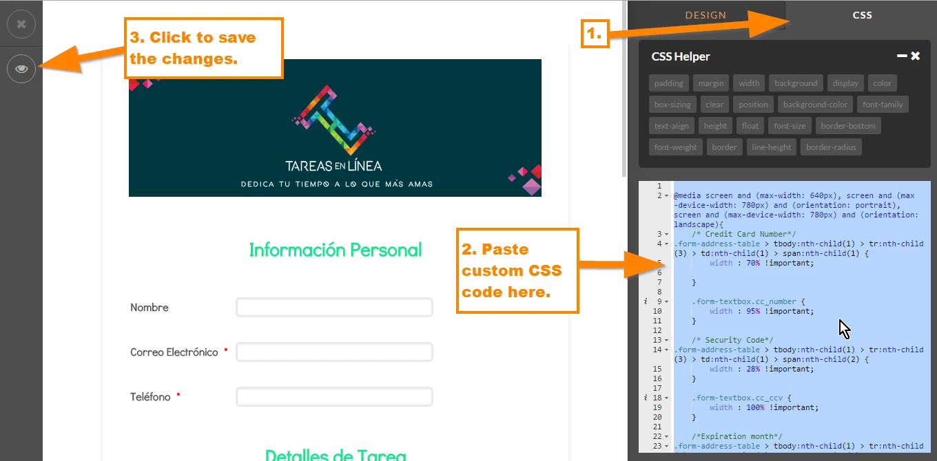
2. After that, navigate to your CSS tab and paste this custom CSS code:
@media screen and (max-width: 640px), screen and (max-device-width: 780px) and (orientation: portrait), screen and (max-device-width: 780px) and (orientation: landscape){
/* Credit Card Number*/
.form-address-table > tbody:nth-child(1) > tr:nth-child(3) > td:nth-child(1) > span:nth-child(1) {
width : 70% !important;
}
.form-textbox.cc_number {
width : 95% !important;
}
/* Security Code*/
.form-address-table > tbody:nth-child(1) > tr:nth-child(3) > td:nth-child(1) > span:nth-child(2) {
width : 28% !important;
}
.form-textbox.cc_ccv {
width : 100% !important;
}
/*Expiration month*/
.form-address-table > tbody:nth-child(1) > tr:nth-child(4) > td:nth-child(1) > span:nth-child(1) {
width : 48% !important;
}
.form-dropdown.cc_exp_month {
width : 93% !important;
}
/*Expiration Year*/
.form-address-table > tbody:nth-child(1) > tr:nth-child(4) > td:nth-child(1) > span:nth-child(2) {
width : 50% !important;
}
.form-dropdown.cc_exp_year {
width : 100% !important;
}
}
Here's a screenshot to where you need to paste the code:

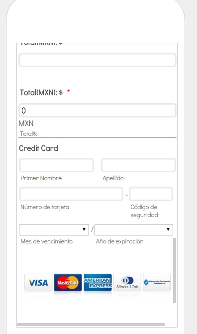
Here's my cloned form: https://form.jotform.com/61016127995963. You can clone it to have it in your account. To clone my form, you can follow this guide: https://www.jotform.com/help/42-How-to-Clone-an-Existing-Form-from-a-URL. Let us know if the credit card details now shows correctly in your mobile view. This is how it should look like:

For the 2nd problem regarding the preview before widget, I went ahead and opened a separate thread for it. Please refer to this link instead: https://www.jotform.com/answers/815563. We will address that one there.
- Mobile Forms
- My Forms
- Templates
- Integrations
- INTEGRATIONS
- See 100+ integrations
- FEATURED INTEGRATIONS
PayPal
Slack
Google Sheets
Mailchimp
Zoom
Dropbox
Google Calendar
Hubspot
Salesforce
- See more Integrations
- Products
- PRODUCTS
Form Builder
Jotform Enterprise
Jotform Apps
Store Builder
Jotform Tables
Jotform Inbox
Jotform Mobile App
Jotform Approvals
Report Builder
Smart PDF Forms
PDF Editor
Jotform Sign
Jotform for Salesforce Discover Now
- Support
- GET HELP
- Contact Support
- Help Center
- FAQ
- Dedicated Support
Get a dedicated support team with Jotform Enterprise.
Contact SalesDedicated Enterprise supportApply to Jotform Enterprise for a dedicated support team.
Apply Now - Professional ServicesExplore
- Enterprise
- Pricing


