


-
ronproskyAsked on April 14, 2016 at 10:56 AM
I've tried all codes, plugin, etc. and for some reason your codes will not work with the Jupiter Wordpress theme. Any ideas?
-
Elton Support Team LeadReplied on April 14, 2016 at 12:11 PM
They should work on WordPress.
If the script embed code doesn't work on your WP site, we suggest to try iframe embed code.
Since the form will load in an iframe, it would not create any script conflict so it should work fine.
Please make sure to paste the iframe embed code on the "Text" tab in your WP post/page.
If you need further help, let us know.
-
Elton Support Team LeadReplied on April 14, 2016 at 12:25 PM
If your form does not have conditions, I suggest to remove the script that is included in the iframe embed code.
Example:
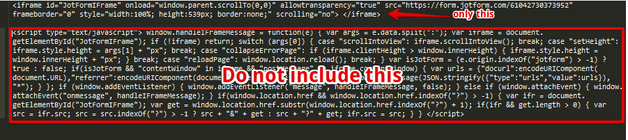
Then change the iframe height so it perfectly fits on the form.
Hope this helps!
-
ronproskyReplied on April 14, 2016 at 1:40 PM
We've tried absolutely everything, every option, every suggestion...nothing works! And surprisingly, the Jupiter Theme is among like the top 10 or 20 most popular WP themes sold worldwide.
-
Elton Support Team LeadReplied on April 14, 2016 at 2:25 PM
Thanks for your reply.
Can you please provide the exact page URL where we can find the embedded form so we can inspect it on our browser? It would be so much easier to identify the problem if we can check the page.
There might be existing styles in your theme that limits the iframe height or some of the styles are overpowering the inline style of the iframe embed code.
We'll await your reply.
-
ronproskyReplied on April 14, 2016 at 2:37 PM
http://scottsdalerecovery.net/test/
-
BenReplied on April 14, 2016 at 4:40 PM
The issue is not happening due to the form actually, but the website elements.
You would need to add the following CSS to your page in order to see the form:
.mk-video-container {
height: 2200px;
}*An important note would be that the CSS above will make change to all of the fields with the same class, so it would be much better if you can set that field - holding the form with the CSS directly.
To do that you would need to add inline style as so:
style="height:2200px;"
The element would then look as so:
<div class="mk-video-container" style="height:2200px;">
</div>Do let us know how it goes.
-
ronproskyReplied on April 15, 2016 at 9:56 AM
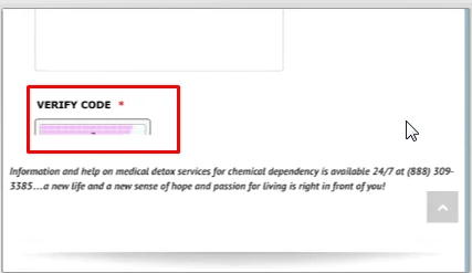
it works great on my computer and android phone. the bottom of form stops at verify code and cuts off the right side of the address and email fields. how can i fix to make it work on iphone too?
-
CarinaReplied on April 15, 2016 at 12:02 PM
I could replicate the same situation:
Please try adding this custom css code to your website:
@media screen and (max-width: 480px) {
.mk-video-container
{height:3200px !important;}
#JotFormIFrame
{height:3200px !important;}
}
Let us know if the problem persists.
-
ronproskyReplied on April 15, 2016 at 1:16 PM
that worked for the height which now shows the whole form on iphone but
1)width still cut off on right side on iphone
2) creates big extra space below form on computer
-
BenReplied on April 15, 2016 at 2:43 PM
The reason why it is too long on your PC is because the element holding the form is set too high. To rectify this, you should change it from:
<div class="mk-video-container" style="height:3200px;">
to
<div class="mk-video-container">
Alternatively, since you can change the div element, do give it an ID such as:
<div class="mk-video-container" id="jotformHolder">
Then you can make it responsive as form using this code:
@media screen and (max-width:480px) {
#jotformHolder, #JotFormIFrame {
min-height:3200px;
}
}
@media screen and (min-width:480px) {
#jotformHolder, #JotFormIFrame {
min-height: 2200px;
}
}Which should set the height of the holding element right on different sizes.
Now in regards to the white space around the form, that would be something on your website not being fully responsive since the form will take the width that it is allowed to and not more, but once you add the code above we would be happy to check it out and assist further if so needed.
-
ronproskyReplied on April 15, 2016 at 4:15 PM
that code does not work.
the only way the whole form showed up in height was when i had the form in a a div as recommended by your associate below but i made min-height 2400px. this was good for computer and not mobile.
<div class="mk-video-container" style="height:2200px;">
</div> -
Kevin Support Team LeadReplied on April 15, 2016 at 5:47 PM
I checked the form on your website and noticed that you have added only the code using the style attribute directly on the HTML container of the form.
<div class="mk-video-container" style="height:2200px;">
</div>The form looks fine when viewing it on a desktop computer, but when I tested it on resolutions such as mobile devices the form does not show the bottom nor the submit button and this is due to a responsive conflict, this should be fixed by adding the CSS code provided by my colleague Ben above, do note that you need to add this code in your website and not in your form.
I have tested it and it seems to be working fine, this should be the result of that code:

The form will show the bottom on mobile and desktop devices, please try adding the code on your website and let us know when it is done, if this is not applied then we will investigate why.
@media screen and (max-width:480px) {
#jotformHolder, #JotFormIFrame {
min-height:3200px;
}
}
@media screen and (min-width:480px) {
#jotformHolder, #JotFormIFrame {
min-height: 2200px;
}
}Now, regarding to the form cutting off on the right side, I see that you have added this code to your form:
@media only screen and (max-device-width: 550px)
.form-all {
width: auto !important;
}
This could be fixed by adding one property to the current code, it should look like this one, highlighted is the change that will avoid the form to be cut off on the right side:
@media only screen and (max-device-width: 550px)
.form-all {
width: auto !important;
margin-left: -35px !important;
}
Please do let us know once you have applied these changes to your form, we will be glad to check the result and help you if needed.
-
ronproskyReplied on April 18, 2016 at 10:12 AM
height is ok now (has extra space at bottom of submit button but I can live with that).
width still not working on iphone, getting cut off on right side
-
BenReplied on April 18, 2016 at 11:34 AM
I took a look at your website - http://scottsdalerecovery.net/test/ and currently it seems that you are using source code embed code rather than the iframe embed.
Now checking it out, I did not see any issues with the same in regards to the width, so please do grab a screenshot of the issue and upload it here. To do that you will need to come to the threads, since emails sent in email will not be captured.
This is the link to the thread: https://www.jotform.com/answers/818453
Once you do we will be able to see what you saw and see what to look for.
-
ronproskyReplied on April 18, 2016 at 11:43 AM
sorry we moved the form to http://scottsdalerecovery.net/insurance/
-
BenReplied on April 18, 2016 at 1:14 PM
Great. I took a look at it and I saw few things.
I would add the following CSS to your form:
div.form-all {
max-width: 590px;
width: 100%;
}
li.form-line {
padding-left: 10px;
padding-right: 10px;
}This should save your form layout as it is, but also allow it to nicely go into the website so it will not be cut off.
Now, the thing is that the field holding the form is slightly moved to the right when on mobile view, so I think that it will need another re-adjustment, but please do check how it works with the code above first.
As mentioned the code should go to the form, not to the website. You can follow these steps to add it there: Inject Custom CSS Codes
-
ronproskyReplied on April 18, 2016 at 2:05 PM
I'm sorry I wasn't clear before. the problem with the width is on the mobile not on the computer!
-
BenReplied on April 18, 2016 at 3:18 PM
Yes, sorry for not mentioning this, but the above code is actually to fix the issue on the mobile version of your website.
We might need to add some other code next to the same, but please do add it and let us know how it looks.
-
jonathanReplied on April 18, 2016 at 5:25 PM
I checked your embedded form http://scottsdalerecovery.net/insurance/ on an Iphone mobile browser. But currently I could not reproduce yet the cut-off issue on the side that you described.

It was actually working as is without yet the custom CSS code provided by my colleagues.
I also checked the form itself, but so far I did not see yet the suggested custom CSS code provided by my colleague on your form. Did you actually add already the CSS codes? or you must have removed them already.

I suggest you still add the custom CSS code on your form using the Form Designer.
div.form-all {
max-width: 590px;
width: 100%;
}
li.form-line {
padding-left: 10px;
padding-right: 10px;Save the form, and then check/test again the form on your mobile browser.
Please let us know if issue remains even after doing all the suggested modifications.
-
LaineReplied on April 20, 2016 at 9:15 AM
I put the code into the form.
1) address and text above submit still cut off on right side on iphone 6
2) when i turn iphone 6 sideways, form shows nothing past the more information box
-
BenReplied on April 20, 2016 at 10:50 AM
Please do add the following CSS code to your form Laine to see if it would help with the 1st issue:
@media screen and (max-width:320px) {
textarea {
width: 80%;
}
.form-address-table .form-sub-label-container {
max-width: 80%;
}
.form-address-table input {
width: 100%;
}
.form-address-table tr:first-child .form-sub-label-container {
width: 100%;
}
.form-address-table td[width="50%"] {
width: 45%;
}
.form-address-table td[width="50%"] {
width: 124px;
}
.form-address-table td[width="50%"] + td input {
width: 140px;
}
}Do let us know how it goes.
-
ronproskyReplied on April 22, 2016 at 12:12 PM
thanks ben. that fixed the address.
more information box and text paragraph above submit button still cut off.
the more serious issue is that when you turn the iphone sideways, there is nothing past the more information box...
-
CharlieReplied on April 22, 2016 at 2:18 PM
From what I am seeing, the problem is that the div element mk-video-container is not mobile responsive. You set it to 2400px, however, the form's height in mobile view is actually 3000px or more, that's why it continues to cut because the parent element is short.
Now the design or the element holding the form is dependent on the Jupiter theme that you have. You can create a CSS code and add it in your website to make the mk-video-container more responsive. However, it would be best to have a web designer to look at it. I believe this issue has already been addressed by my colleagues above by adding an ID to the <div> element.
In my case, I could suggest like this:
<div class="mk-video-container" id="iframe-holder">
//JotForm form embed code here
</div>
The paste this CSS code in your main stylesheet:
@media screen and (max-width: 480px), screen and (max-device-width: 768px) and (orientation: portrait), screen and (max-device-width: 415px) and (orientation: landscape) {
#iframe-holder {
min-height: 3200px !important;
}
}
Would it be possible to move the form embed code on a different parent element? Something like a responsive element? I am not quite familiar with the Jupiter theme on WP so my knowledge with it is quite limited. Apologies.
-
LaineReplied on April 27, 2016 at 10:52 AM
there has been so much different code suggestions which i appreciate, but am confused at this point what to keep and what to delete. if you could just provide fresh instructions to replace the code that is not working to display well on pc and iphone 6. thank you.
http://scottsdalerecovery.net/insurance/
current page html:
<div class="mk-video-container" id="iframe-holder">
<iframe id="JotFormIFrame" style="width: 100%; height: 3200px; min-height 3200px; border: none;" src="https://form.jotform.com/60133366943152" width="300" height="150" frameborder="0" scrolling="no"> </iframe></div>current website css:
@media screen and (max-width: 480px) {
.mk-video-container
{height:3200px !important;}
#JotFormIFrame
{height:3200px !important;}
}
@media screen and (max-width:480px) {
#jotformHolder, #JotFormIFrame
{min-height:3200px;}
}
@media only screen and (max-device-width: 550px)
.form-all {
width: auto !important;
margin-left: -35px !important;
}
div.form-all {
max-width: 590px;
width: 100%;
}
li.form-line {
padding-left: 10px;
padding-right: 10px;
}
@media screen and (max-width: 480px), screen and (max-device-width: 768px) and (orientation: portrait), screen and (max-device-width: 415px) and (orientation: landscape) {
#iframe-holder {
min-height: 3200px !important;
}
}
jot form css:div.form-all {
max-width: 590px;
width: 100%;
}
li.form-line {
padding-left: 10px;
padding-right: 10px;
}@media screen and (max-width:320px) {
textarea {
width: 80%;
}
.form-address-table .form-sub-label-container {
max-width: 80%;
}
.form-address-table input {
width: 100%;
}
.form-address-table tr:first-child .form-sub-label-container {
width: 100%;
}
.form-address-table td[width="50%"] {
width: 45%;
}
.form-address-table td[width="50%"] {
width: 124px;
}
.form-address-table td[width="50%"] + td input {
width: 140px;
}
} -
CharlieReplied on April 27, 2016 at 12:21 PM
If you check your website, you'll noticed that the form is already cut off because of the parent element div .mk-video-container, your theme is actually setting up the height smaller that the form you have, as mentioned in our previous discussions.

We can try fixing this by:
1. In your current page HTML, use the iFrame embed code (try both with and without the script code).
In your case, it should look like this:
<div class="mk-video-container" id="iframe-holder">
<p>
<div>
<iframe id="JotFormIFrame" onDISABLEDload="window.parent.scrollTo(0,0)" allowtransparency="true" src="https://form.jotform.com/60133366943152" frameborder="0" style="width:100%; height:3200px; min-height: 3200px; border:none;" scrolling="no"> </iframe> <script type="text/javascript"> window.handleIFrameMessage = function(e) { var args = e.data.split(":"); var iframe = document.getElementById("JotFormIFrame"); if (!iframe) return; switch (args[0]) { case "scrollIntoView": iframe.scrollIntoView(); break; case "setHeight": iframe.style.height = args[1] + "px"; break; case "collapseErrorPage": if (iframe.clientHeight > window.innerHeight) { iframe.style.height = window.innerHeight + "px"; } break; case "reloadPage": window.location.reload(); break; } var isJotForm = (e.origin.indexOf("jotform") > -1) ? true : false; if(isJotForm && "contentWindow" in iframe && "postMessage" in iframe.contentWindow) { var urls = {"docurl":encodeURIComponent(document.URL),"referrer":encodeURIComponent(document.referrer)}; iframe.contentWindow.postMessage(JSON.stringify({"type":"urls","value":urls}), "*"); } }; if (window.addEventListener) { window.addEventListener("message", handleIFrameMessage, false); } else if (window.attachEvent) { window.attachEvent("onmessage", handleIFrameMessage); } if(window.location.href && window.location.href.indexOf("?") > -1) { var ifr = document.getElementById("JotFormIFrame"); var get = window.location.href.substr(window.location.href.indexOf("?") + 1); if(ifr && get.length > 0) { var src = ifr.src; src = src.indexOf("?") > -1 ? src + "&" + get : src + "?" + get; ifr.src = src; } } </script>
</div>
</p>
</div>
Noticed that it is under another <div> and a <p> element. That's how I saw it in your website. You can add an attribute min-height on your iframe although I suggest do this later on only if you see the form is still being cut off after doing step two below.
2. Try adding this in your website's CSS, it would be best if you can place it inside the same CSS stylesheet to where the original .mk-video-container styling is located.
@media screen and (max-width: 480px), screen and (max-device-width: 768px) and (orientation: portrait), screen and (max-device-width: 415px) and (orientation: landscape) {
#iframe-holder.mk-video-container,
#iframe-holder.mk-video-container > p,
#iframe-holder.mk-video-container > p > div {
min-height: 3200px !important;
}
}
#iframe-holder.mk-video-container,
#iframe-holder.mk-video-container > p,
#iframe-holder.mk-video-container > p > div {
min-height: 3200px !important;
}
So far, those are the things I see that is needed. For the CSS code inside the form itself (the ones shown in your Form Designer Tool), I believe you don't need to edit those.
Let us know us know if that works.
- Templates
- Integrations
- INTEGRATIONS
- See 100+ integrations
- FEATURED INTEGRATIONS
 PayPal
- Slack
- Google Sheets
- Mailchimp
- Zoom
- Dropbox
- Google Calendar
- Hubspot
- Salesforce
- See more Integrations
- Products
- PRODUCTS
- Form Builder
- Jotform Enterprise
- Jotform Apps
- Store Builder
- Jotform Tables
- Jotform Inbox
- Jotform Mobile App
- Jotform Approvals
- Report Builder
- Smart PDF Forms
- PDF Editor
- Jotform Sign
- Jotform for Salesforce Discover Now
- Support


