


-
melodicsoundsAsked on April 14, 2016 at 12:30 PM
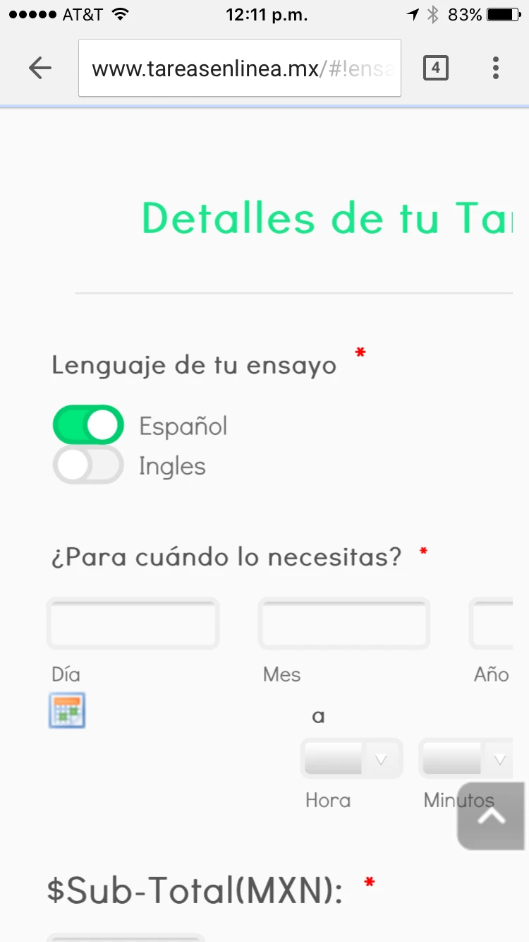
I have this form: https://form.jotform.com/60328003160945 wich has enabled the button "make this form responsive" in the designer and also the mobile responsive widget. Still while being on the embedded page: http://www.tareasenlinea.mx/#!ensayo/kal4q while being on mobile you see like this: please see that its bigger than the screen to the right and see also that the calendar looks very small.


-
Kiran Support Team LeadReplied on April 14, 2016 at 1:50 PM
As I check your JotForm using the direct link, it seems to be displaying responsive on mobile phones. However, when we see the web page where the form is embedded, it looks like there is an issue. This is due to the form is embedded using iframe method on the web page. I notice that you are using Wix to host your website and see that you have used the iframe embed code. Could you try embedding the form on your web page by using the direct link in Website Address instead of iframe embed code.

Also, please be noted that it is not required to have Mobile Responsive widget on the form while the form is enabled to be responsive in the Form Designer. Having both options on the form might have some conflicts and result in not displaying the form correctly. Please remove the Mobile responsive widget from the form and go through the guide below that can help you in making the responsive.
https://www.jotform.com/help/311-How-to-Make-Forms-Mobile-Responsive
Hope this information helps! Please get back to us if the issue still persists. We will be happy to assist you further.
-
melodicsoundsReplied on April 14, 2016 at 3:38 PM
I did all this: 1.) Change the link in wix to direct Website Adress. 2.) Errase the Mobile Responsive. And form still not responsive on phone, any other tip?
-
melodicsoundsReplied on April 14, 2016 at 4:01 PM
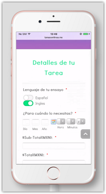
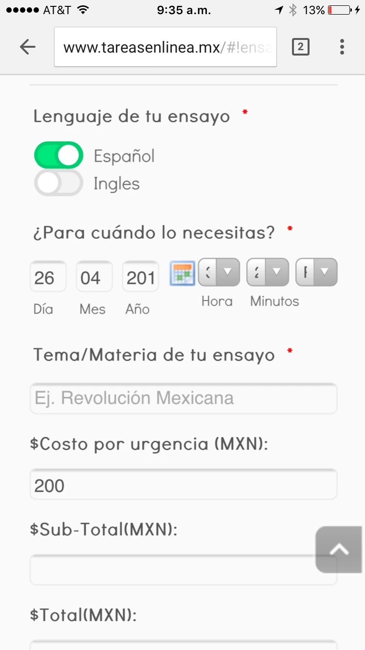
See how it looks now with those changes: http://www.tareasenlinea.mx/#!ensayo/kal4q please see in mobile.
-
Kiran Support Team LeadReplied on April 14, 2016 at 5:47 PM
It seems that you have also added some CSS code the form. I'm checking out the issue by cloning your JotForm to my account. Please allow me some time to check on this and get back to you later.
Thank you for your patience.
-
Kiran Support Team LeadReplied on April 15, 2016 at 10:03 AM
Thank you for being patient. I've checked your JotForm and see the following issues.
1. Terms & conditions widget is set to a width of 620px. Since the widget is loading on an iframe within the form, the widget is displaying to its full width on the form.

Please remove the width of the widget so that it adjusts automatically.

2. There is additional CSS code added to your JotForm with some fixed width for some fields which is also causing the issue. I've tried removing the injected code to see if the direct URL of the form is responsive and it worked on my cloned form. You may need to check the CSS code injected on your form and modify as required.
3. Add the Mobile Responsive widget. This is due to the form is still loading in iframe, it is not adjusting the form width while viewing on mobile devices.
Additionally, I've added the following CSS code to change the padding set by this widget while viewing on mobile phones.
.jotform-form {
padding: 15px !important;
}
Here is the cloned version of your JotForm with the above changes:
https://form.jotform.com/61053986582969?
I've tested it adding to my test Wix website and see that the form is responsive on mobile devices.
http://kiranjotform.wix.com/testingjotform
Hope this information helps! If you need any further assistance, please let us know. We will be happy to help.
-
melodicsoundsReplied on April 15, 2016 at 1:51 PM
Ok so I did 1 and 3 but 2.) I don't know what to modify... I did also errasing all that CSS and indeed it is responsive without all those codes. But unfortunately if you errase those theres some important things that are modified like the Radio Buttons or some other fields that are disturbed (thats why in first place we added that CSS). So can you help me edit that CSS codes so it keeps doing their job but modify the responsiveness? And can you please mark the changes you did because this problem is in other 5 forms I have that are really similar to this form.
Thank you!
-
Kiran Support Team LeadReplied on April 15, 2016 at 3:33 PM
I notice that you made some changes to the injected CSS code on your form. Could you let us know the fields that are being affected or you would like to modify using custom CSS so that we'll see what best we can do in this regard?
We will wait for your response. Thank you!
-
melodicsoundsReplied on April 18, 2016 at 11:24 AM
Well, the radio buttons where very small width, the description text was blocking the AM/PM date... the Dropdowns of the time calendar where very small... I believe those are the ones that are affected by CSS.
-
Kiran Support Team LeadReplied on April 18, 2016 at 1:23 PM
Ok. Please allow me some time to go through the CSS code applied and get back to you later.
We appreciate your patience in this regard. Thank you!
-
melodicsoundsReplied on April 19, 2016 at 12:36 PM
Updates on this?
-
melodicsoundsReplied on April 20, 2016 at 12:31 PM
???
-
Kiran Support Team LeadReplied on April 20, 2016 at 2:49 PM
Sorry for the delay and thank you for being patient. As I check the CSS code injected to your JotForm, I notice the following:
1. The date and time field width is set to 70% of the screen width.
#cid_46 {
max-width : 70% !important;
}
Removed this part to make the date field to 100% of screen width.
2. Further, the time section in this field is set to display only 50% of the total field width (70% of the screen width)
#cid_46 > span.allowTime-container {
float : right !important;
width : 50% !important;
}
The width can be increased upto 60% or 70% so that the dropdown should be displayed normally.
3. The code applied to the radio button is further reducing the restricting the width
.form-radio-item:not(#foo) label {
width : 450px !important;
}
Removed this part to make the field to 100% of screen width.
4. The form description position for two fields is being changed by applying the following code
#id_46 div.form-description {
position : static !important;
float : right;
margin-top : -115px;
}
#id_49 div.form-description {
position : static !important;
float : right;
margin-top : -130px;
}
Removed this part to display the description properly above the field label.
Here is the final modified CSS code after removing the duplicates and corrections that can be applied to your JotForm:
.form-input {
max-width : none;
}
.form-textbox {
border : 3px solid #eeeeee !important;
}
.form-dropdown {
border : 3px solid #eeeeee !important;
}
.form-textarea {
border : 3px solid #eeeeee !important;
}
#cid_46 > span.allowTime-container {
float : right !important;
width : 60% !important;
}
.time-dropdown.form-dropdown {
width : 100% !important;
}
#input_55_donation {
width : 50% !important;
}
.form-radio-item:not(#foo) label {
width : 400px !important;
}
.jotform-form {
padding : 15px !important;
}
You may remove the custom code already injected in the form and replace it with the above provide code.
Hope this information helps! If you need any further assistance, please let us know. We will be happy to help.
-
melodicsoundsReplied on April 21, 2016 at 10:12 PM
I replaced all the CSS and also added 3 more widths for textboxes... My whole CSS looks like this:
.form-input {
max-width : none;
}
.form-textbox {
border : 3px solid #eeeeee !important;
}
.form-dropdown {
border : 3px solid #eeeeee !important;
}
.form-textarea {
border : 3px solid #eeeeee !important;
}
#cid_46 > span.allowTime-container {
float : right !important;
width : 60% !important;
}
.time-dropdown.form-dropdown {
width : 100% !important;
}
#input_55_donation {
width : 50% !important;
}
.form-radio-item:not(#foo) label {
width : 400px !important;
}
.jotform-form {
padding : 15px !important;
}
#input_59 {
width : 25% !important;
}
#input_60 {
width : 25% !important;
}
#input_51 {
width : 25% !important;
}
I got the direct embed link in Wix, the responsive enabled in the designer and the mobile responsive widget... What am I missing because its still not responsive... Maybe its those 3 new #inpu_60,51,59?
-
Chriistian Jotform SupportReplied on April 21, 2016 at 11:57 PM
I checked your website on my android device and the form appears to be mobile responsive there.

Are you still encountering issues with your form? Is the form not mobile responsive on your end? From which device did you encounter the issue? Do let us know so we may further investigate it. You may send us a screenshot of the issue by following this guide: How to add screenshots/images to questions to the support forum?
I will wait for your response.
-
melodicsoundsReplied on April 22, 2016 at 1:15 PM
We are checking on Iphone 6, 5, 5s and 4 and none of those look responsive... also in Chrome... this is how we look at our form via mobile.
-
melodicsoundsReplied on April 22, 2016 at 1:26 PM
Theres also a problem.. with the updated CSS the date is really fucked up look:

-
melodicsoundsReplied on April 22, 2016 at 2:07 PM
 Also the "año/year" field is too small... so what I need is a CSS that works and makes my mobile responsive but the date fields and other fields that we edited first keep working fine... would appreciate an updated CSS that does all this.
 -
MikeReplied on April 22, 2016 at 4:51 PM
I have removed the current form CSS:
http://pastebin.com/raw/ae13Hqpa
Then, added the next CSS:
http://pastebin.com/raw/8u6es7nd
The layout seems to be better now.
Thank you.
-
melodicsoundsReplied on April 22, 2016 at 7:09 PM
This works fine for all the responsive issues! The only thing remaining will be the calendar, the input is really small and the numbers doesn't show correctly, please add some values to the calendar and you will see what I am talking (on mobile).
-
melodicsoundsReplied on April 22, 2016 at 7:31 PM
Another problem.. this 2 fields look really bad.. thats why in first place we injected that CSS for those fields, help please.

-
jonathanReplied on April 22, 2016 at 11:05 PM
Can you please test again. I just Shrink the field on a test form, and when I test on mobile browser, it look much better


Let us know if still not resolve.
-
melodicsoundsReplied on April 25, 2016 at 10:45 AM
Nope still not responsive at 100%. It does expanded the field but see how it looks:
(tested on iphones).
2.) Also the fields on the calendar are really small you can't even see the numbers in mobile.
-
HubersonReplied on April 25, 2016 at 2:01 PM
You can add the below CSS at the bottom of existing code to fix the issue with the date.
[data-type="control_datetime"].allowTime .form-sub-label-container {
width: 28%!important;
}
#cid_46 .allowTime-container{
width: 100%;
}
[data-type="control_datetime"].allowTime .form-sub-label-container:last-child {
position: absolute!important;
width: 15%!important;
}
[data-type="control_datetime"].allowTime .allowTime-container .form-sub-label-container:first-child {
width: 4%!important;
}
The modified clone can be viewed here: https://form.jotform.com/61154840665962
-
melodicsoundsReplied on April 25, 2016 at 2:39 PM
Guys another problem....
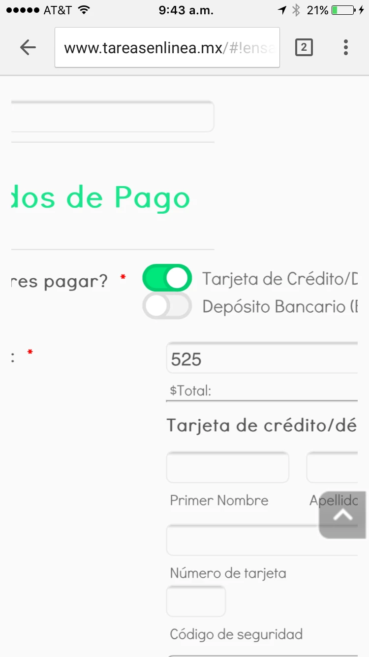
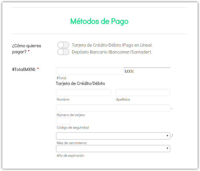
1.) See on my form "Ensayo" how the Stripe integration looks really small, the boxes are smaller than normal... compare this photo from my form "Ensayo":
See how the Name fields and lastname are really small... and it is really small the whole field.
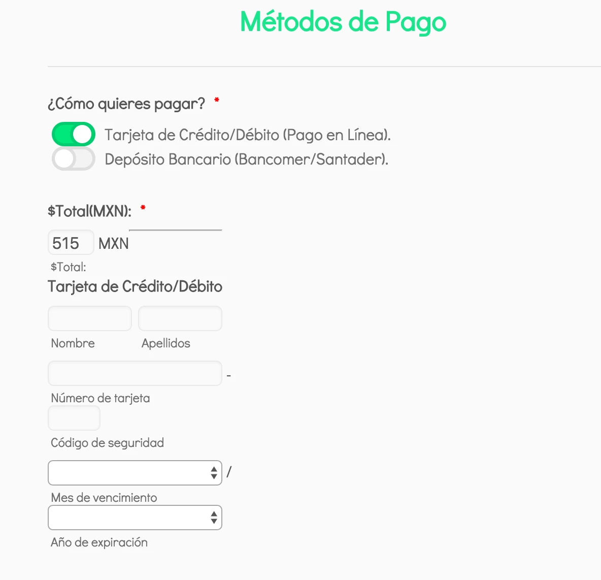
Compare it with my form "Trabajo sobre libro" see how it looks normal:
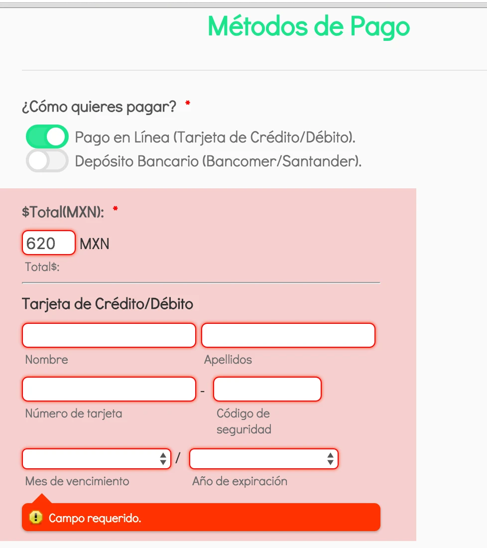
NOTE: This is on WEB not Mobile. Mobile looks also smaller but in WEB the problem looks more. HELP ....
-
HubersonReplied on April 25, 2016 at 4:07 PM
Add the following CSS to increase the payment field width:
#cid_55{
max-width: 260px!important;
}
The 260px value can be modified as you see appropriate.
-
melodicsoundsReplied on April 26, 2016 at 11:09 AM
Sorry this didn't helped, the Stripe integration still looks really tiny on my "Ensayo".
-
MikeReplied on April 26, 2016 at 11:59 AM
I have increased the input width parameter via form designer.
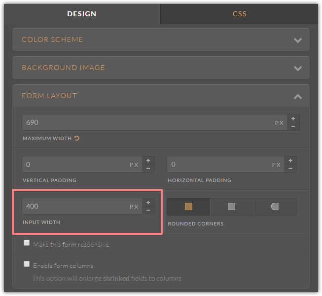
Also added the next CSS.
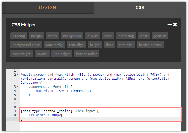
The radio button field with and payment section should be increased.
- Templates
- Integrations
- INTEGRATIONS
- See 100+ integrations
- FEATURED INTEGRATIONS
 PayPal
- Slack
- Google Sheets
- Mailchimp
- Zoom
- Dropbox
- Google Calendar
- Hubspot
- Salesforce
- See more Integrations
- Products
- PRODUCTS
- Form Builder
- Jotform Enterprise
- Jotform Apps
- Store Builder
- Jotform Tables
- Jotform Inbox
- Jotform Mobile App
- Jotform Approvals
- Report Builder
- Smart PDF Forms
- PDF Editor
- Jotform Sign
- Jotform for Salesforce Discover Now
- Support


