


-
BBC2016Asked on May 2, 2016 at 1:33 AM
I have an issue/question about differences in desktop vs mobile:
In mobile SOME fields show on the same line and others get broken up into 2 lines? - why?
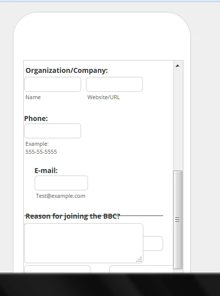
Organization/company is on ONE line but PHONE and EMAIL fields are NOT. They NEED to be on the same line . AND the bottom of the form where it says REASON FOR JOINING BBC and BILLING INFO SECTION is all messed up too! It looks like they are OVERLAPPING. HELP ASAP!!!!!
I put an IFRAME in the wordpress.
Page URL:
http://buildingbridgescoalition.org/registration-form/ -
BBC2016Replied on May 2, 2016 at 1:34 AM
I MADE A SCREEN SHOT FOR YOU TO SEE IT:
-
Kevin Support Team LeadReplied on May 2, 2016 at 1:47 AM
You need to inject this CSS code to fix it:
@media screen and (max-width: 480px){
li#id_5{
margin-left: 18px;
}
}
This is because the margin between the fields needs to be less on mobile devices as the screen is not the same width like a desktop or tablet device.
Follow the steps on the guide linked below to inject the code to your form:
How-to-Inject-Custom-CSS-Codes
Hope this helps.
-
BBC2016Replied on May 2, 2016 at 1:57 AM
i put code in but no DIFFERENCE - can u look on ur end too????
-
BBC2016Replied on May 2, 2016 at 2:01 AM
i added ur code below to all my other forms too - but same problem - form fields are not staying on the same line some of them.
@media screen and (max-width: 480px){
li#id_5{
margin-left: 18px;
}
}
-
beril JotForm UI DeveloperReplied on May 2, 2016 at 3:04 AM
You can solve that issue by adding the CSS code.
@media screen and (max-width: 480px), screen and (max-device-width: 768px) and (orientation: portrait), screen and (max-device-width: 415px) and (orientation: landscape){
#input_11 {
margin-top : -5px !important;
}
}
We would appreciate it if you could test it with your mobile phone. It will show you the correct view. The mobile emulator doesn't work properly.
-
BBC2016Replied on May 2, 2016 at 10:44 PM
stillnotworking.....plshelp!
I have an issue/question about differences in desktop vs mobile:
In mobile SOME fields show on the same line and others get broken up into 2 lines? - why?
Organization/company is on ONE line but PHONE and EMAIL fields are NOT. They NEED to be on the same line . AND the bottom of the form where it says REASON FOR JOINING BBC and BILLING INFO SECTION is all messed up too! It looks like they are OVERLAPPING. HELP ASAP!!!!!
-
Kiran Support Team LeadReplied on May 3, 2016 at 12:05 AM
I've checked your JotForm and see that there are some issues with the CSS code injected to your JotForm.
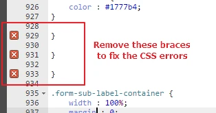
Please make the following changes to the existing CSS code on the form.
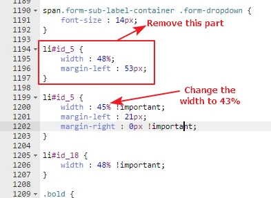
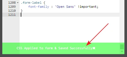
Make sure that the changes applied to the CSS code is saved successfully to the form.
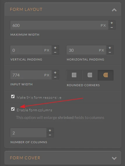
Also, enable Form columns from the Form Designer as shown in the image below:
Let us know how it goes. We will be happy to take a look again.
- Templates
- Integrations
- INTEGRATIONS
- See 100+ integrations
- FEATURED INTEGRATIONS
 PayPal
- Slack
- Google Sheets
- Mailchimp
- Zoom
- Dropbox
- Google Calendar
- Hubspot
- Salesforce
- See more Integrations
- Products
- PRODUCTS
- Form Builder
- Jotform Enterprise
- Jotform Apps
- Store Builder
- Jotform Tables
- Jotform Inbox
- Jotform Mobile App
- Jotform Approvals
- Report Builder
- Smart PDF Forms
- PDF Editor
- Jotform Sign
- Jotform for Salesforce Discover Now
- Support


