


-
jurullcAsked on May 4, 2016 at 9:05 PM
WordPress issue
I am using the JotForm WP plugin, unfortunately after going through the survey that I have set up the "thank you message" has been cut off. How do I make the thank you message responsive or at least for someone to scroll down to to see the rest of the message.
Embedding into WP issue
After embedding the form into WP the questions are centered, is there a way to make the form responsive to the questions appear full screen. Also, how do I adjust the form styling to match that of the website (fonts and colors).
Thank you message questions
Is it possible for a person to receive a thank you message pop up AND a thank you email message in their inbox.
-
Elton Support Team LeadReplied on May 4, 2016 at 10:18 PM
There seems to be a conflict with calculating the correct height of your thank you page. Inject this CSS codes to your form to extend your thank you page height. This should show the entire thank your message.
body.thankyou .form-all {
height: 2071px !important;
box-shadow: none;
}
Guide: https://www.jotform.com/help/117-How-to-Inject-Custom-CSS-Codes (paste it into the bottom section)
--
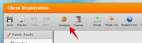
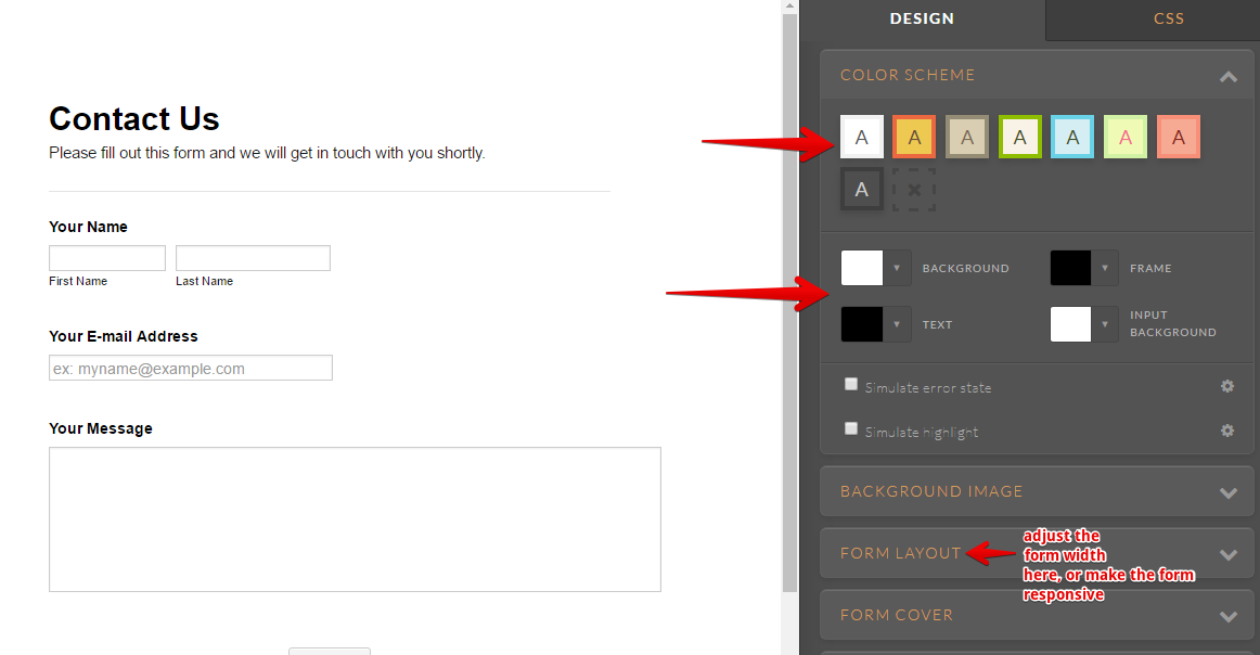
I'm not quite sure about your second question about making it fullscreen. If you want to expand your form width, you can adjust it on the form Designer under Form Layout. You can also adjust the fonts and colors there as well.
Here's how:
We will answer your other question on this thread https://www.jotform.com/answers/832980.
-
jurullcReplied on May 4, 2016 at 10:23 PM
Question 1
So how does this CSS impact the form if it's viewed on a mobile device.
Question 2
How does this impact the form on mobile devices as well.
-
Elton Support Team LeadReplied on May 4, 2016 at 10:37 PM
1. Please update your CSS with the following so it does not stick on the same height when viewed on mobile.
body.thankyou .form-all {
min-height: 2071px !important;
box-shadow: none;
}
This basically does not do anything when viewed on mobile. What this does is set a minimum height of the thank you page.
2. This changes the overall layout of the form, both desktop on mobile. If you want your form to be fully mobile responsive across different devices, you can check the responsive option as indicated on my previous screenshot. Or you can follow this guide: http://www.jotform.com/help/311-How-to-make-Forms-Mobile-Responsive
Basically, JotForm forms are mobile responsive. The fields will automatically adjust when viewed on mobile which makes them easily to fill.
- Templates
- Integrations
- INTEGRATIONS
- See 100+ integrations
- FEATURED INTEGRATIONS
 PayPal
- Slack
- Google Sheets
- Mailchimp
- Zoom
- Dropbox
- Google Calendar
- Hubspot
- Salesforce
- See more Integrations
- Products
- PRODUCTS
- Form Builder
- Jotform Enterprise
- Jotform Apps
- Store Builder
- Jotform Tables
- Jotform Inbox
- Jotform Mobile App
- Jotform Approvals
- Report Builder
- Smart PDF Forms
- PDF Editor
- Jotform Sign
- Jotform for Salesforce Discover Now
- Support
